APARTMENT DIY: No Nails Slat Wall
 

Adapting back to apartment life has had its challenges, but I have found beauty in "calling the landlord" when something goes wrong. As you know from the blog – this is not a luxury I've had for quite some time! I've grown to love our little place. It's quietly tucked between two other stand alone "mini houses" with off-street parking, laundry, and private outdoor space which is pretty rare for LA. We live next to my dear friend and rotate dinners (which is AMAZING with all of our busy schedules), watch each others dogs, take out each others trash, the list goes on. Basically, we can never move.  

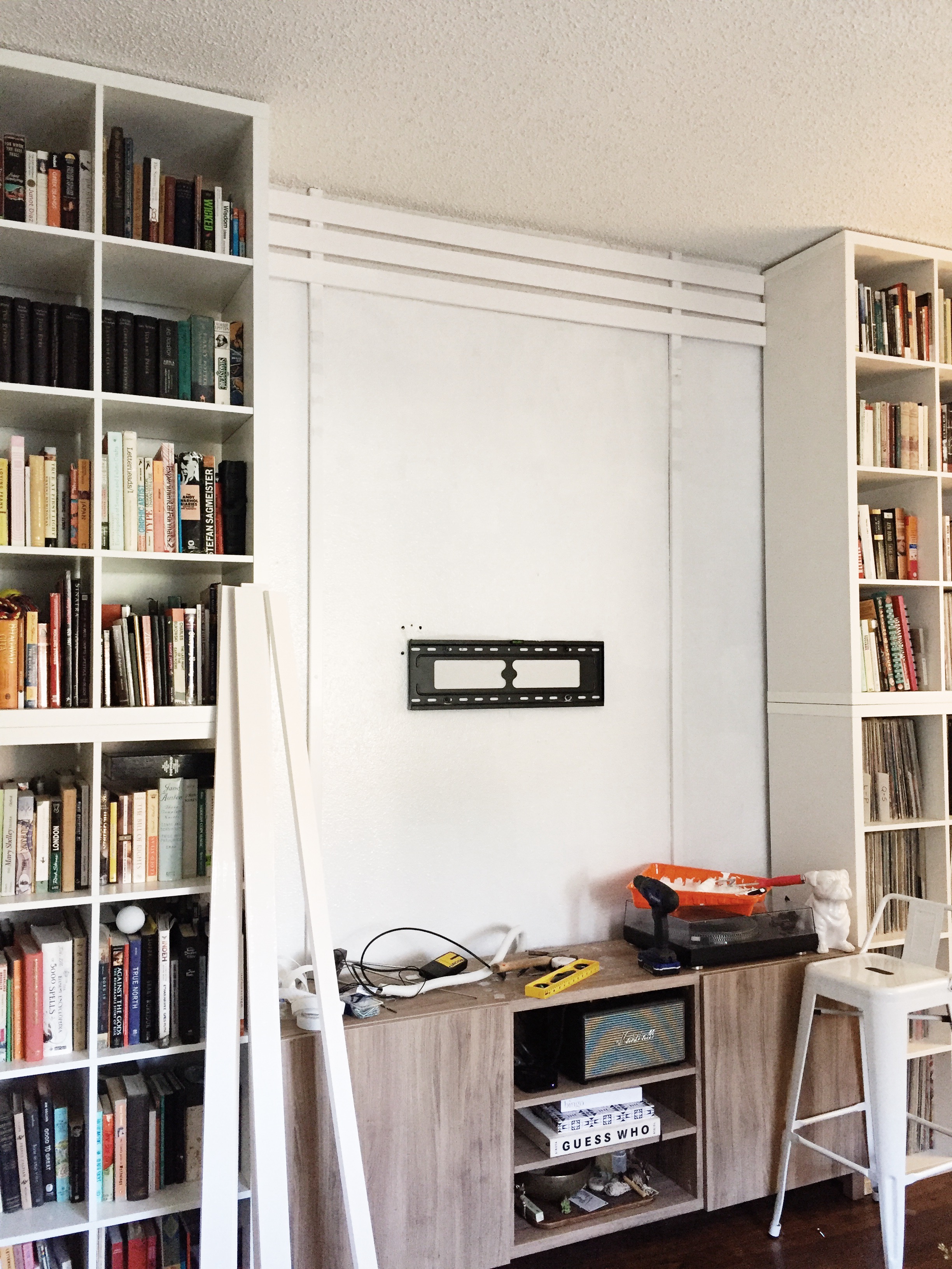
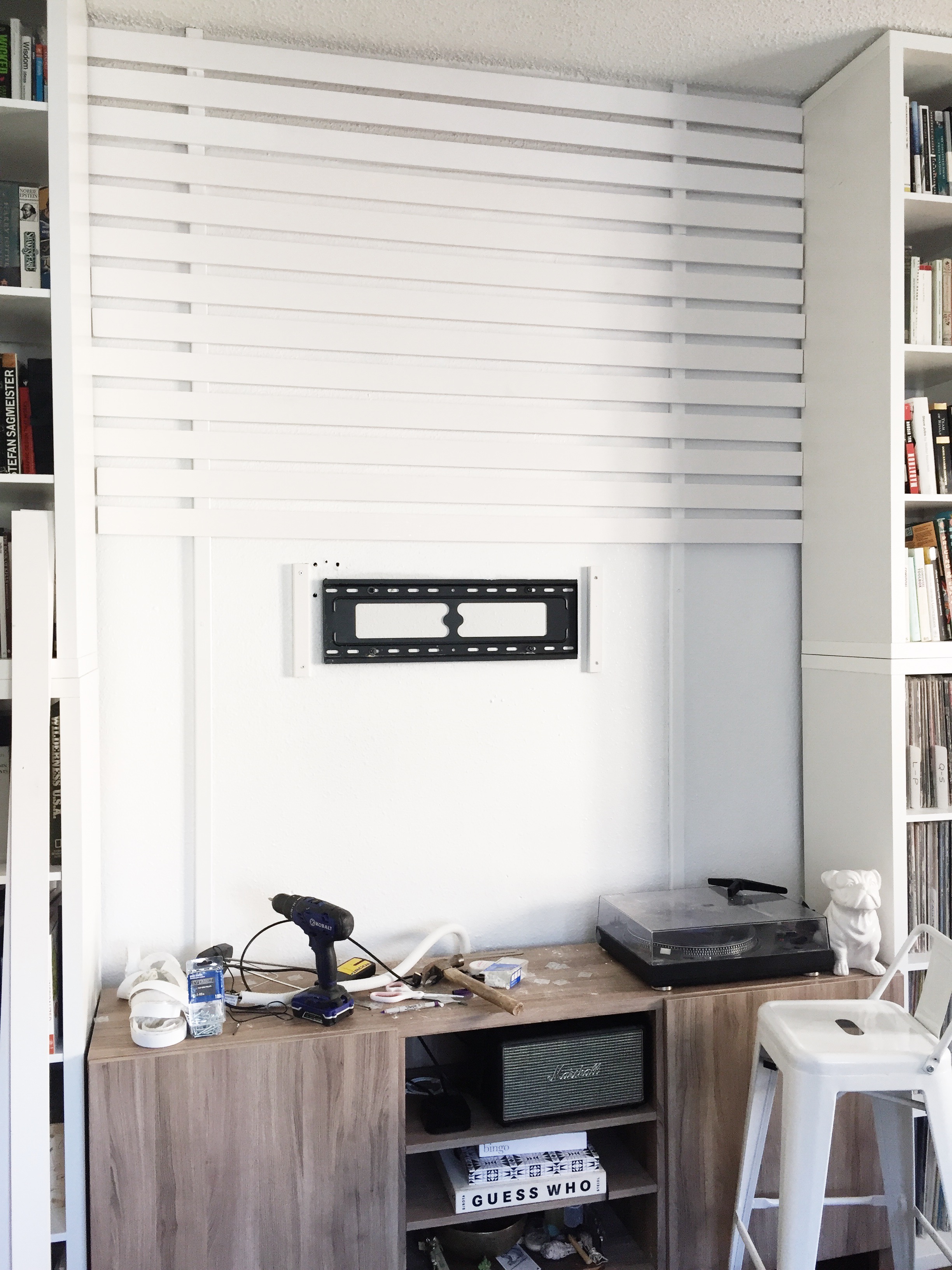
The interior has been a real struggle because I'm use to making decisions that are permanent, so I've gotten verrryyyy creative about creating solutions that feel built-in, but are very easy to remove and take along on our next adventure. This slat wall concept has been living in my brain since we moved in and we had quickly made an IKEA run to create a solution to our non-existent storage problem. We configured the bookshelves and TV stand into an entertainment wall and wanted to add dimension and something to hide the cords. I loved the slat wall idea, but the thought of having to transport, cut, paint, nail, patch, paint again was paralyzing and this very sad wall stayed like this for almost a year. (Don't judge the off-centered TV. I hung this myself while Brandon was at work which was a bad idea on so many levels.)

IMG_2638.JPG

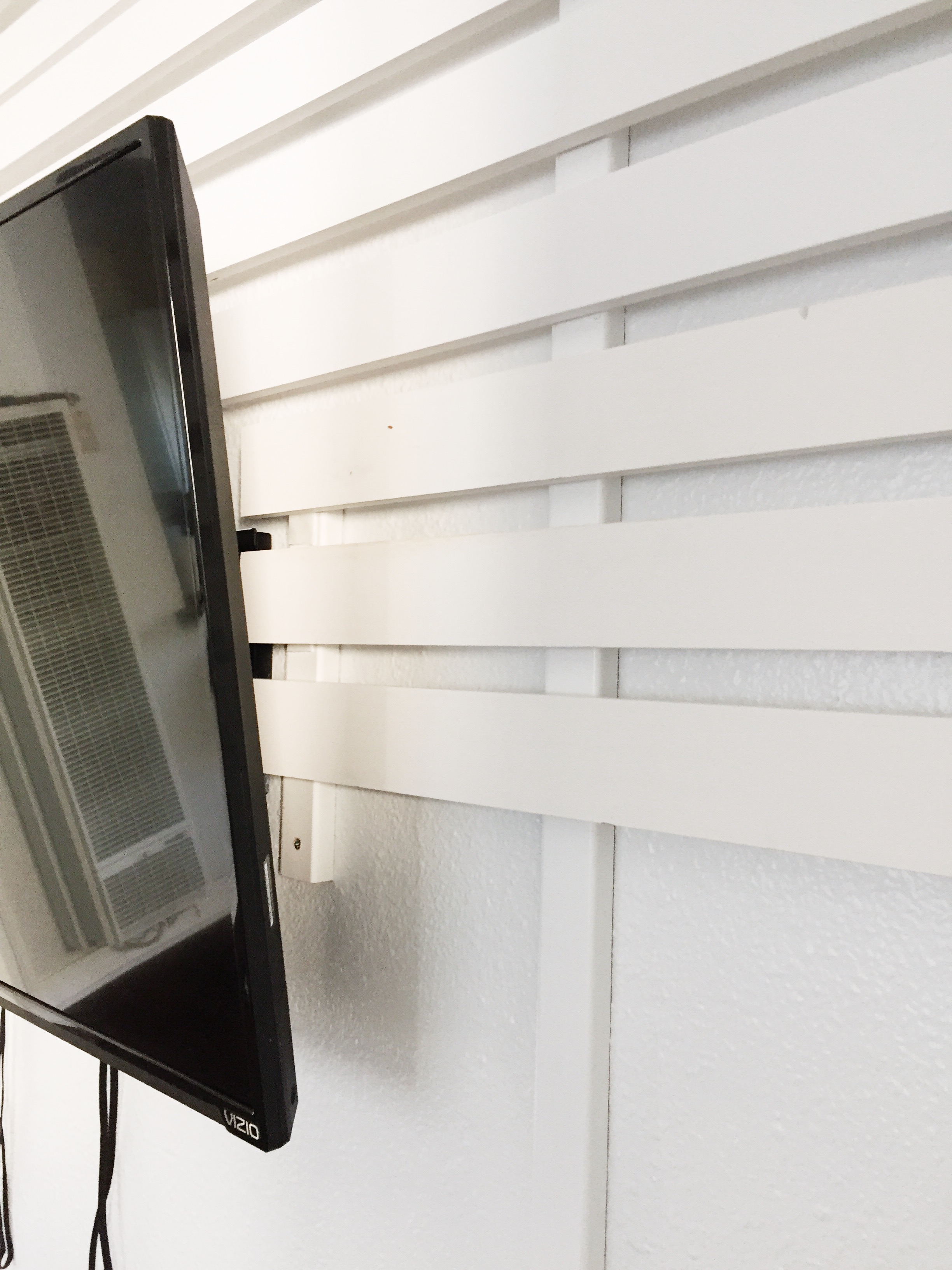
So, one day I had some time on my hands and brought the idea back to life. This time, I thought of the idea backwards – the removal process. What could I use that would hold the slats, but also be removable if I wanted to get to the chords or I took it down all together? BINGO. Industrial strength velcro!

Below you will find the steps to achieve a removable slat wall with only 6 screws (pending ceiling height).

What you need:

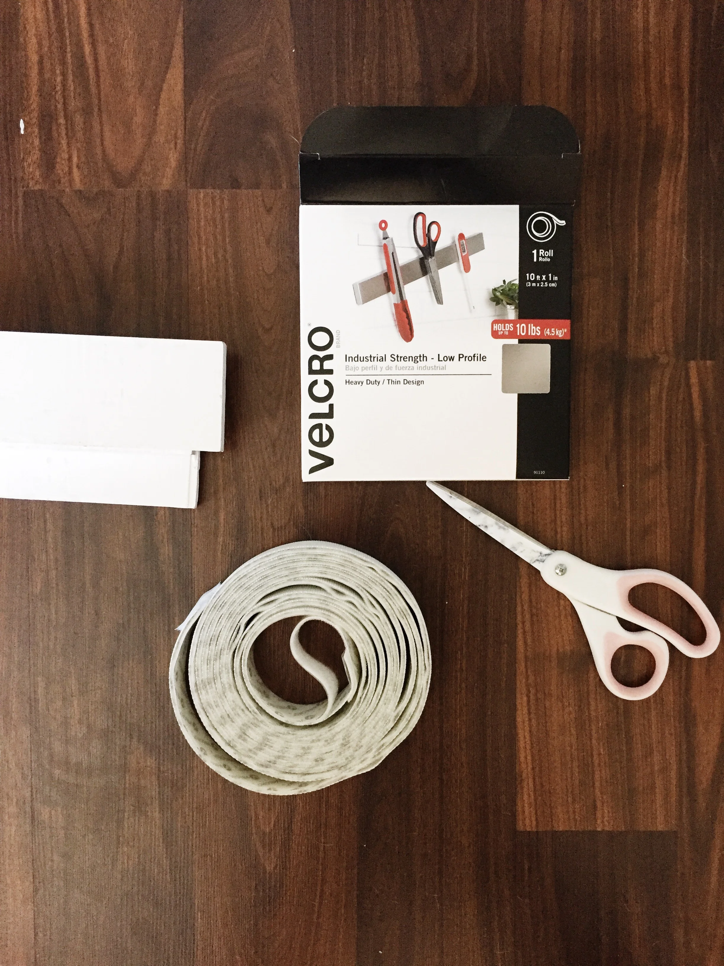
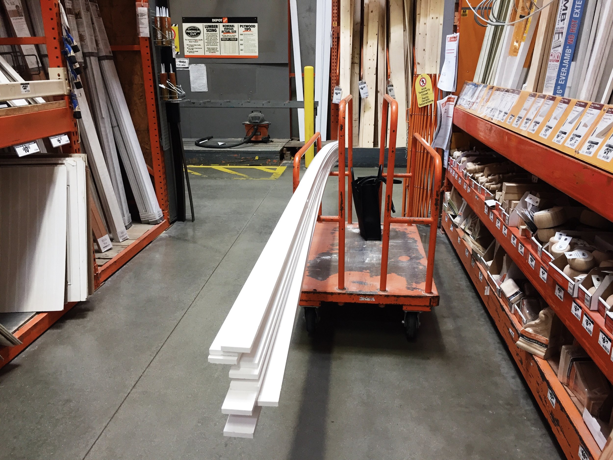
1. PRIMED* multi-purpose boards from Home Depot. These come in various sizes – we used the 2.5" size and created 1" spacing using the thickness of the level. 

2. 1" PRIMED* trim boards - these will be used to attach to your wall. 

3. Industrial Strength Velcro.

4. Scissors

5. Drill

6. Proper screws for your wall conditions (and anchors if needed)

7. Level

8. Stud Finder

9. Miter Box (if you need to cut your pieces to fit around the TV)

*You don't have to buy the boards primed, but it will save you a lot of time.


STEP 1: Measure the width and height of your desired space. Divide your desired board width evenly and subtract the spacing to get the number of boards you will need. 

I used 2.5" boards with 1" spacing in between to get a total of 20 boards.


STEP 2: Find a very, VERY nice person at your lumber yard of choice to cut your boards down the the final width. Thanks to my local Home Depot, I walked out the door with everything cut to size so that I didn't spend my day figuring out how to transport to my apartment and cut them down. 


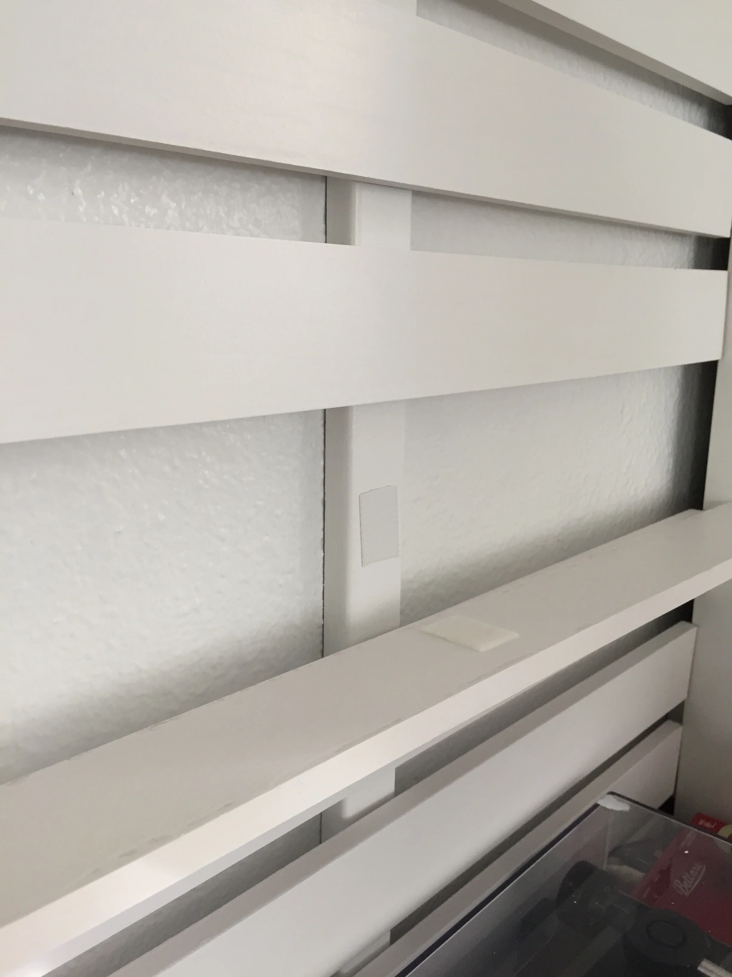
STEP 3: Using your stud finder, located the studs and attach your 1" trim pieces vertically from ceiling to your desired height. The boards are very light weight, so you don't need to go crazy with screws to attach the strips.

STEP 4: Starting at the top, roughly apply both sides of the velcro to the wall strip where your first board will go. Make sure the first board is level as this will be a guide for you all the way down. Press the board onto the velcro and voila!

To make it easy, I used a level that was 1" thickness, so I simply turned the level on it's side and placed the next board all the way down to have an even thickness.

STEP 5: When you get to the TV Bracket, use your miter box to cut two small strips that are slightly longer than the height of the bracket and place to the left and right.

Then, hang and connect the cords to your TV before moving onto step 6.

STEP 6: Using your miter box, cut the slats to size and work them around your television. You will be adding the slats OVER the cords, so make sure these are connected before finishing your wall.

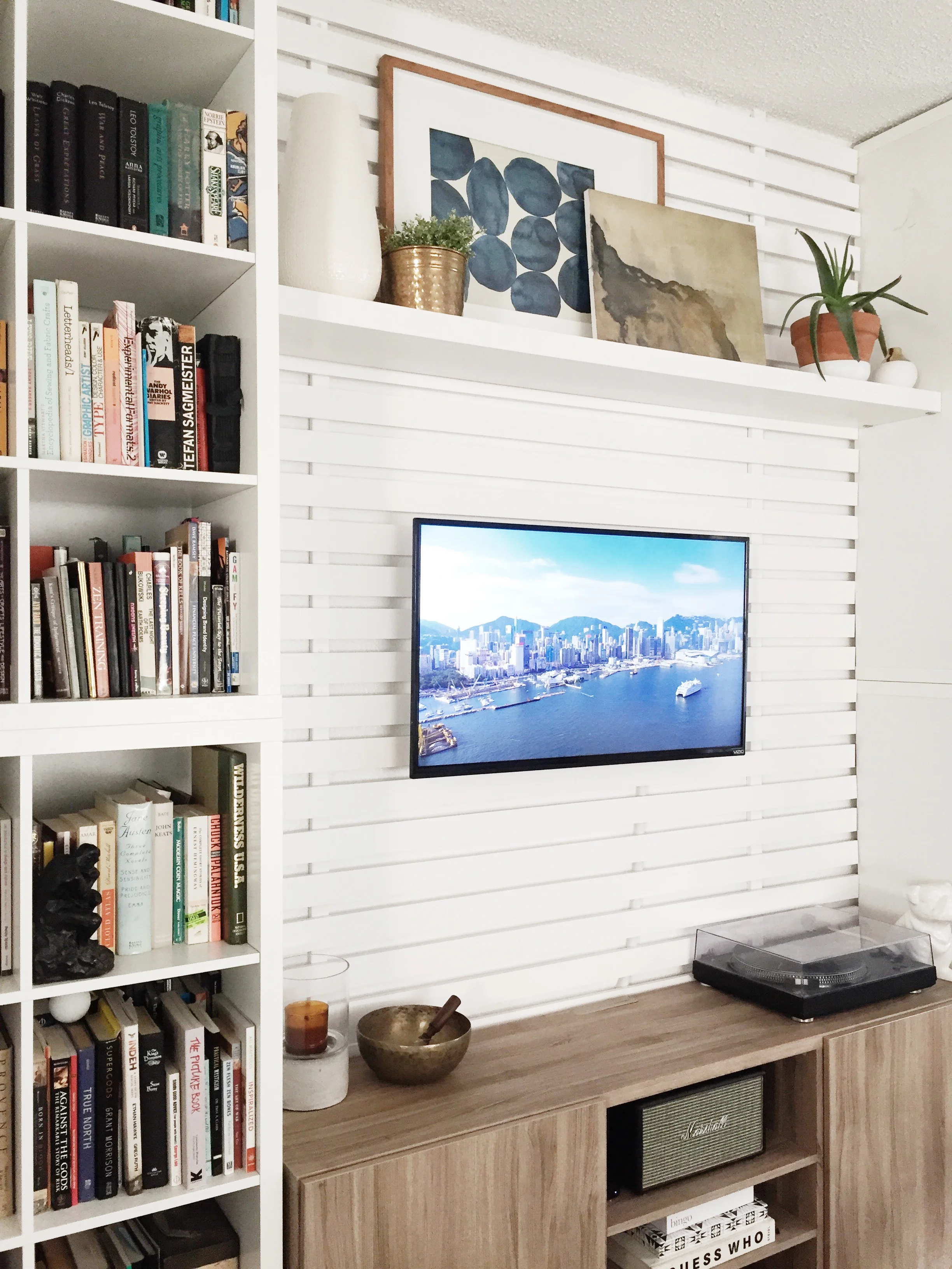
STEP 7: Add shelving if desired or hang sconces, art, you name it!

 
A New Year
 

While working into the wee hours last night, I got a visit from an unexpected stranger just stopping in to say hello. A friendly face. One much needed after the shelf incident. By then, it was all cleaned up, the power was back on and I had orders to fill – determined to turn that day around even though it probably would have been my best bet to call it a day and walk out the door. But, I didn’t. And because of it, I made my very first walk-in SALE and I’m not technically open yet.

I think that is probably the best representation of how my year has been. There were so many terrible things happening around me – so many deaths, an election that still blows my mind, close friends going through some really tough times, the list goes on. It was a year of the unthinkable and through each incident, I gripped onto the life I had that much more. It certainly isn’t perfect, but as we all witnessed this year – it’s short. Insanely short. And I don’t intend on wasting any of it.

It became a year of taking risks – quitting a job I had for over 5 years, HUSTLING to get a business launched after quitting said job with no plan (thankfully I learned a lot from my husband, so this was able to happen quickly), moving to San Francisco and back, selling my home, signing a LEASE on an office, starting a candle line. I mean, pure crazy talk.

And even though there have been so many moments – like everyday moments – that I think I’m headed in the wrong direction, I change my tude, keep moving and good things continue to come out of it. Even if they are very, very small. Like a friendly face and a $12 candle purchase at 9PM.

Tomorrow marks a new year and while I have a list of personal resolutions, you may have noticed that I started one a little early and that is to be more transparent about my process and some of the ugly stuff too. I never felt good about posting these beautiful, glamorous snippets of my not-so-perfect life. It’s not really who I am and something I’d like to change this year. I think it will be good for me. I promise not to be a downer and share every detail like running out of toilet paper or dropping my coffee. Just some real life sh*t that I think we could all use a little more of. So, if you’re into it – please follow along (instagram is my social media tool of choice) and see how this average gal who doesn’t know what she’s doing, doing things. And as my husband always says “we’re all going to be dirt one day”, so my New Years wish for all of you is to do a little leaping, be weird, and make it the best year yet. I know you have it in you.

 
Angela Satterlee Comments
Northern Michigan Cabin: A Session with Fairly Modern

Virtual Design (also called remote design) is a very affordable option that can achieve professional results. While this isn't for everyone, it's a perfect solution for someone who doesn't mind getting their hands dirty or already has a reliable contractor to get the job done. Most of the cost associated in working with an interior designer comes from the management of your project, so where a design plan can range from $500 - $2,500 – full service projects can start much higher.

So, how would one design a space without stepping foot in the door? Well, for me – this comes very naturally both as a designer and consultant. Once I receive photos (at different angles) or a video walk through of your space and measurements, it's much like reading from a blueprint. From there, we set up a call/video meeting to discuss your likes/dislikes and the goals of your project. Depending on the size of the project, there are various checkpoints that allow for collaboration and to make sure we're on the same page.

Read about another example of remote design here.

For this project, I was 100% remote and was approached by Rachel and Solomon of Vida Living Properties to help with their latest home – a Northern Michigan Cabin. This dynamic duo has done an amazing job with properties of their own, but needed help defining a direction on this one as the style was far different than any of their other projects. 

I was extremely inspired by their space and rather than going crazy with a completely different style, I kept as much existing as possible and enhanced with elements they may not have thought of or validated ideas they had.

The first step was the mood board which usually consists of a high level direction to set the tone. I think this step is most important to get everyone on the same page. I can quickly collaborate to define likes/dislikes so that the process runs smoothly and I'm not making suggestions that I know the client wouldn't like.

For this project, there were specific areas the client wanted to focus. Below is an example of how I use the clients images to make design decisions. These visuals are shared during a call so that we can discuss the different options and either get approvals or go in another direction.

For the kitchen, they already had a layout and cabinet selections complete. I reviewed the plan and validated that they had made a wonderful selections. I simply tweaked a couple outstanding layout issues (pantry/bathroom door), made suggestions for flooring and selected the finishes.

I've always dreamed of owning a cabin someday, so I had a lot of fun stepping back to my roots and working with this team to bring their project to life. Thank you Rachel and Solomon for being such a pleasure to work with! I can't wait to see the finished result.

Angela SatterleeComment
PIQUA KITCHEN REVEAL

Most often with remote clients, it can take several months or longer to see a project from start to completion. While Fairly Modern does offer full-service, on-site projects – it's not always necessary or the most cost effective way to achieve the same results. For this project, the client wanted the whole sha-bang. A new, functional layout, cabinets, countertops, finishes, lighting, doors and windows. They were willing to do the demo themselves and hire a contractor that would follow the plan I put in place. This is a very affordable solution to anyone looking for a similar overhaul.

While the client was 100% remote, we started with a handful of photos and a skype call to discuss the wish list as well as what needed to stay. From there, the client provided me with measurements and we worked on the functional aspects of the kitchen.

When starting a remodel, it's important to note that moving plumbing, gas or electrical lines can add a lot of cost to your project. I always try to avoid moving mechanicals unless it will make a dramatic impact to the flow of the space. 

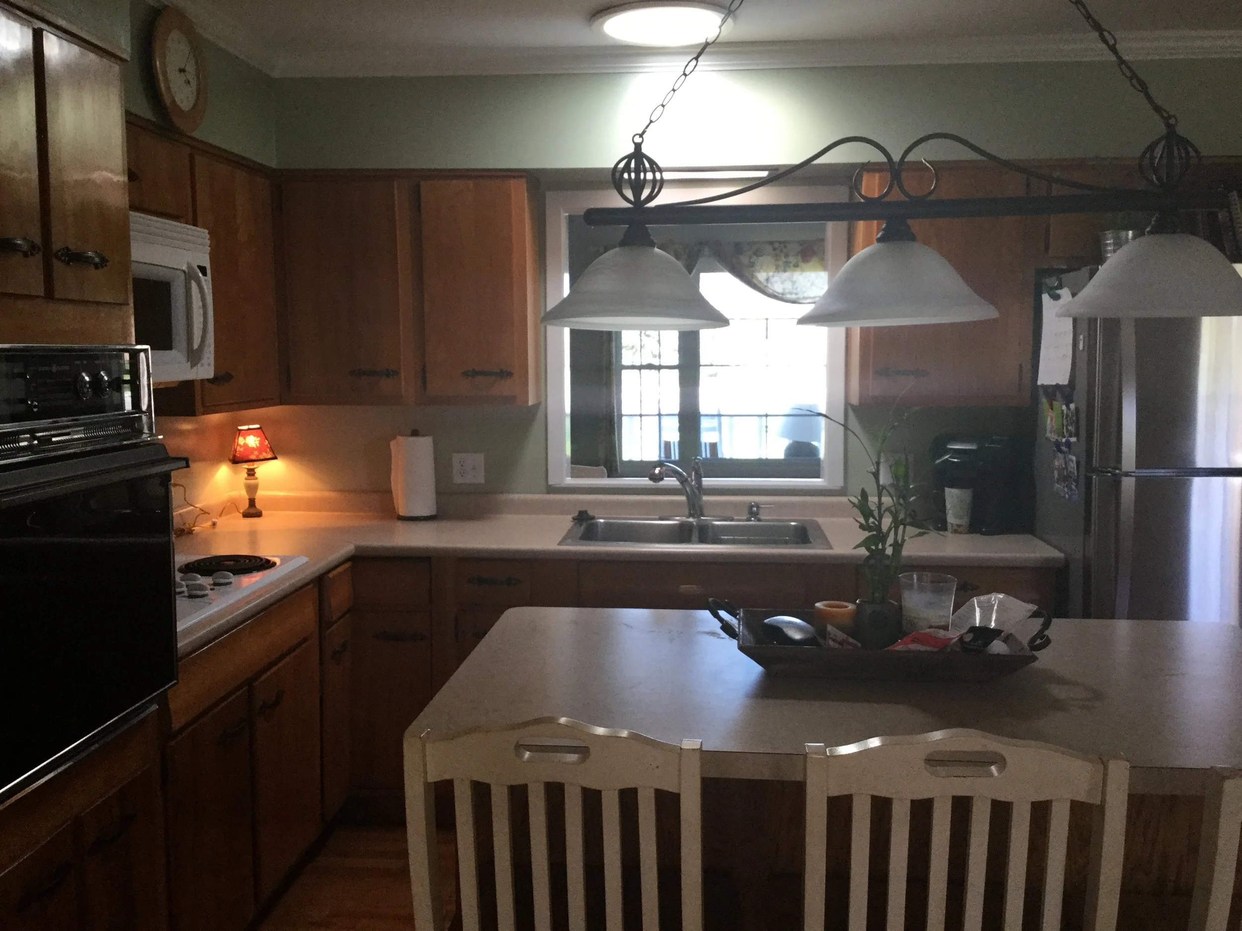
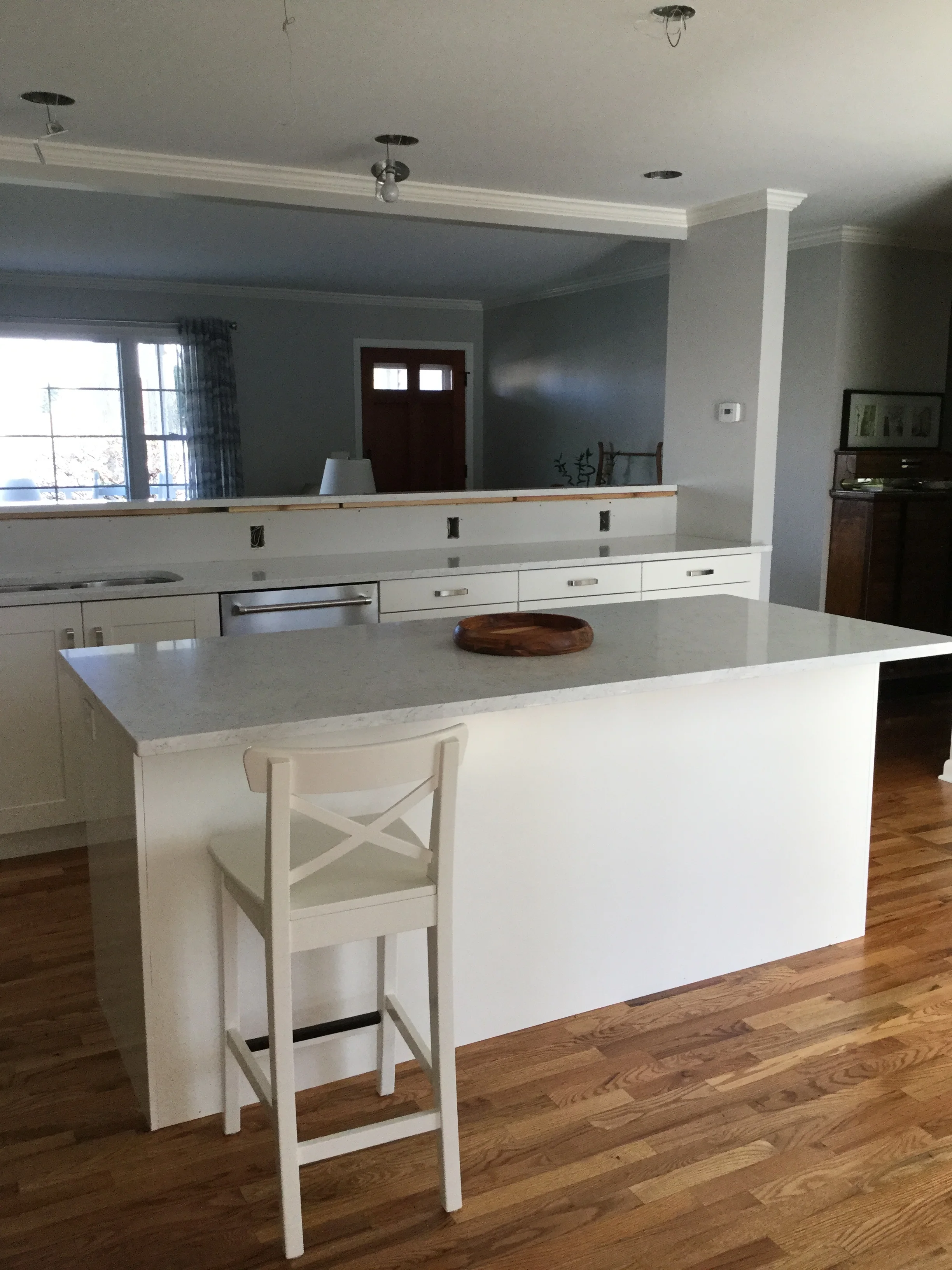
In this case, I kept the stove and sink in place. The client was removing the wall oven and replacing the countertop stove with a combo unit which allowed for me to gain enough space to suggest moving the refridgerator. This was a HUGE win because it then allowed us to blow out the wall and make it open to the living room! 

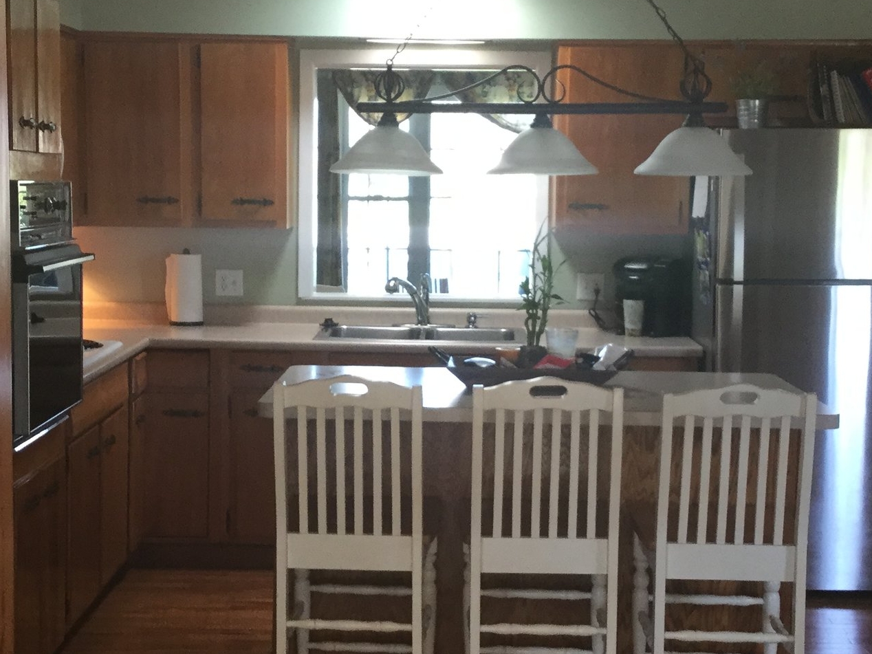
Before

Before

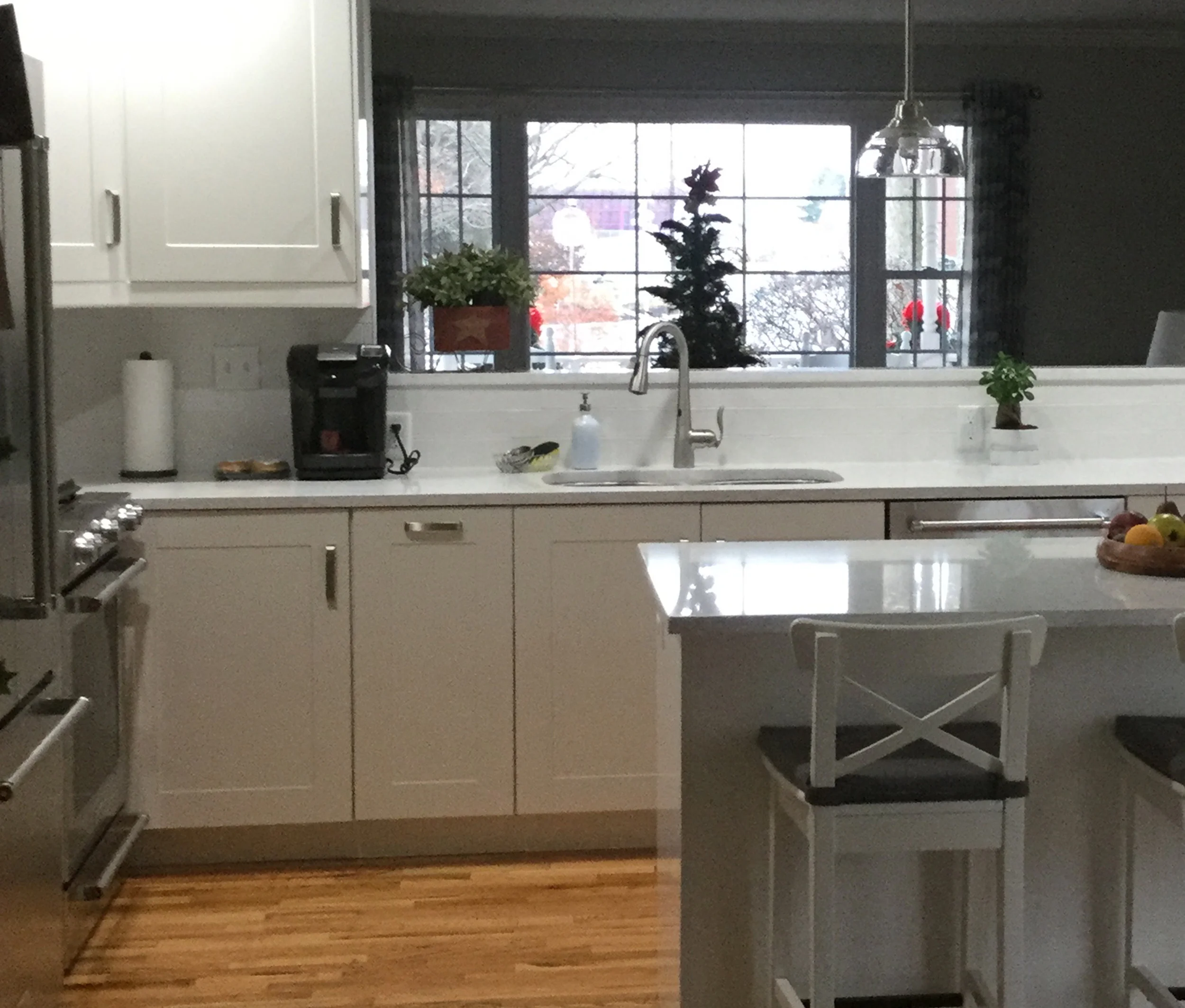
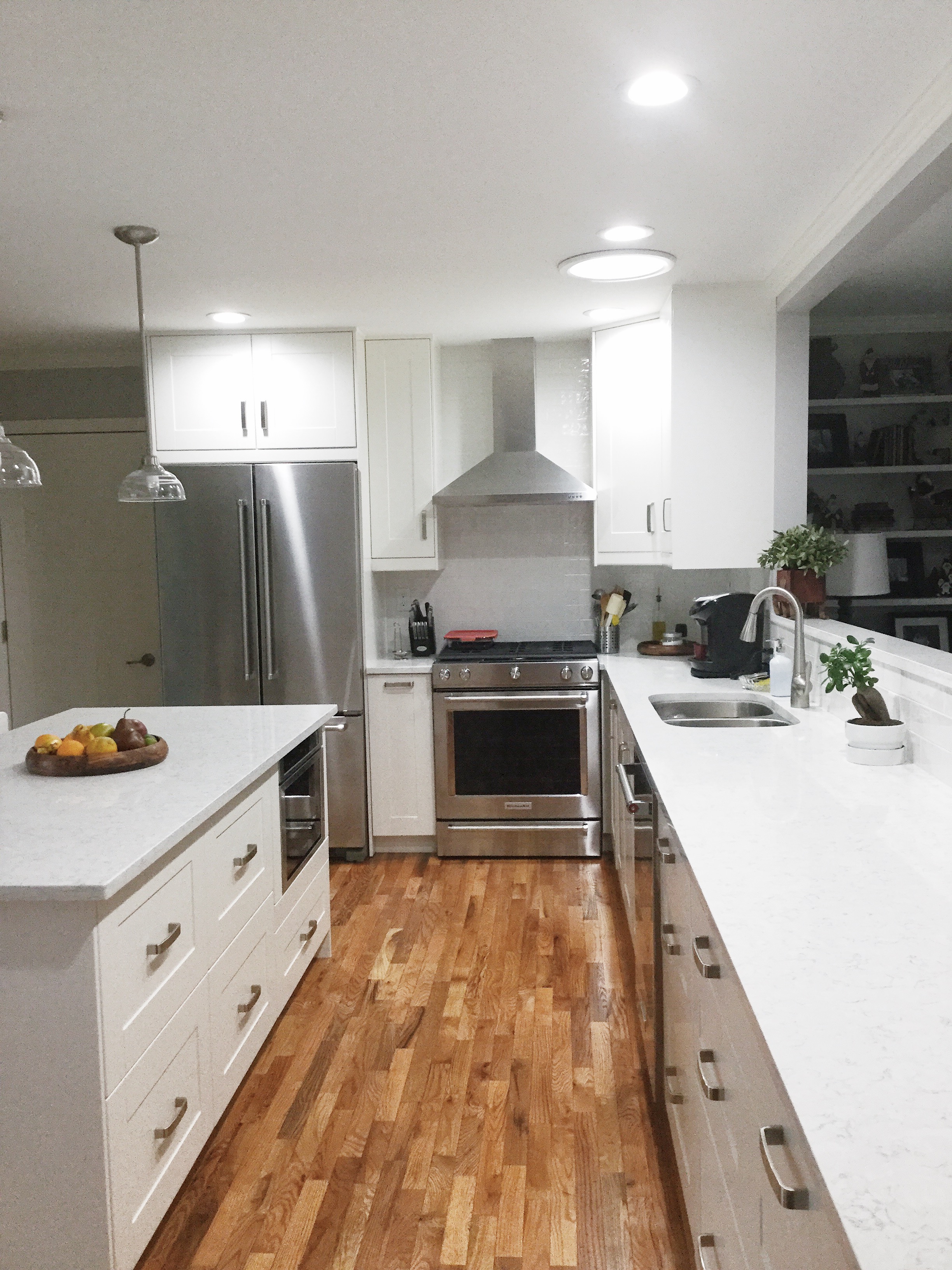
After / In Progress

After / In Progress

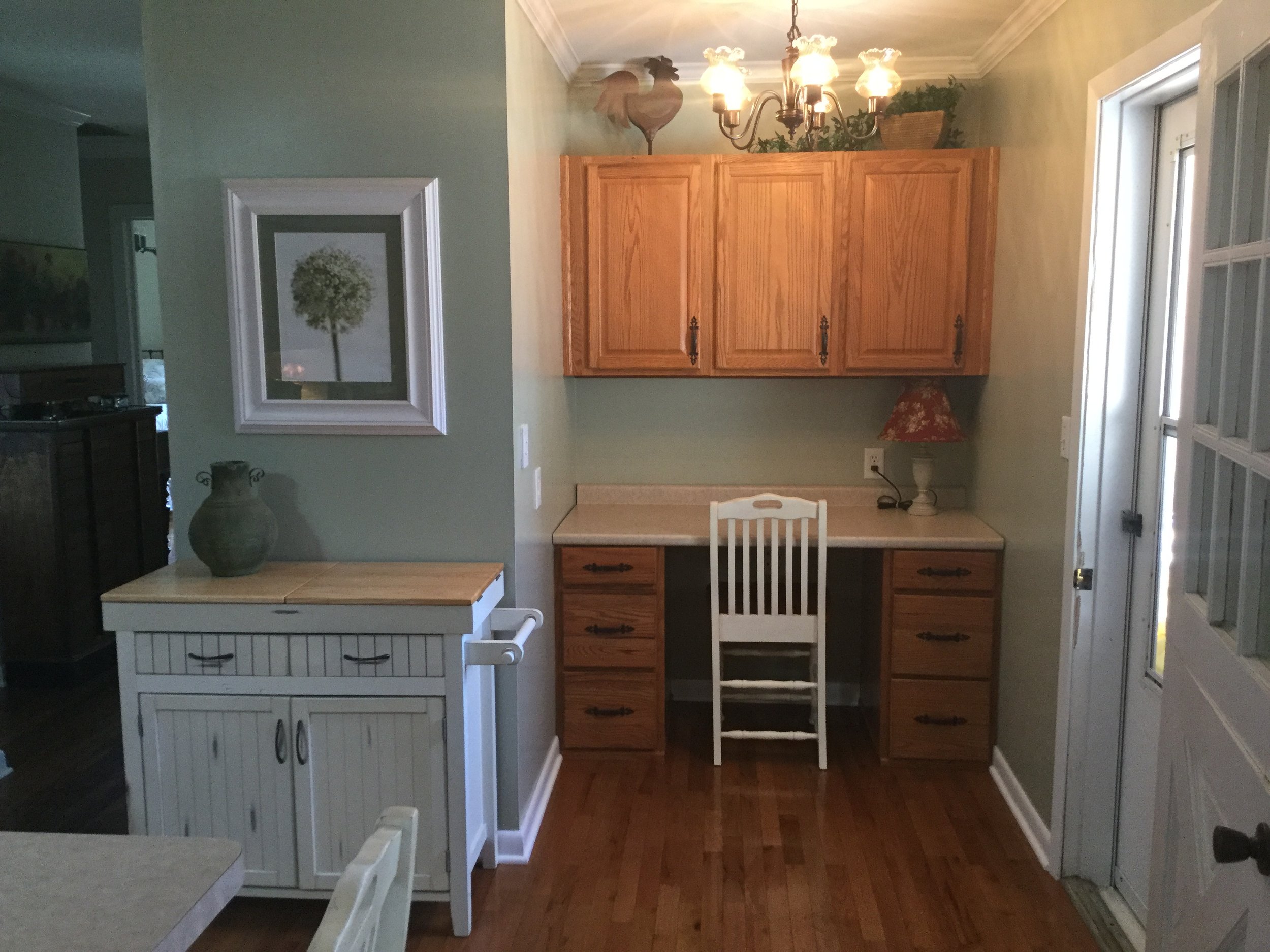
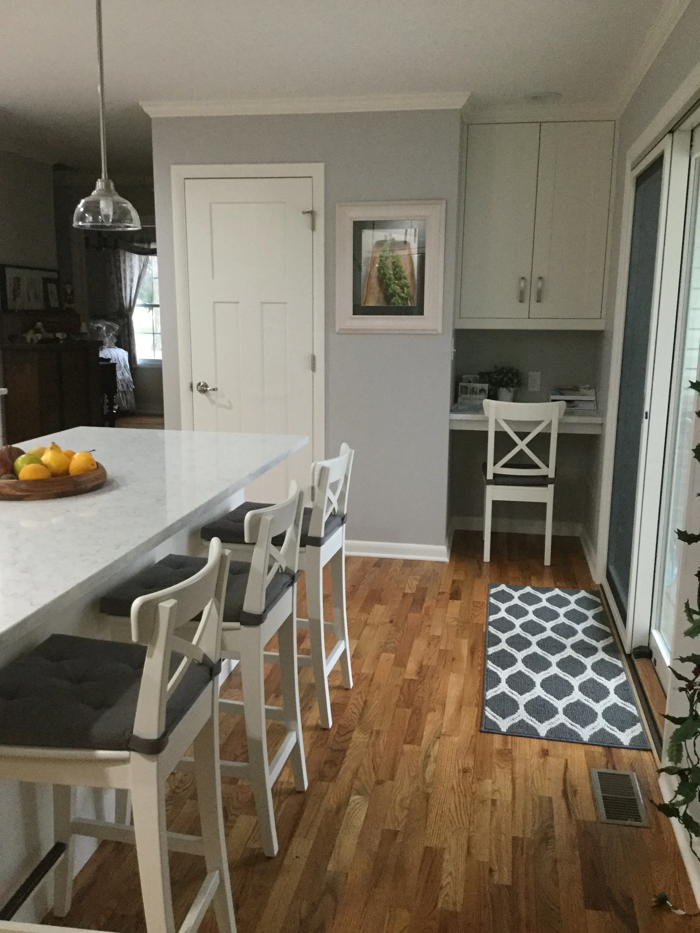
Since they were losing some precious pantry space, I suggested taking a "rarely used" hall closet and converting it to a walk-in pantry. While the desk needed to stay, we did make it smaller to allow for more pantry space and brought in a TON of natural light by changing the small door into a glass slider.

Before

Before

After

After

One pain point that the client shared was that the island made it difficult to have too many people in the kitchen. We went through a variety of options with the island and discussed functionality and worked around the built-in drawer microwave.

After determining the desired configuration, I then moved the island further away from the kitchen cabinets to allow for a wider work area.

Before

Before

For the finishes, it was important to keep the space light and bright. I suggested keeping the foundational elements such as the cabinets and tile traditional as they plan on living in this home forever. I love a trendy kitchen as much as the next person, but it's important to understand the life span of how long someone intends to enjoy the space before another overhaul down the road. We worked through several iterations before landing on this combination.

I could not be happier with the end result for this very sweet and hard working couple! They stuck closely to the plan and allowed for it to come to life. Talk about a before and after!

FAIRLY MODERN NOW HAS A HOME OF ITS OWN.
 

All I can say is...WOW. What a difference a year makes. If you were a steady follower of the blog (thank you!), you may have noticed the dramatic halt and transitions over the year. I'm going to go out on a vulnerable limb here and say that we had some major personal hurdles and leaps of faith that quickly changed a few things. It's a little early to be talking about the new year, but hey – things don't always go according to plan, do they?

Through a vague turn of events, we made the decision to move to Los Angeles last October. For those of you that know us – we don't sit still for long. Shortly after our move, Brandon had an amazing opportunity to work at Apple which required us to move to San Francisco temporarily. During that time, we made some incredible friends, traveled, sold our house in Michigan – the house where Fairly Modern was born – to my lovely sister and brother in law, and I started to re-evaluate what I wanted for myself and my career. 

In June, I made the very difficult decision to quit my steady, full-time job with no plan other than I knew I wanted more. I left knowing I had given it my all and that it was about to be the biggest personal leap I’ve taken in my life. I’ve always played it safe. Had a plan. Crossed my fingers and hoped for the best.

This time was very different.

After a week of hanging poolside, I knew sitting around eating bon bons was not the future I envisioned for myself. I like to work. Actually, I love to work, but amidst scrolling handfuls of qualified job listings....nothing felt right. So, with a few years of working on interior side projects and encouragement of clients, friends, and family (you know who you are) – Fairly Modern went from a blog and limited clientele to a full-time business in the blink of an eye. Its grown, I’ve grown....

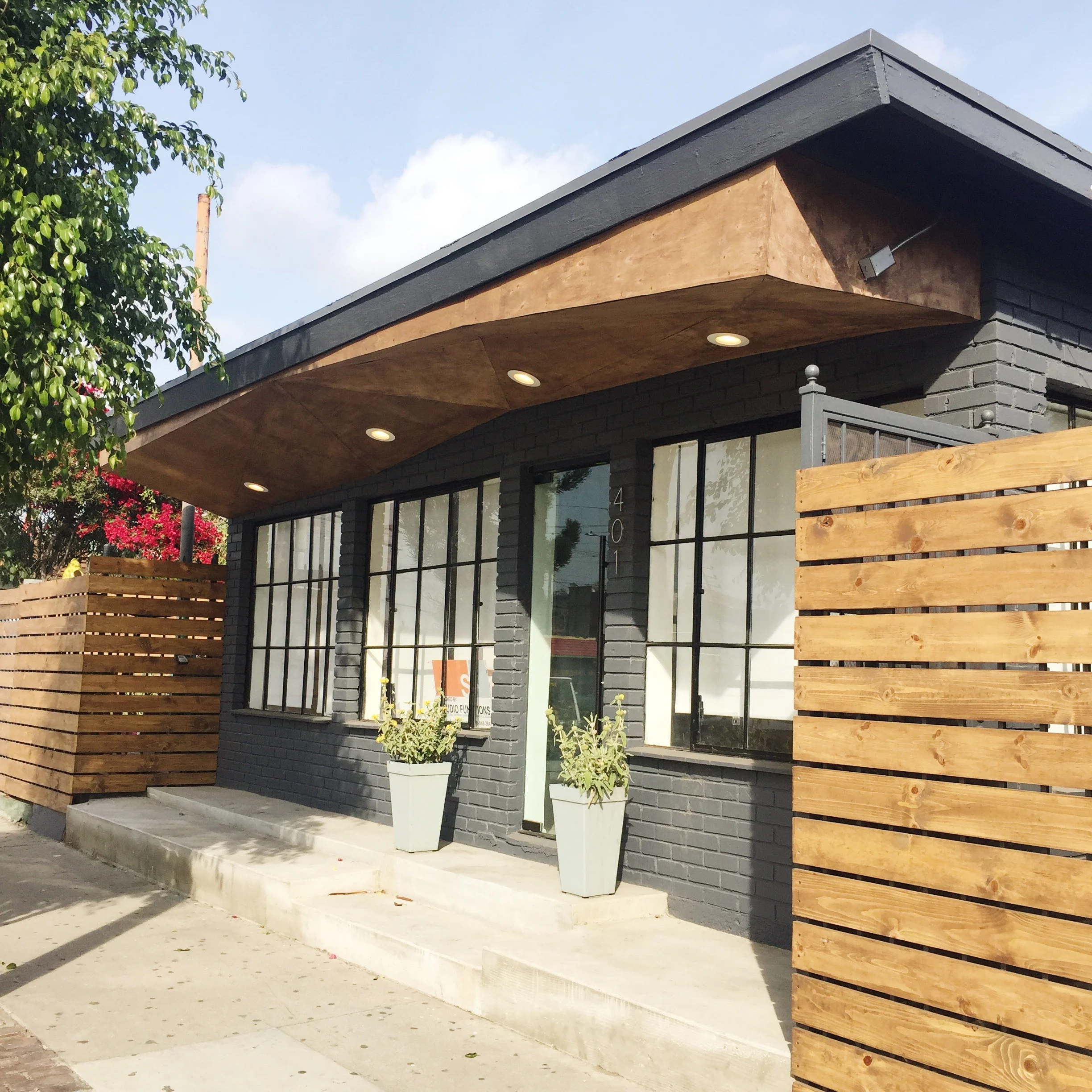
And I am insanely humbled to announce that Fairly Modern now has a home of its own!

Starting today, Fairly Modern will be operating from 401 Cypress / Los Angeles, CA as a full-service Interior Design + Brand Identity Studio. I will be launching “The Market by Fairly Modern” after the new year which will include our line of hand-made candles (yes, we make them all ourselves!) and other Home + Lifestyle products both in-store and online. 

The studio is located in my neighborhood of Arroyo Secco (Cypress Park / Highland Park for those unfamiliar). I'm not only looking forward to my short walk to work, but planting some roots in this wonderful community of "urban pioneers". 

Thank you, thank you, thank you to all of my wonderful clients, family, friends, business partners, past co-workers, and those of you who continue to send me work, a text, buy a candle, be a good friend, be a good stranger, offer advice – the list goes on and on. This sincerely would not be possible without you.

Be sure to follow along for studio updates on facebook and instagram @fairlymodernhome and our retail shop @shopfairlymodern and/or fairlymodernhome.com/shop

LET'S TALK RETAIL: FEATURES ON TINY BLUE SKY

A while back, I wrote a guest blog post for Tiny Blue Sky offering tips on how to work with a designer to get the most from your brand and was interviewed on the TBS Podcast. Below you will find excerpts and links to the full features.
 

THE PINTEREST TRAP: HOW TO FOCUS YOUR BRAND FOR RETAIL DESIGN AND BEYOND

"Without a doubt, Pinterest is a tool built to provoke ideas, facilitate collaboration and curate just about anything. At Fairly Modern, we use Pinterest not only to pull inspiration, but to collaborate with our clients gaining a better understanding of their vision and design direction. The drawback of using a site like this is also the reason we are drawn to it: endless possibilities. So, before you get caught in the Pinterest trap, we’ve put together a checklist of what you should have prepared before you create another Pinterest board or meet with a designer."

Read the full blog post here.


PODCAST: EXPERIENCE DESIGN FOR RETAIL SPACES

What is your process when designing a retail space and how do you incorporate branding into the process?

Well, every project is different. And, rightfully so in this case. First, I spend time understanding the product or the business. What makes them unique? What stories do they tell? Once I have a good understanding of that – I like to pull inspiration from there and incorporate it from a customer experience standpoint rather than focusing on the space itself. For example, think about an ordering process. That really has nothing to do with the design of the physical space, but it is important and can be built upon. Are the orders by number or do customers stand in a line? If they take a number, what would it be made of? What is something interesting I could do with it? Things just come to life when you start with the customer first.

Listen to the full podcast here

The Basement: Details

Now that most of the major projects are complete, we are starting to re-visit each of the "good enough for now" tasks that were left behind. You know, the ones that will keep you up at night, yet no one else would notice? Yeah, those. They drive me crazy!

Our house is constantly evolving. If you were to ask me "what's next?" I will either say "everything" or "it depends on what annoys me that day." A few weeks ago it was our basement storage wall. One minute I was hanging out watching trash tv and then out come the saws and hammers. Being 10PM when I started this, my husband was convinced I had officially lost my mind.

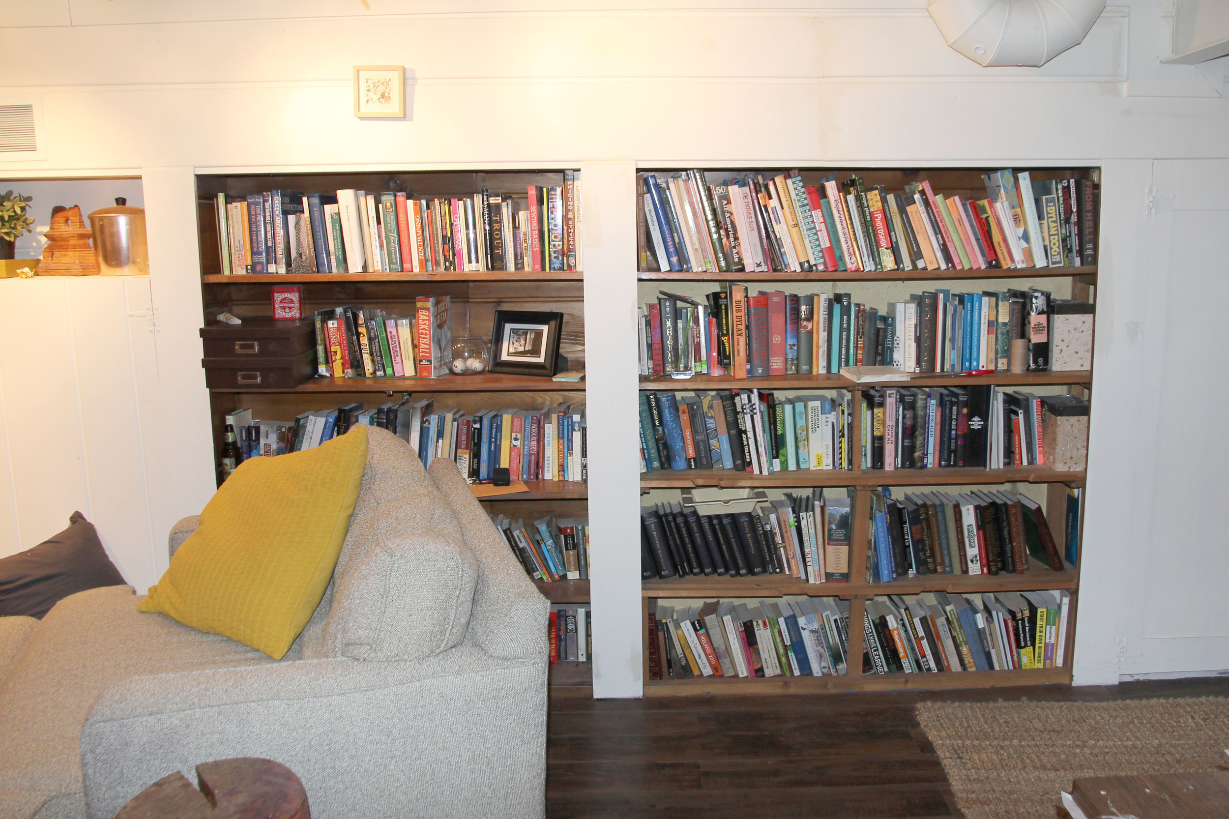
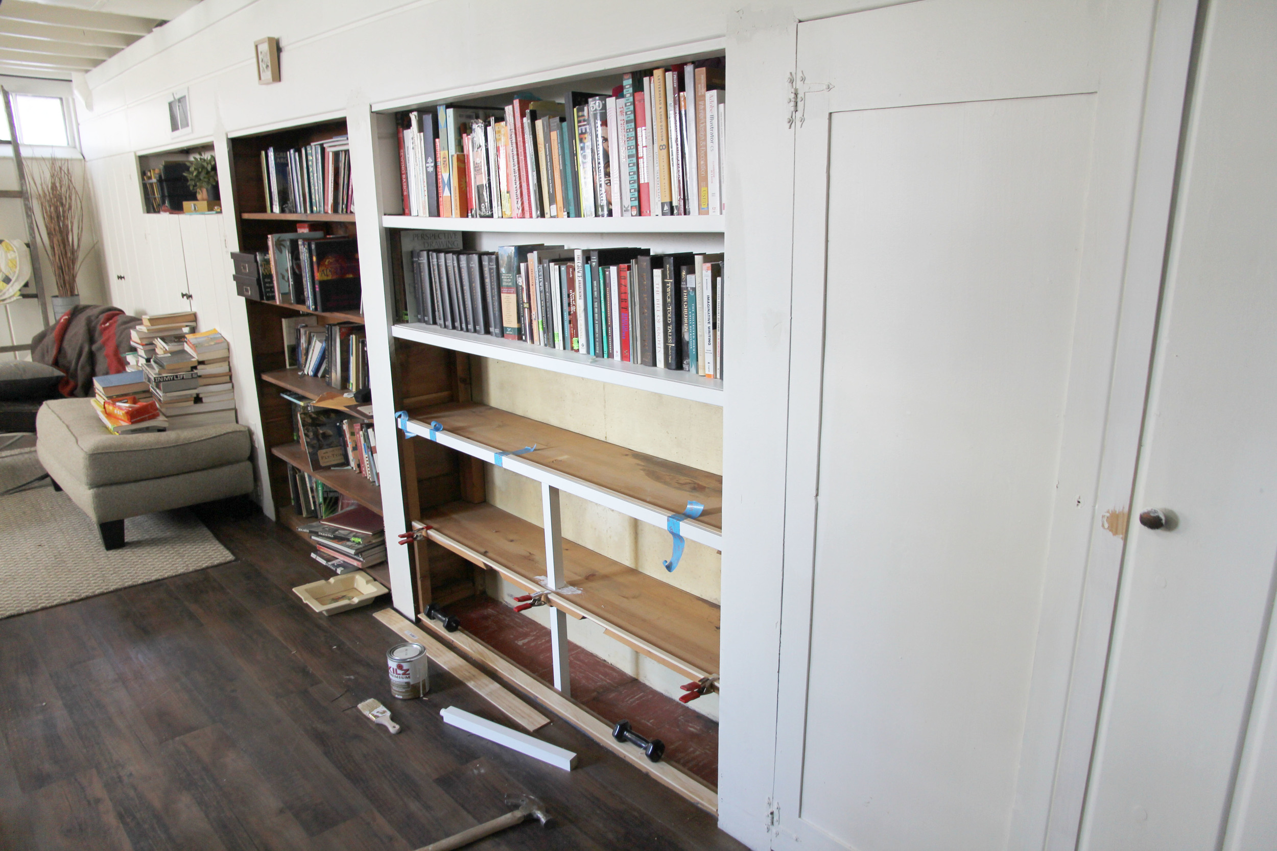
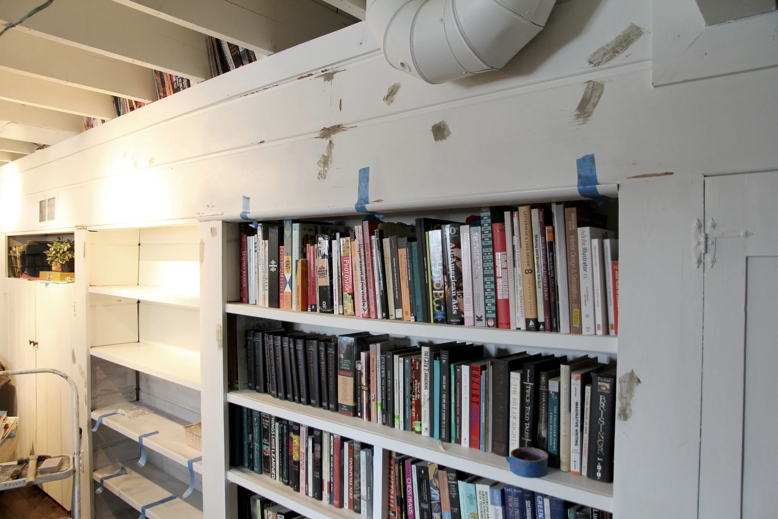
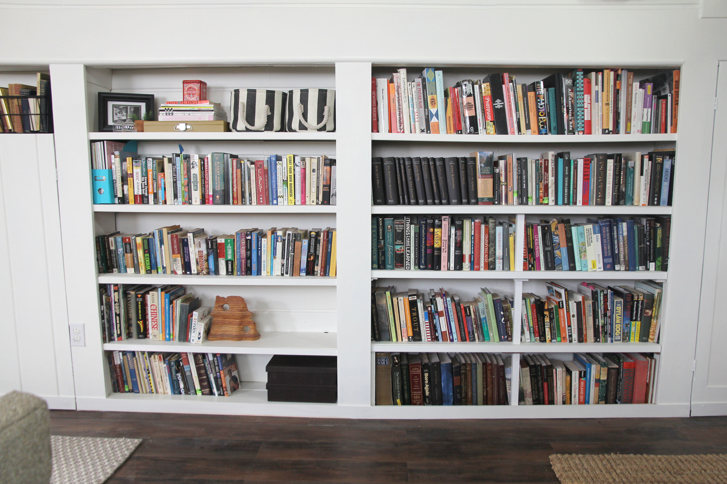
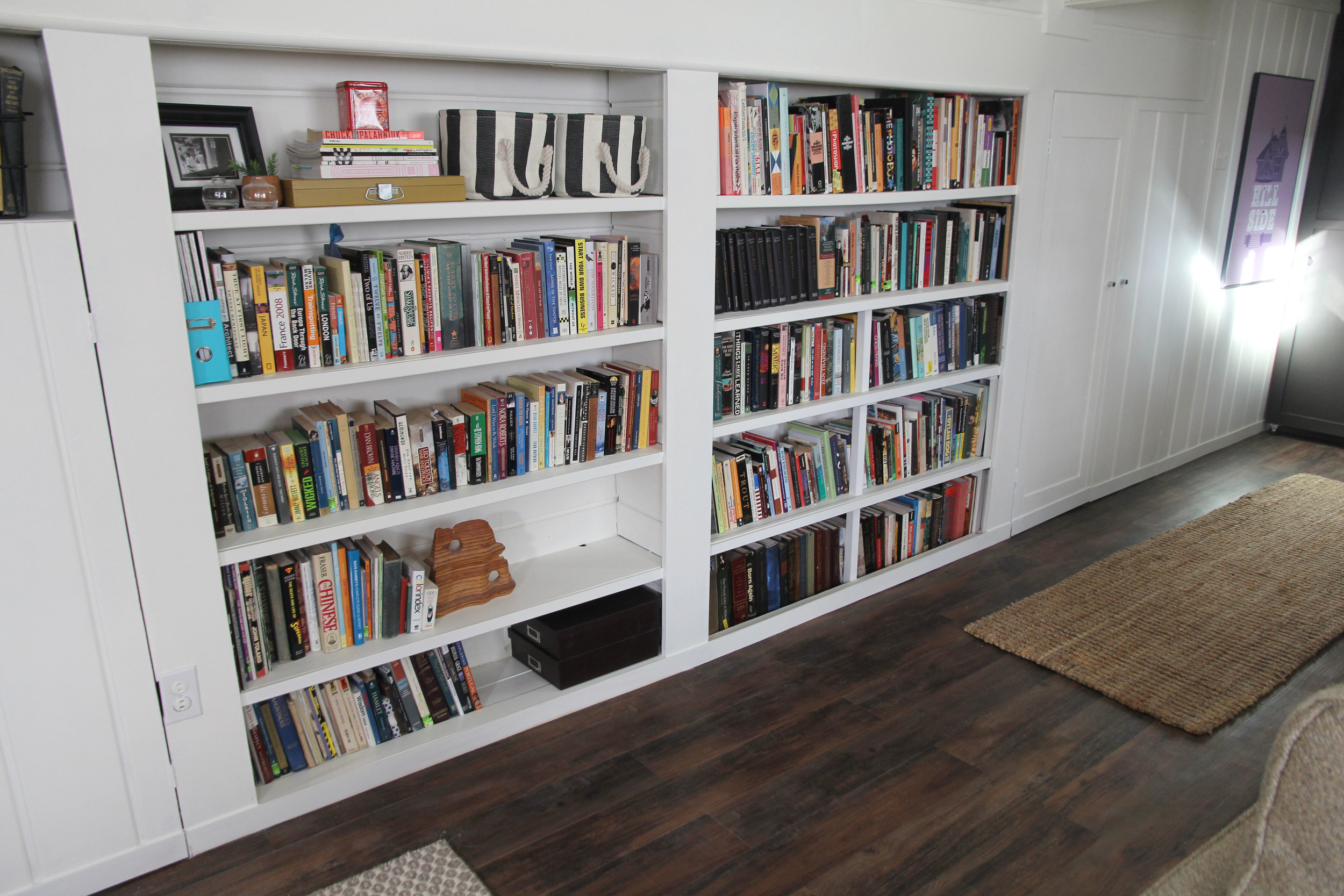
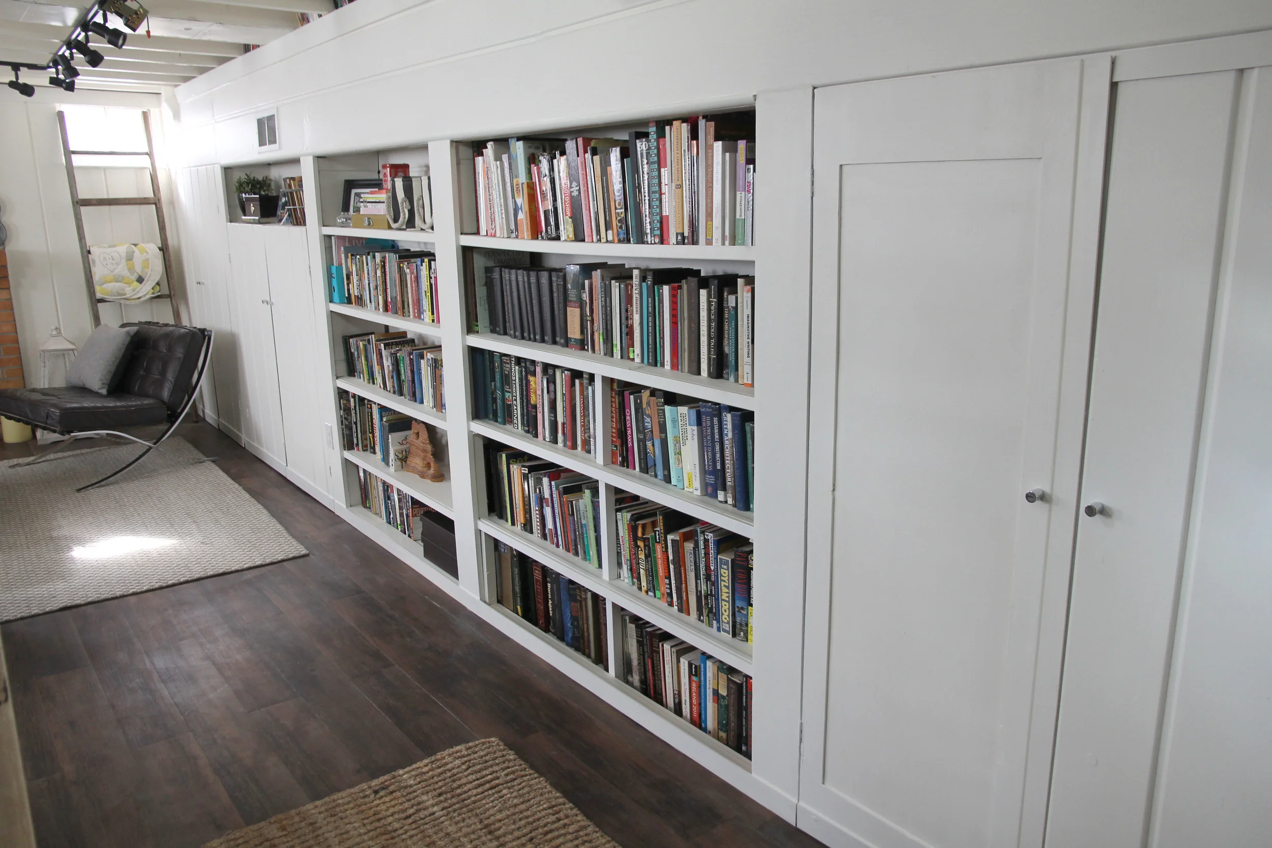
One of the selling points of this house was the basement storage. I absolutely LOVE this wall as it provides built in bookshelves for our growing collection PLUS tons of concealed storage which has been a nice home for crafts and office supplies. We had immediately removed the doors where the open bookshelves are now, but as you can see...they still needed a LOT of love.

This project started off small the night before using some trim I had leftover from another project. Then, as you know...you get going and you find every flaw imaginable. I was determined and it went from a simple paint job to a 3 week night/weekend project that included patching, removing/replacing old hinges and knobs, adding very detailed trim, replacing broken or uneven pieces, sanding, sanding, and more sanding, and several coats of paint. 

BUT...all the hard work paid off. I absolutely love how they turned out and am happy to take a short break from the late nights and the crazy amounts of dust.

An Updated Entry

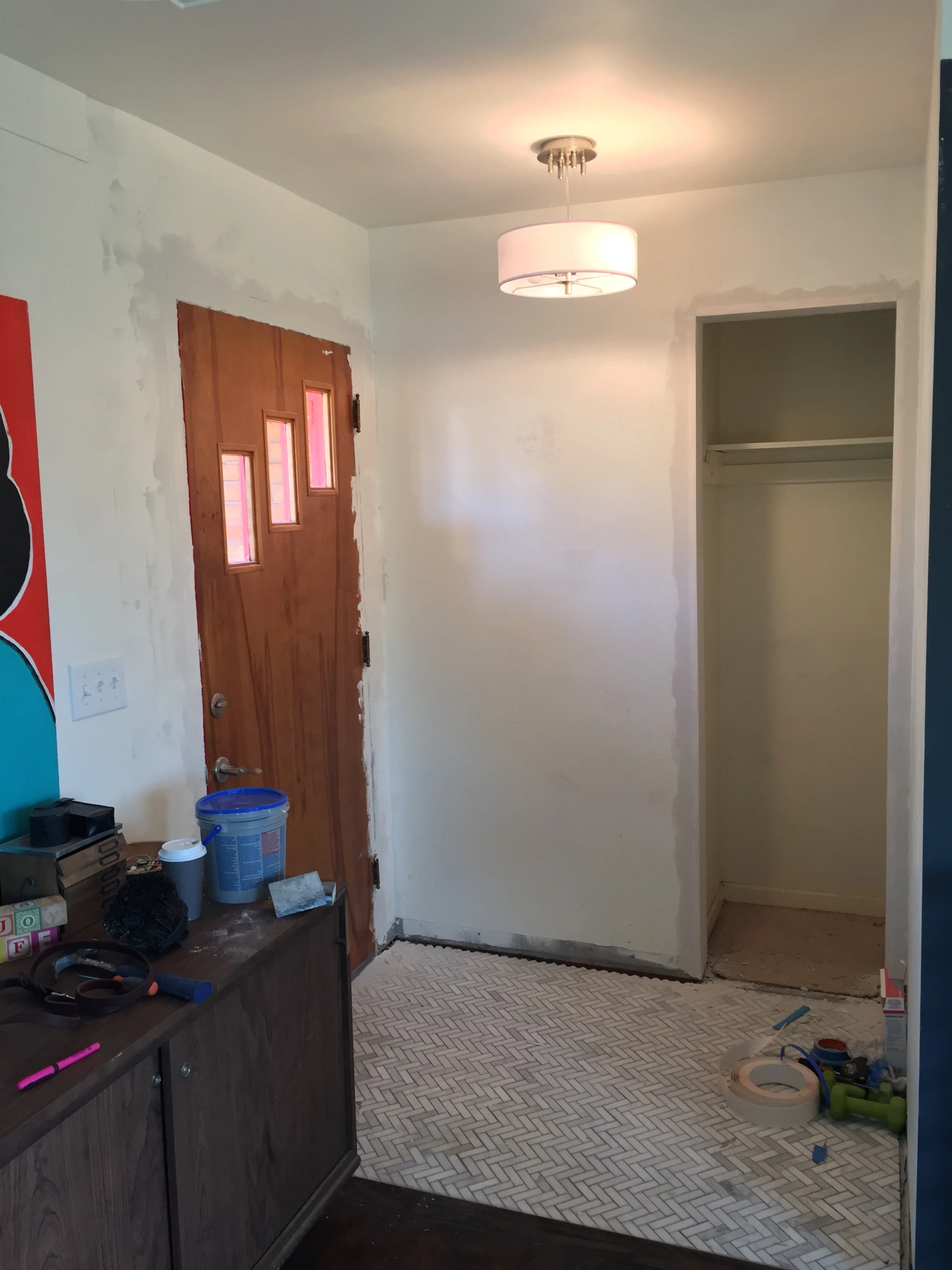
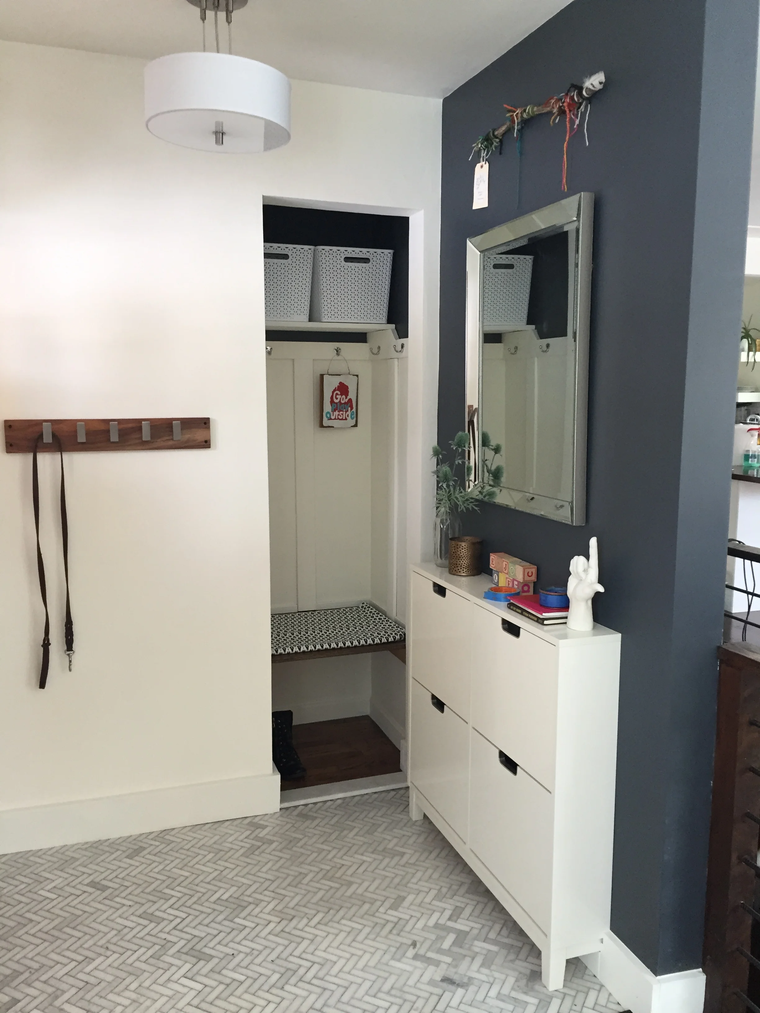
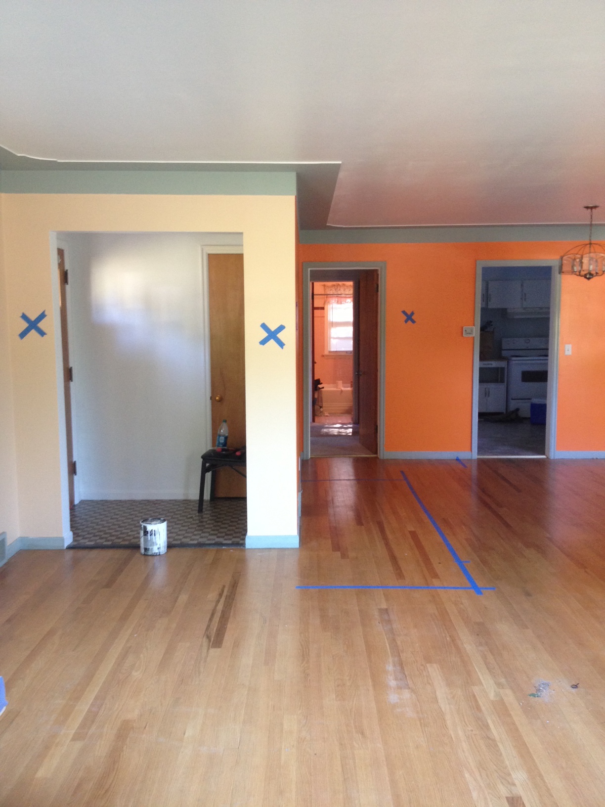
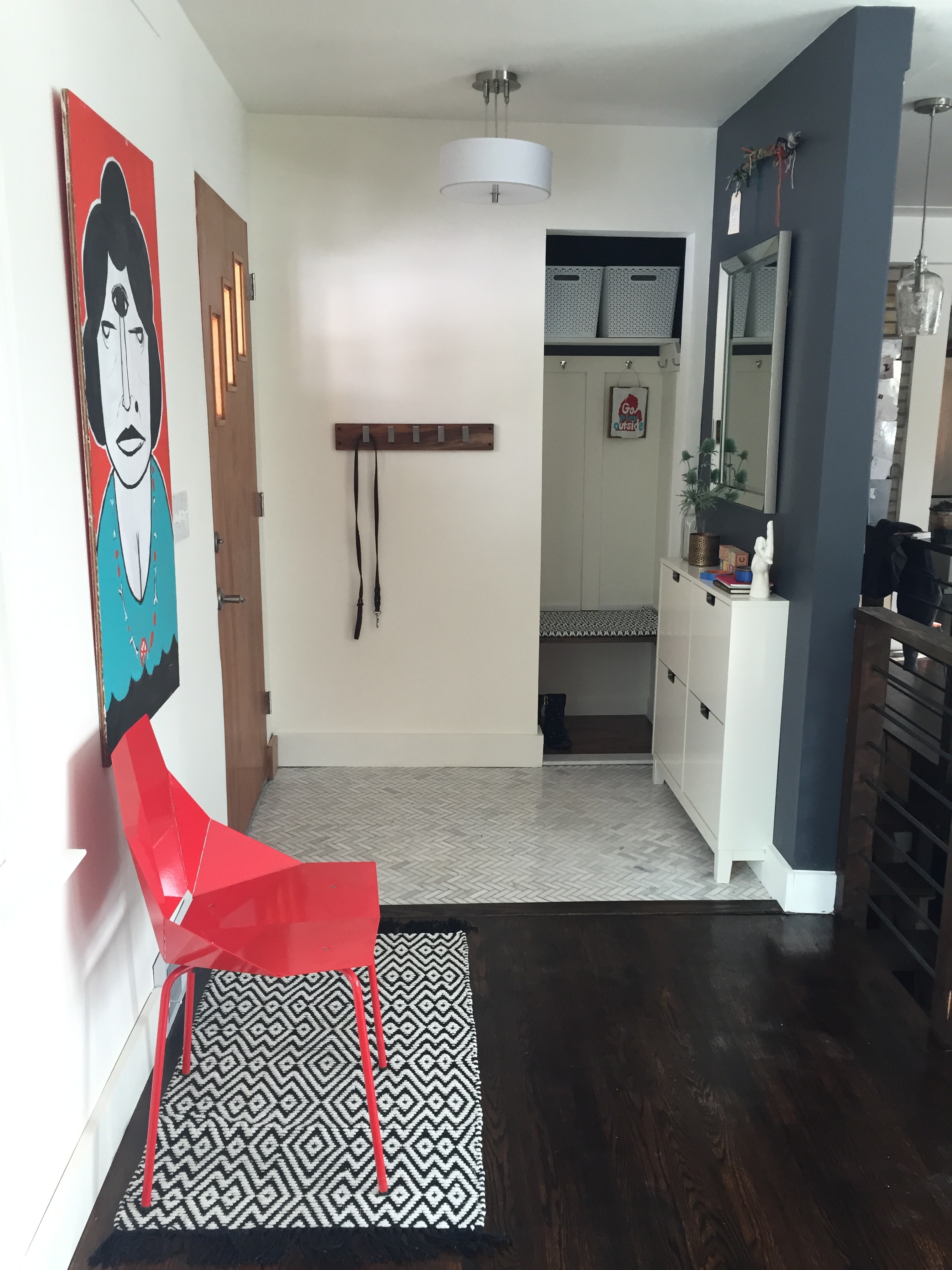
My husband and I always joke that if he leaves for a couple of hours, I will take down another wall in our house. While no major demo was done, I did make some big progress on our entry way while he was away in New York. This space is small, but as "drop zone" – it needed to be completely functional and contain a lot of storage. I decided to turn our closet into a cubby by removing the door. Call me crazy, but I was determined to put a shoe storage cabinet as this is our biggest issue with the closet. Having a door wouldn't allow for that, so away it went.

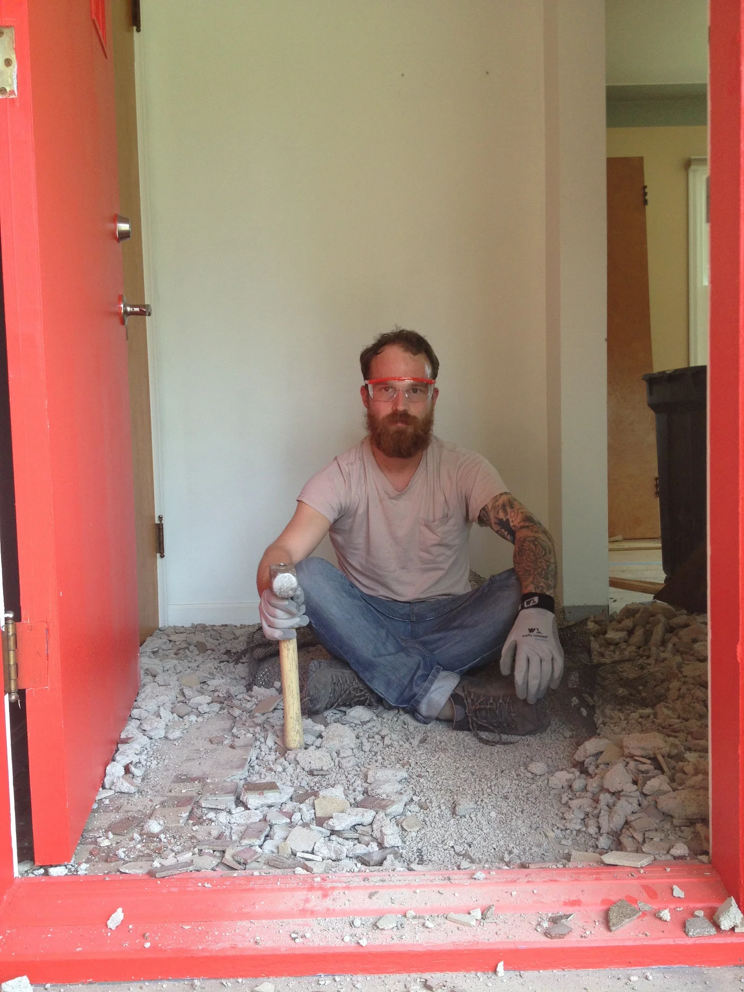
I'm still not sure it was the best idea. It shows all of the clutter you would expect in an entry, but I suppose once winter is over it won't be so bad. We put a LOT of work into this tiny lil' space if you remember....there was some old tile that had to be hammered out, a new subfloor, new trim, drywall to replace where the trim was on the door we took out, plaster work, new lighting, and new tile. We added this great cabinet that holds close to 10 PAIRS of shoes, which I love. SO much work, but is such a great little space to kick our shoes off. 


And....ta da! The after.

Side note, one of my favorite pieces is above our mirror. Everything in our house has a little story, but this one was created by Mary Rothisburger called the "hoping machine". It's a good reminder to leave each day working towards our hopes and dreams and only bringing good things home. I've always loved the meaning of this piece and I'm happy it's found the most important spot on the wall.


Angela Satterlee Comments
Office Interior: Owl Computing Inc.

I'm allliiivvveeee. It's hard to believe it with how crazy life has been, but all is well! In the world of interiors, I've been busy working on some pretty exciting projects and I just had to share what a hoot this one was. I was recently hired to take on a commercial project – which is all in thanks to a good friend who trusted me to deliver. What a gal. Thanks, Chris! 

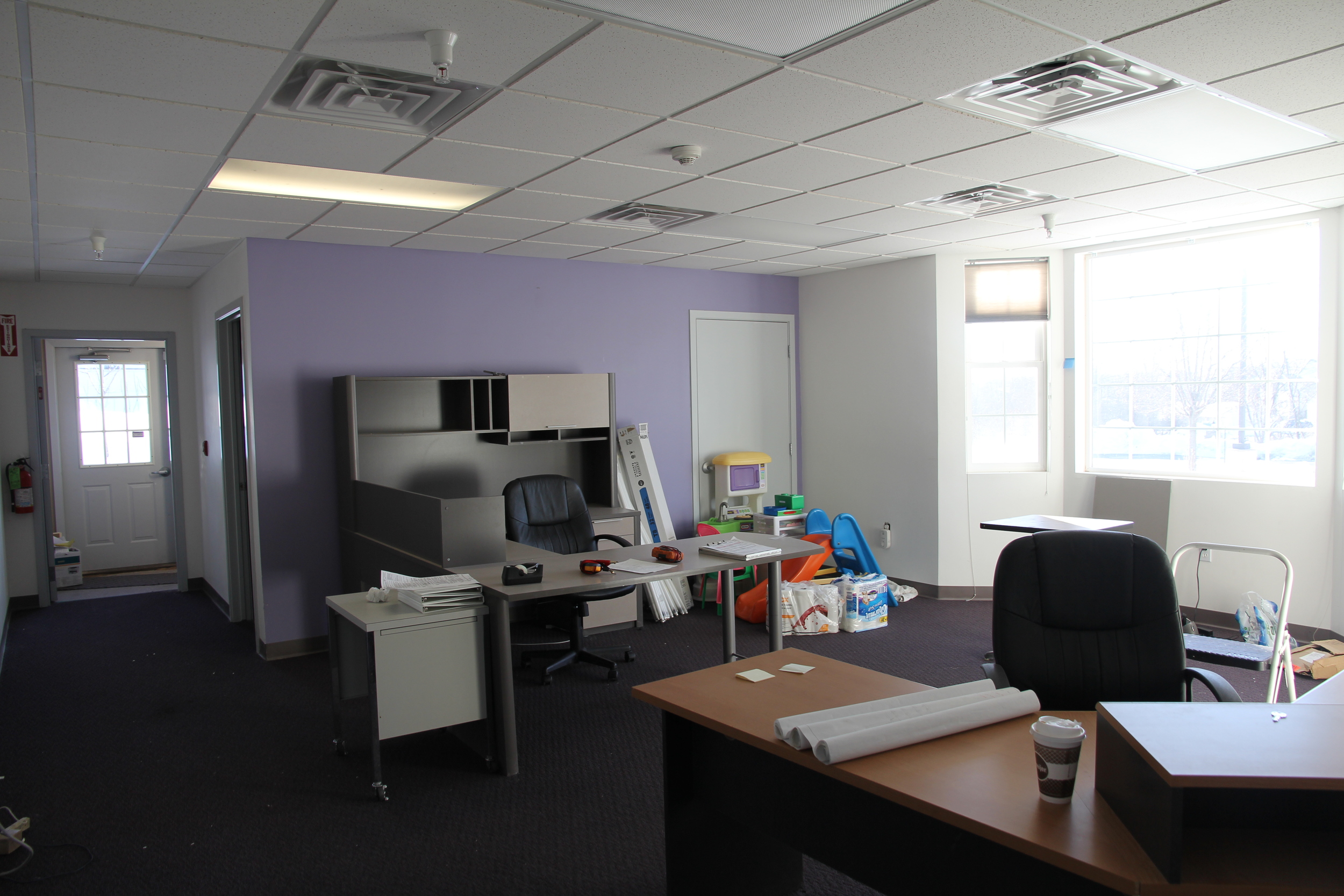
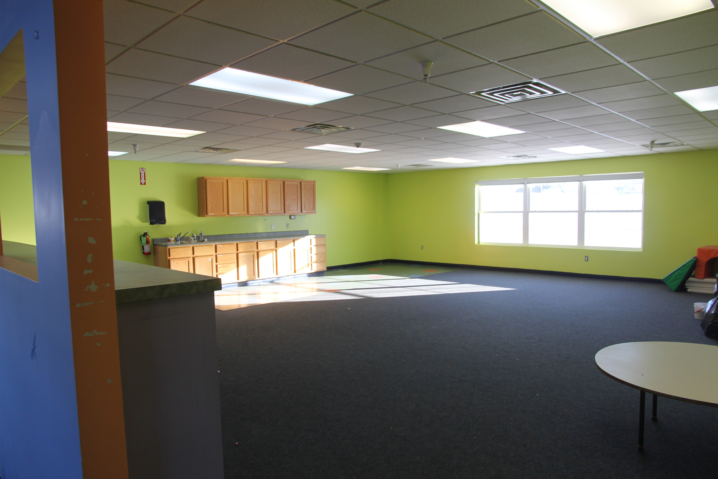
I wasn't sure what to expect as I entered this former daycare, but all I could see was potential. The owner, Ryan of Owl Computing, was such a pleasure to work with and was open to any and all ideas (my kinda client!). As a quickly growing company for web and software development – making this a fun, flexible space for different work styles was key. 

I can't even describe to you how insanely big all NINE+ rooms are. This is going to be such a great place to host events, classes, and day to day operations. 

So, are you ready for the reveal?

This is the "main office" which is the first room you will see to your right upon entering. It currently has some old cubicles that were left by the previous owners, but it was important to Ryan to have an open office. I used their logo for a wall graphic, selected furniture and picked out some FLOR tiles to tie everything together.

As for any growing business, being cost conscious was really important. I selected some lovely (and affordable) Turnstone pieces in areas I knew would take on some daily wear and tear and complimented them with more cost effective pieces for storage, etc.

The next room is a mixed use space that will be used as a common area, alternative work space and where events will be held.

I decided to reface the current kitchenette, remove the cabinets above and replace with open shelving to create height and add a bar area that can be used as a standing workspace or the food and beverage station for events. The furniture selected was designed to be completely flexible for work or event space. The walls in this room are chalkboard along the kitchen wall and a recycled magazine grasscloth (SWOON) on the tv wall.

OWL_Main-Room_Master.png

For the workroom, there was already a lot of great natural light, so it just needed a little TLC to make it a space that was fun to work in!

IMG_7493.JPG

Again, I used selected the Turnstone furniture to tie everything together. I love their Campfire line. It makes selecting a collaborative space so easy! For this room, I kept the left closet as storage and turned the right closet into a print station. 

So, there we have it! The painting is already underway, so I'm excited to see this project progress over the next coming weeks. Congratulations, Ryan on a great space! 
Want to see more? Check out their Pinterest board.

Angela SatterleeComment
1 Year Home-iversary!

Wow. It's hard to believe that one year ago we began on this crazy journey. This blog started as a way for our friends and family to follow along as our home went major renovations and what resulted was an overwhelming amount of support and encouragement to follow my biggest passion. I am so incredibly thankful for a few good friends that let me invade their home and fill it with my crazy ideas (thank you Holly and Molly!). It was this foundation of work and encouragement that Fairly Modern mini-sessions were born! I am so lucky to have met such incredible clients through this process – many of which have become dear friends. Thank you, thank you, thank you everyone!

This summer has been insanely busy in the very best way. While the blog has suffered a bit, I can assure you the personal home projects and client work are still rolling! After almost a year of using a basement bathroom that looks like it was plucked from an episode of Orange is the New Black, I'm SO thrilled to have our bathroom project 98% FINISHED! While we still have finishing details to wrap up (trim, doors, and a bit of painting)...I can't leave you hanging without some pics.

A huge thank you to my dad for...everything (seriously, everything.) and the awesome Danny Geurink who did all of our tile work. If you're ever in the need for an awesome contractor - he's your guy.

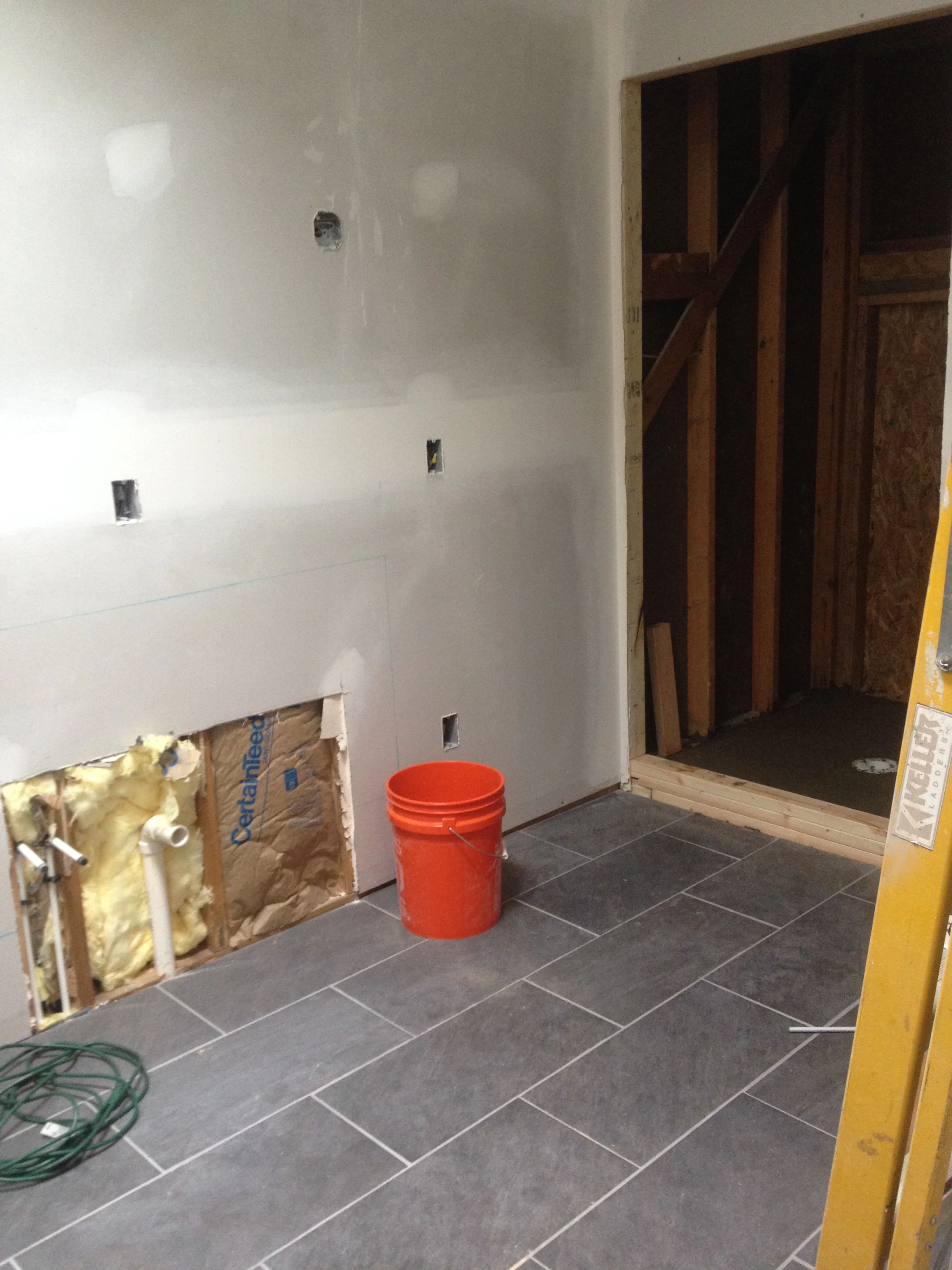
Let's start with the original bathroom. We ended up tearing this entire room out, taking over the original stairs and part of the kitchen to get the space we have today. The left half of this bathroom is now part of our closet. 

You can also see the original plans we had for our bathroom at the beginning...I'm shocked that we stuck pretty close to them!

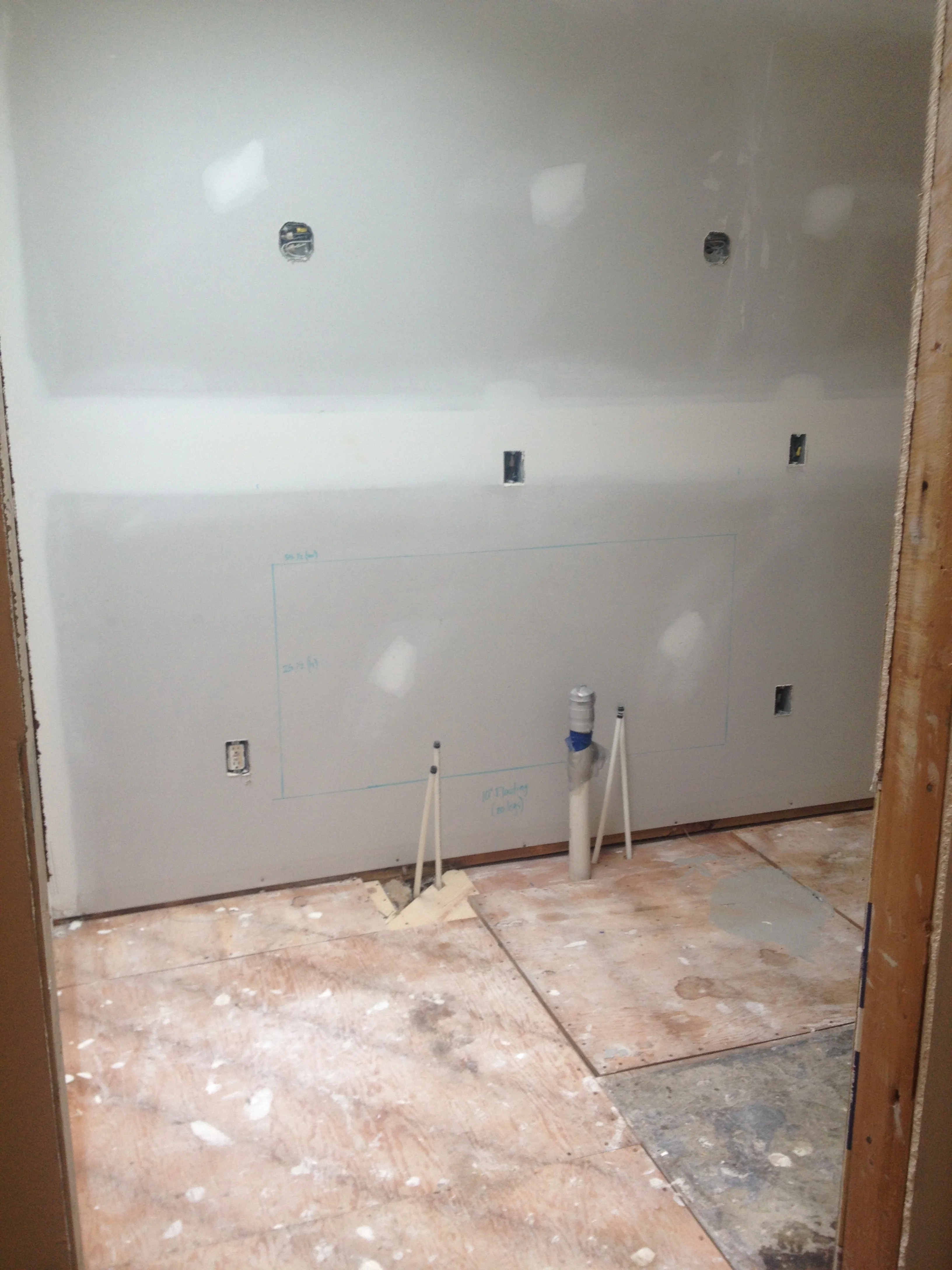
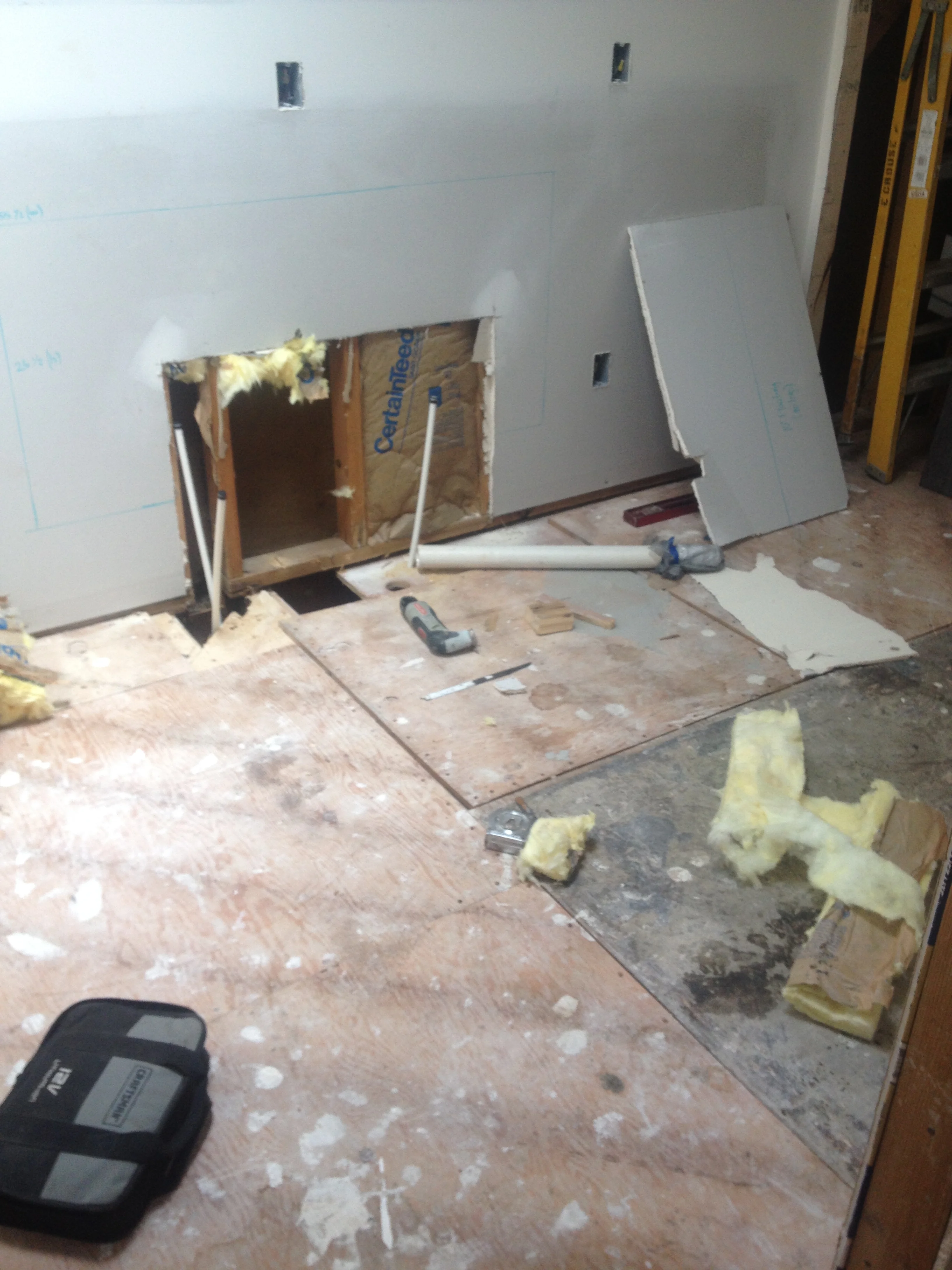
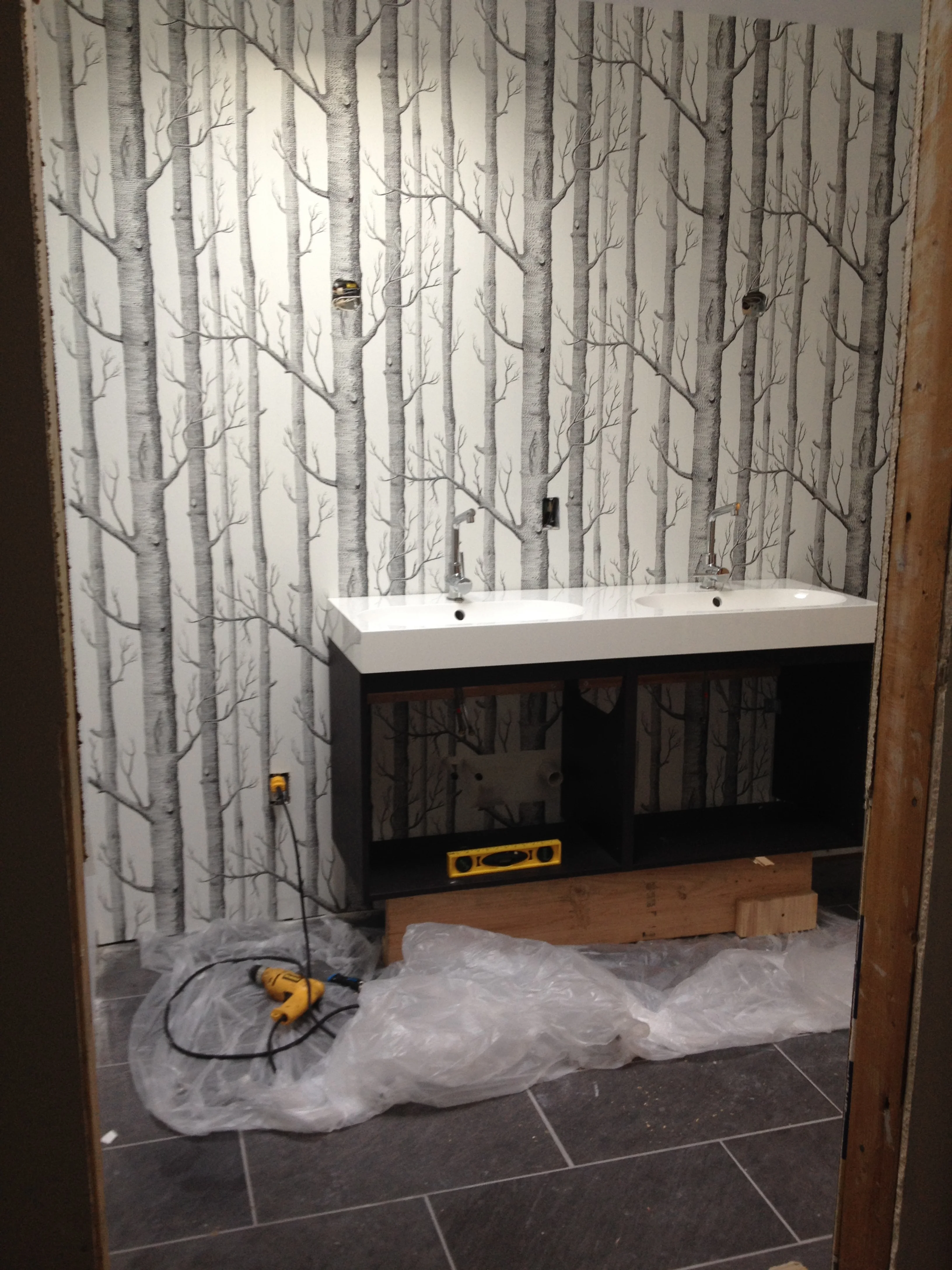
After the drywall was complete and just before the tile was done...we realized that the plumbing for the vanity was done incorrectly. We did a floating vanity, so the plumbing needed to be moved into the wall....which meant an added drywall repair project. Boo.

Floor tile installed!

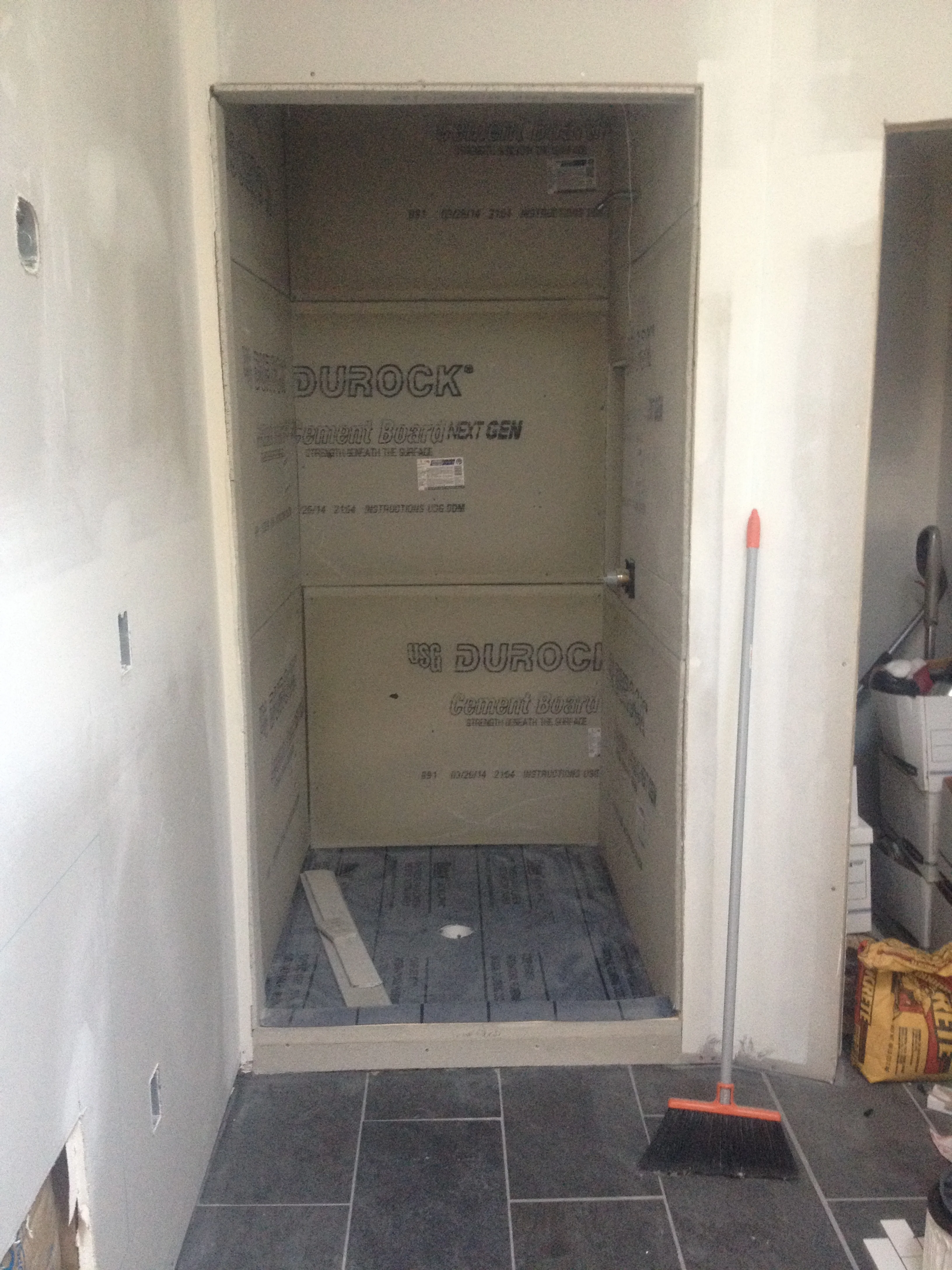
Shower Prep. Shout out to my bro-in-law, Curtis Brown for helping Brandon with this while I was gone.

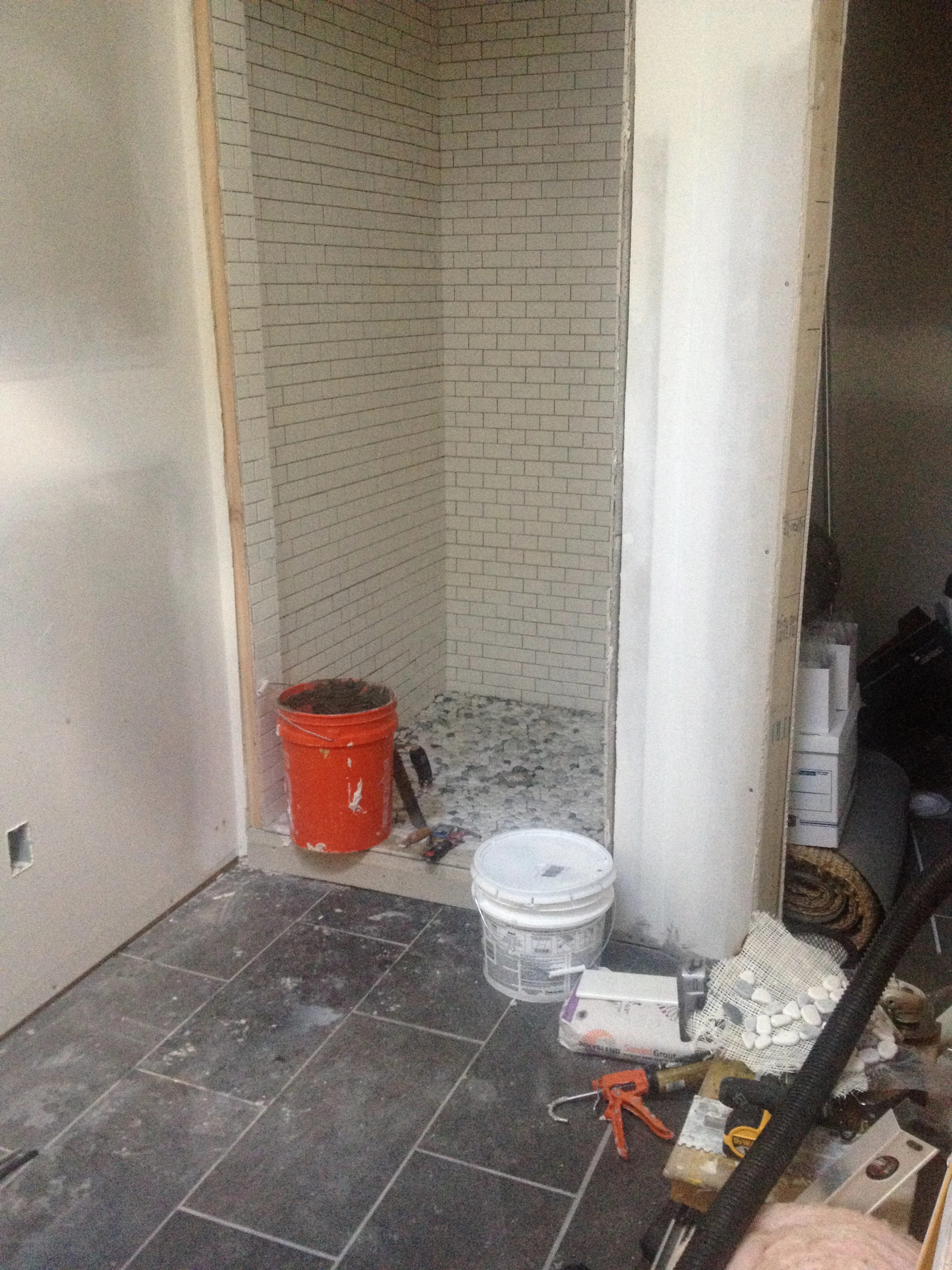
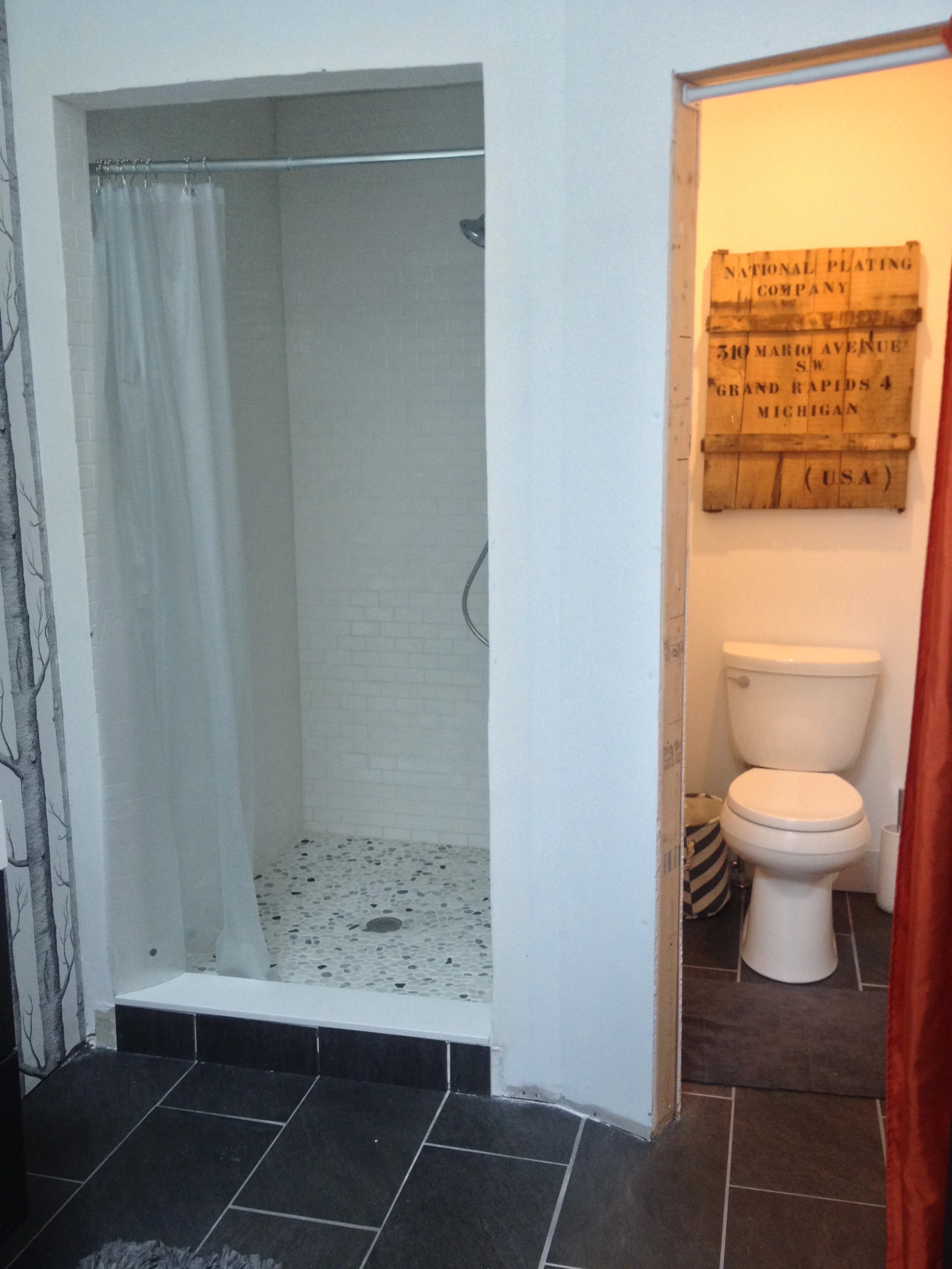
Shower Tile: Credit goes to Danny Geurink on this one!

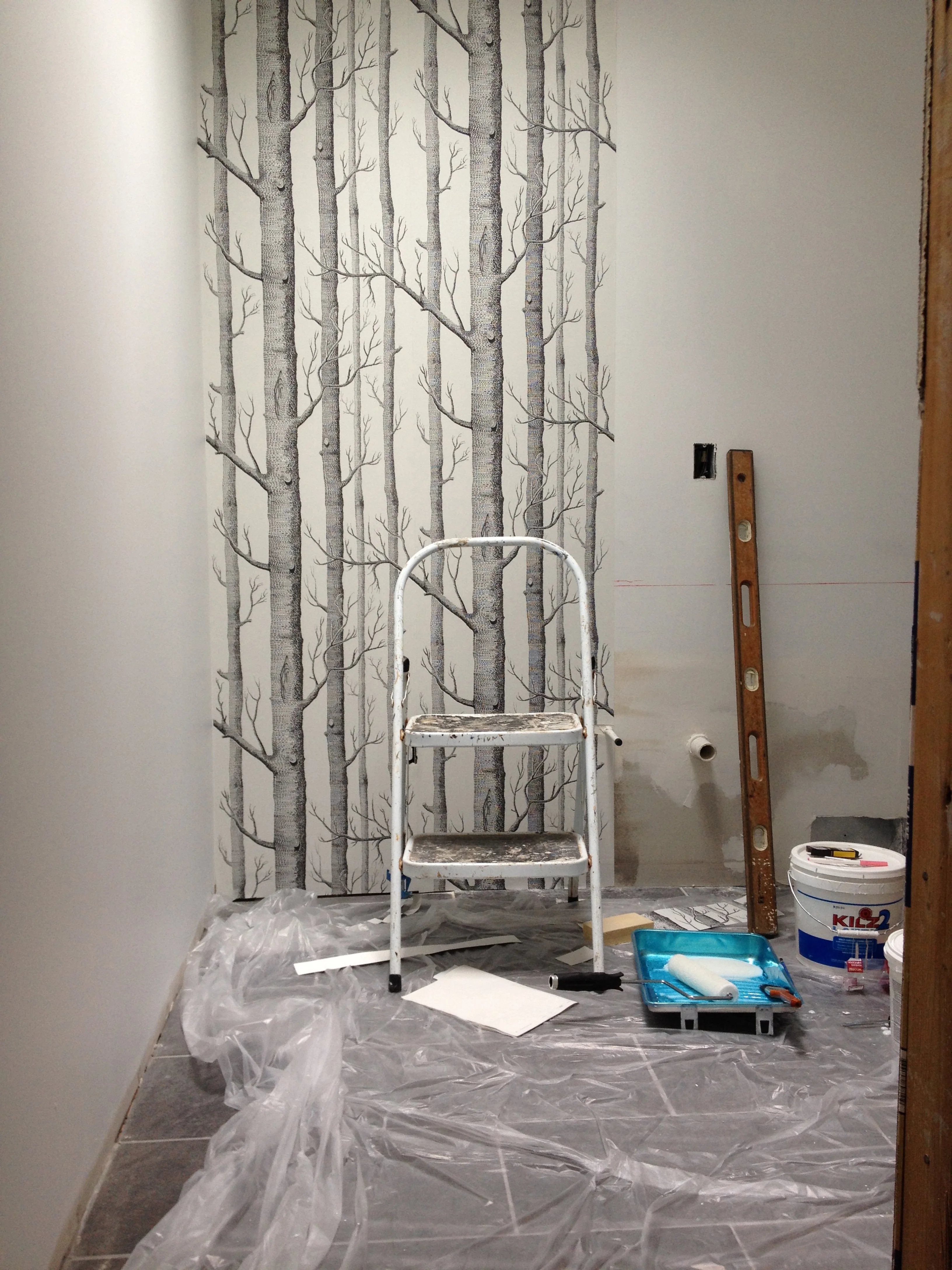
Paint + Wallpaper Install, by muah.

Vanity Install: We purchased our vanity from IKEA. It was insanely easy to put together and install. With a help of a wooden stand I built to hold it level...it was up in no time.

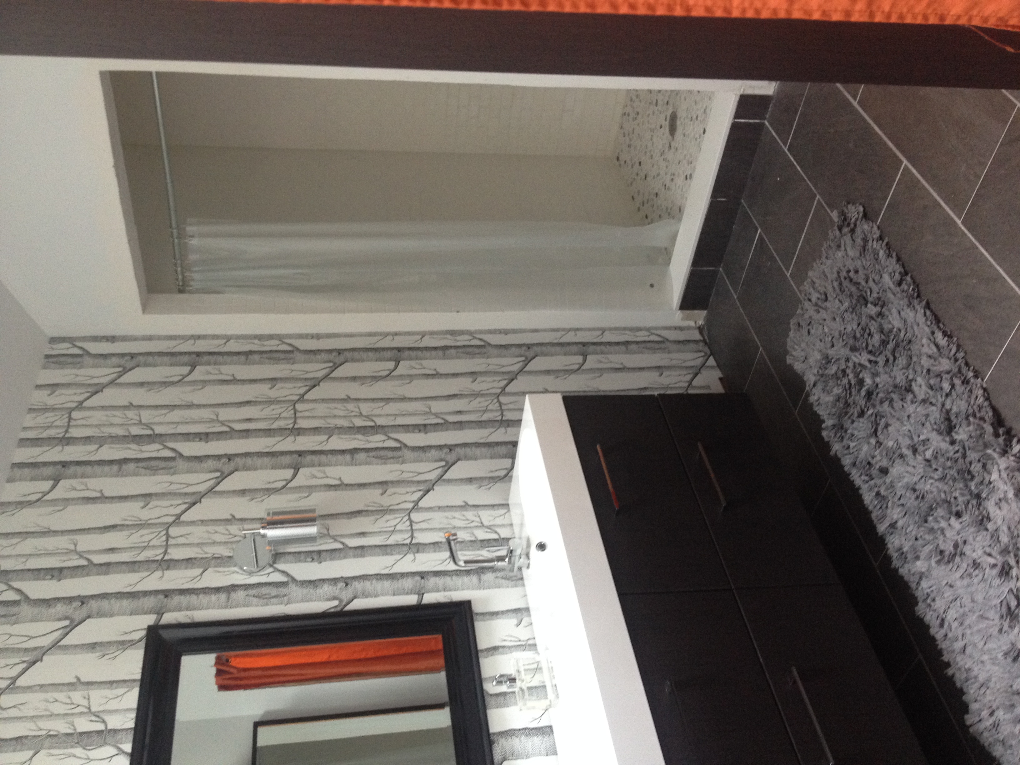
"Finished"! Curtains shown will be replaced with custom doors, shower will be glass (when budget allows), Trim and a little painting needs to be done as well along with towel bars.

We're not in love with the mirror, but it does the job until we can find another one. I'd love something with a pop of color.

Toilet closet with a preview of the trim:

IMG_4603.JPG

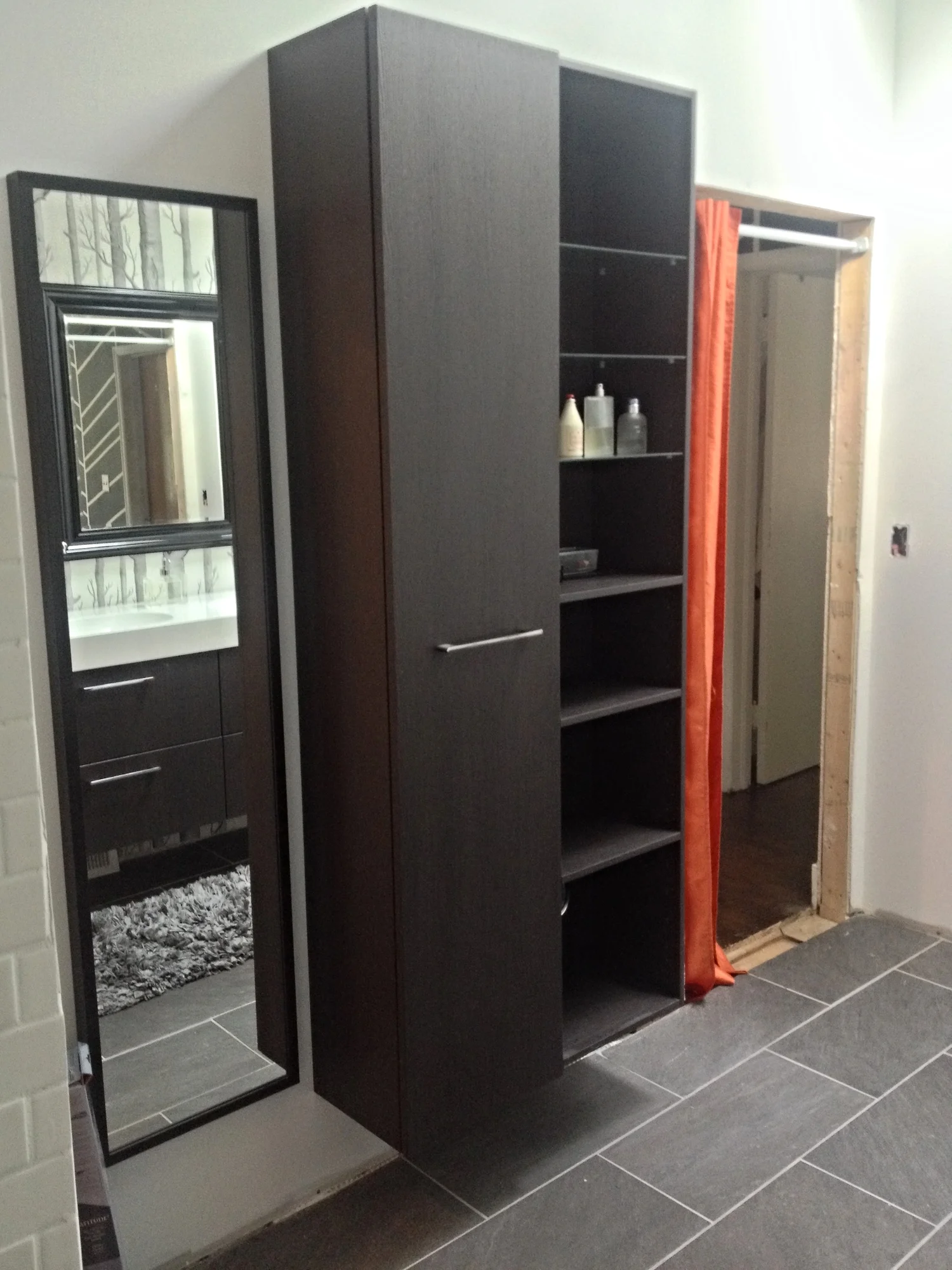
Wall Storage and full-length mirror...the right door was cracked, so that is being replaced...(sigh). 

Hardware and lighting details...LOVE how the sconces turned out. We have a matching chandelier going up next week which I can't wait for. 

Ta daaaaa! So there you have it. Several months worth on this one, but it's hands down our favorite room so far! 

Angela SatterleeComment
Staycation Progress

We had big plans to take a trip to Portland for our anniversary this year, but we decided since we are still without a real bathroom, we should be all adult and take care of that and some other things first. So, I took a week off of work to tackle the lingering projects that we simply haven't had time to get to and/or wanted because we've been enjoying our summer!

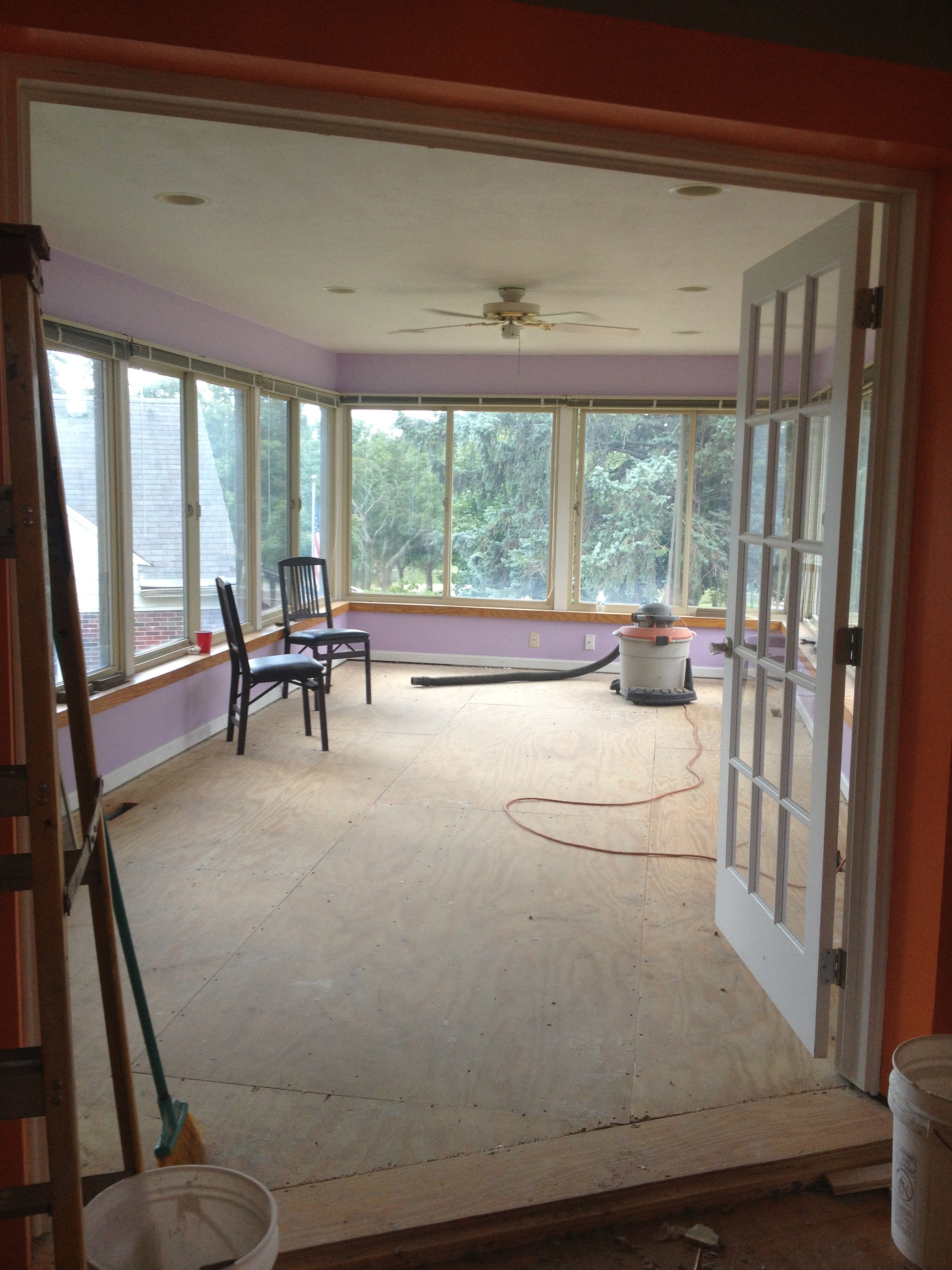
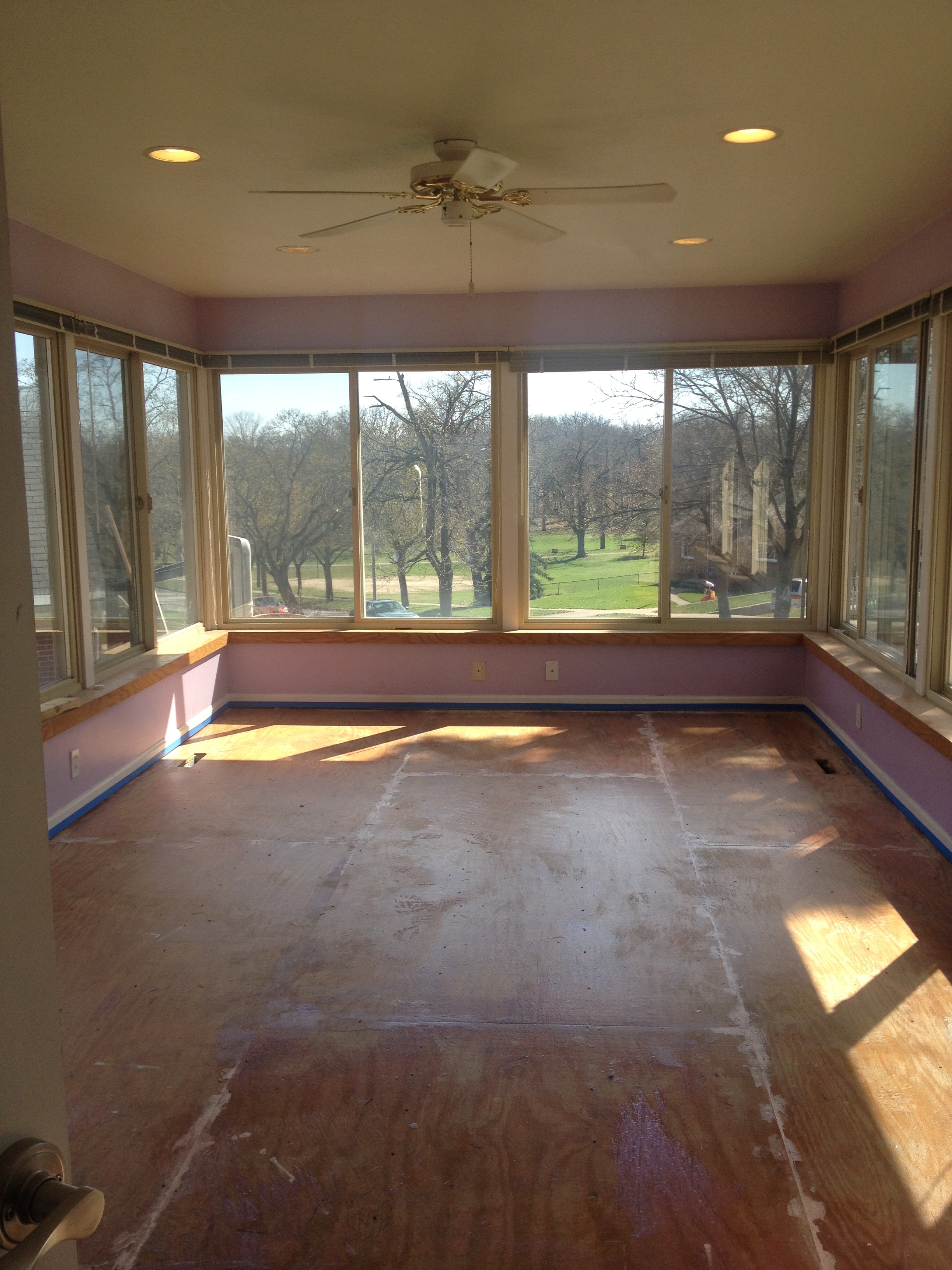
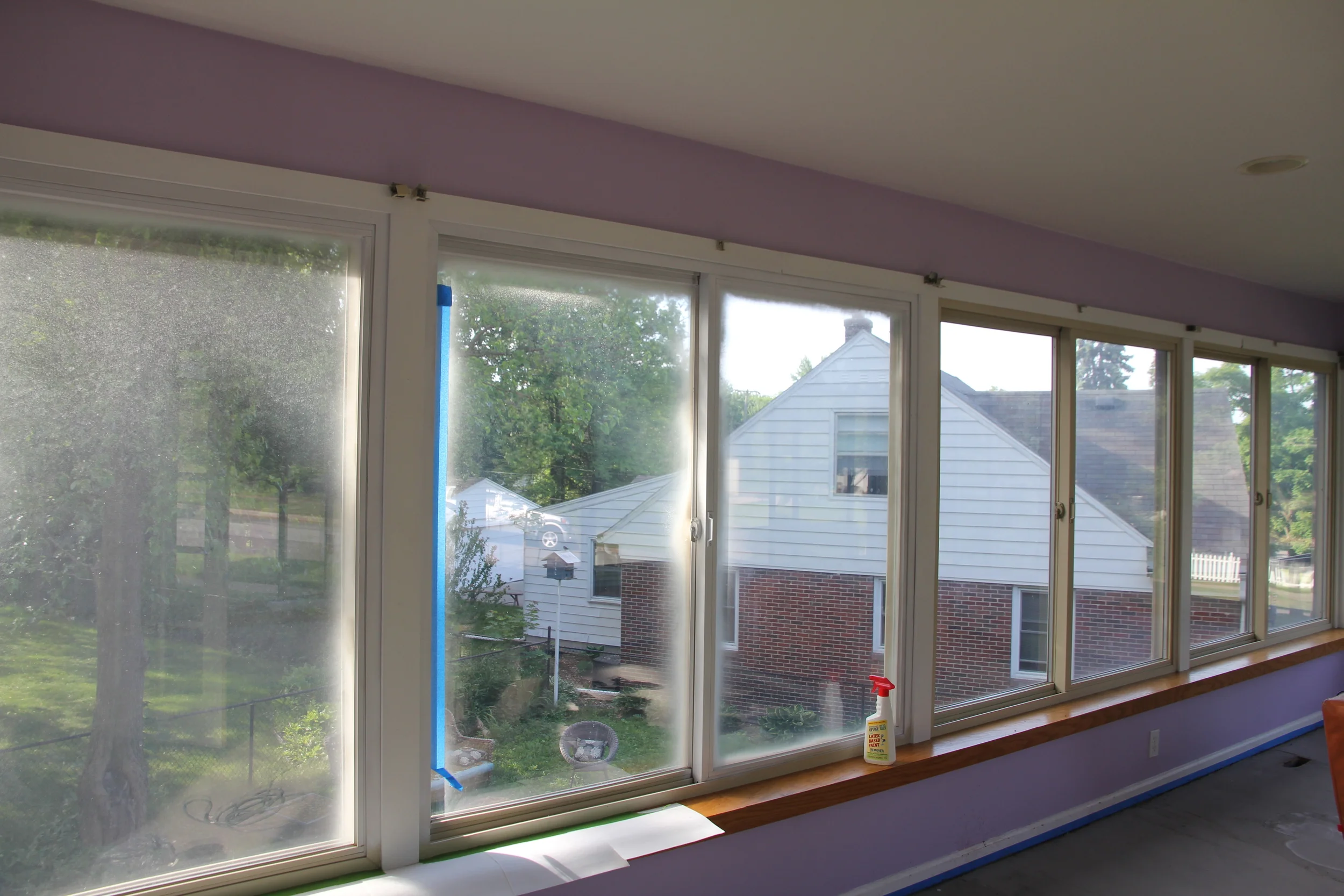
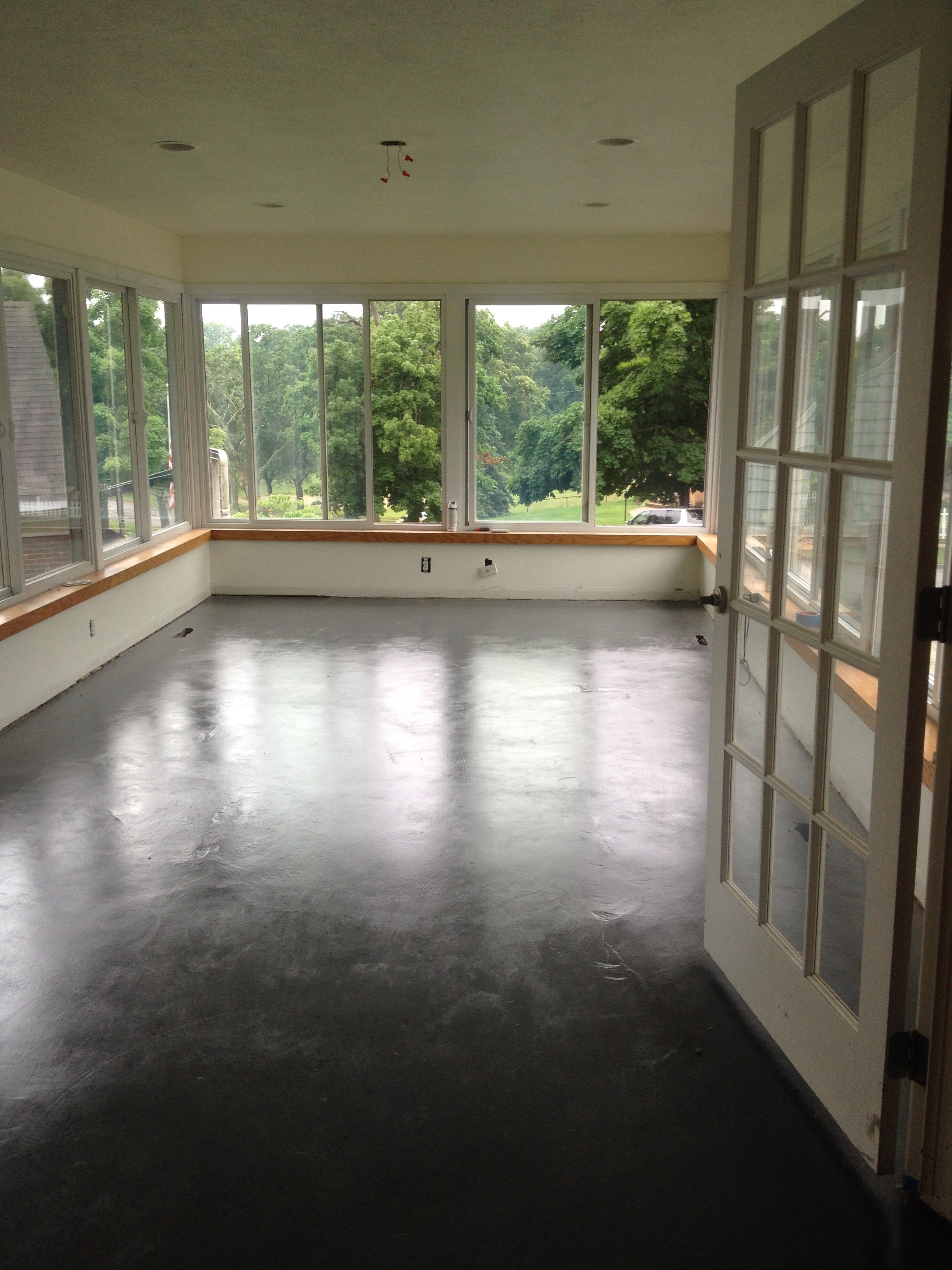
My main goal was to get through the "sunroom" (aka dining room).  It's easily the most tedious project in the house because I decided to paint all of the vinyl windows from a dirty beige to a white....which took like, FOREVER. I slowly picked away at it on weeknights and pray that I would eventually reach the end. We also experimented with a flooring that ended up being hell on earth, but more on that in a minute. 

Here is when we bought the house:

And progress...carpet was the first to go.

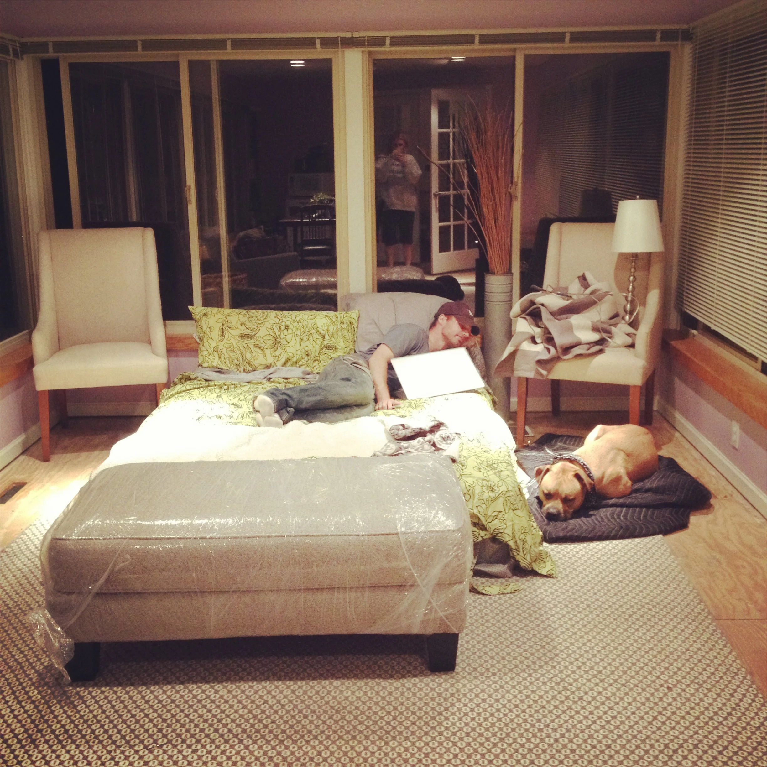
...and here is when we lived in this 300 square foot space for a month+ :

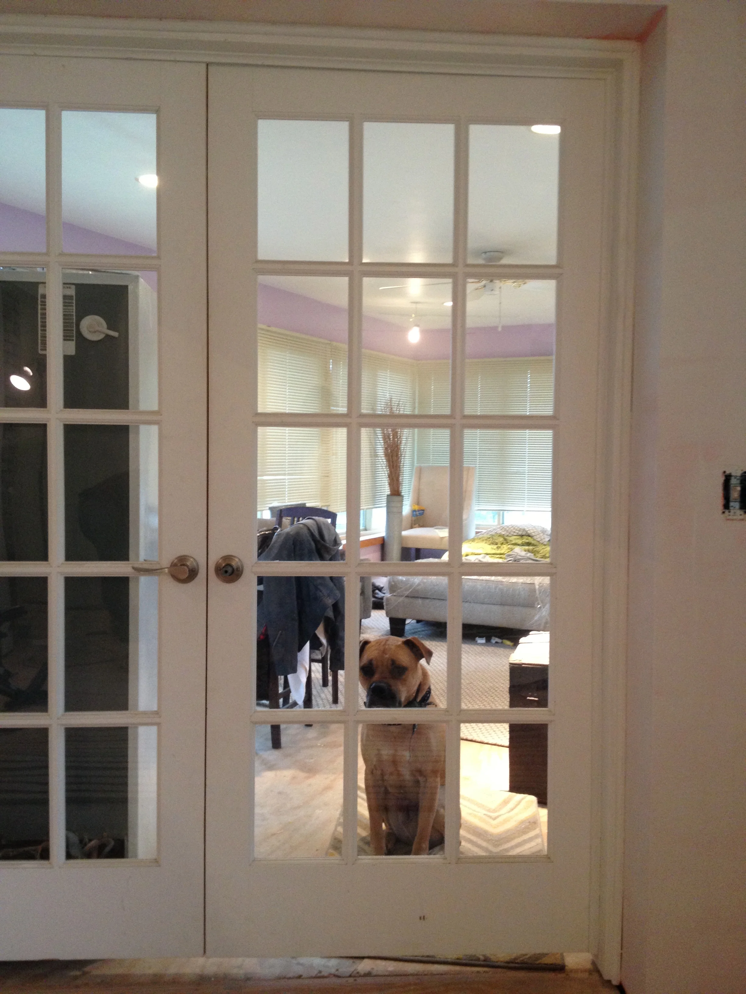
...and when we would cage Frank while the floors were being done:

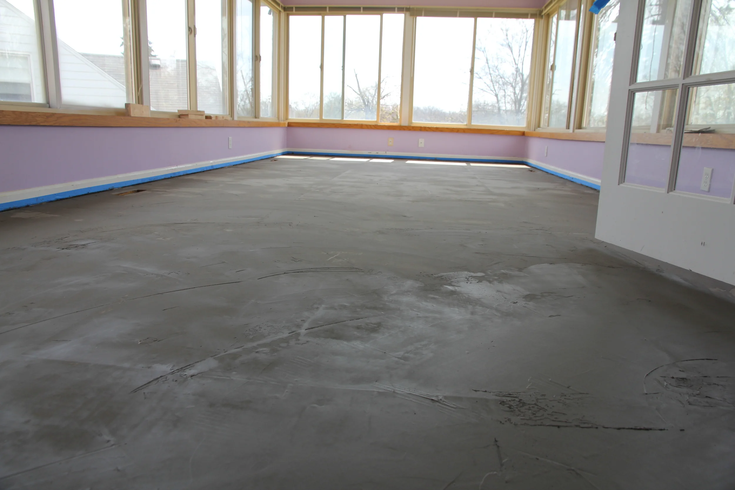
Remember my reference to the disastrous flooring? Here is the short version. We looked into all sorts of flooring options and really weren't thrilled with any of them. Some of the troubles we were having was that this opens to our kitchen/nook area and the floors are wood. I knew I didn't want tile for various reasons, cork or laminate was out, hardwood floors was going to be over our budget, but we did LOVE the look of concrete. After some research, I stumbled upon people using the Ardex Feather Finish which quite frankly had a lot of mixed reviews. Some loved it and others really, really hated it. I can see where people who did this on countertops would melt into a puddle of tears because it IS NOT a good material if it gets wet. Our dog peed on this before we put the seal on it and it turned into crackly bubbles. He survived, though.

The positive: You can lay it over a subfloor, it's somewhat flexible, it's supposedly durable, it does look like concrete, and it's cheap. We did about 300 squarefeet for about $250 with the primer and sealer.

Before I get to the negatives....I should preface this by saying that this product is not intended to be for a finished floor, so my frustrations stem from having to make it become something that it's not.

First, it would help if you had some experience with laying concrete [Insert dad here]. The bag says it covers 300 square feet. It does not. I think we did 11 bags mostly because it dries SO quickly in the bucket that you can't use it all. It's super thin, so it's suppose to be flexible with the subfloor...but time will tell, I suppose. While it does look like concrete when it dries....the color is really light (like a powdery gray). 

IMG_6431.JPG

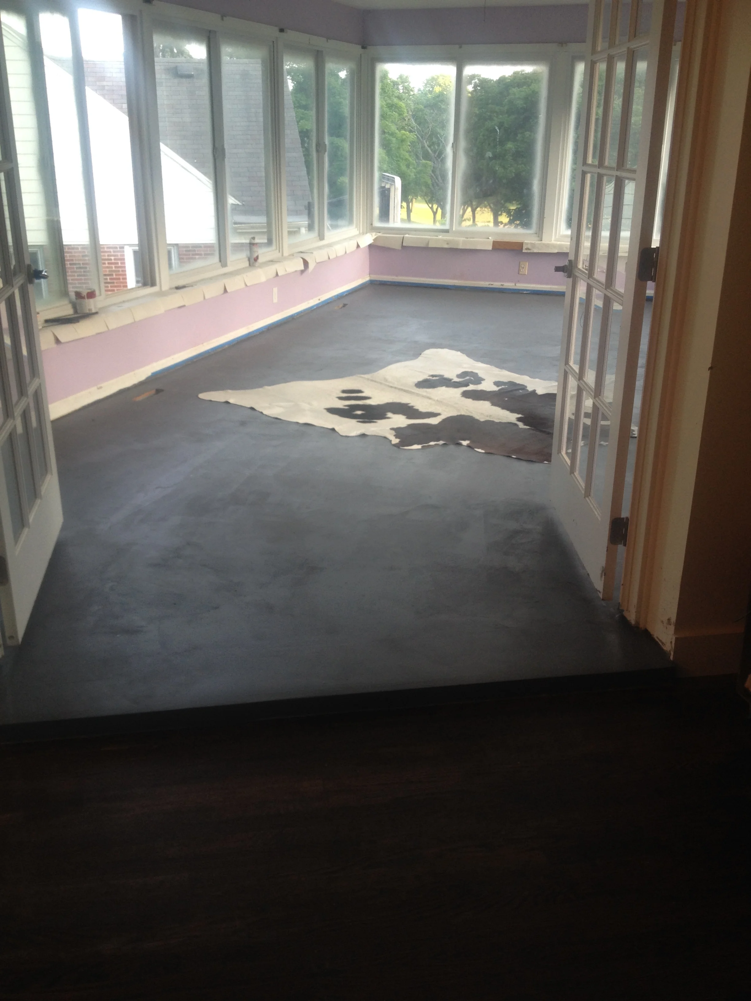
Fast forward to having the last coat of the concrete on and then a minor sanding disaster which caused me to create my own mix and brush the entire floor on by hand. Looked great until I decided that I hated the color. Solution? Concrete stain. Which kinda worked until it dried and looked like we should have skipped all the work we just did and just paint the darn floors. 

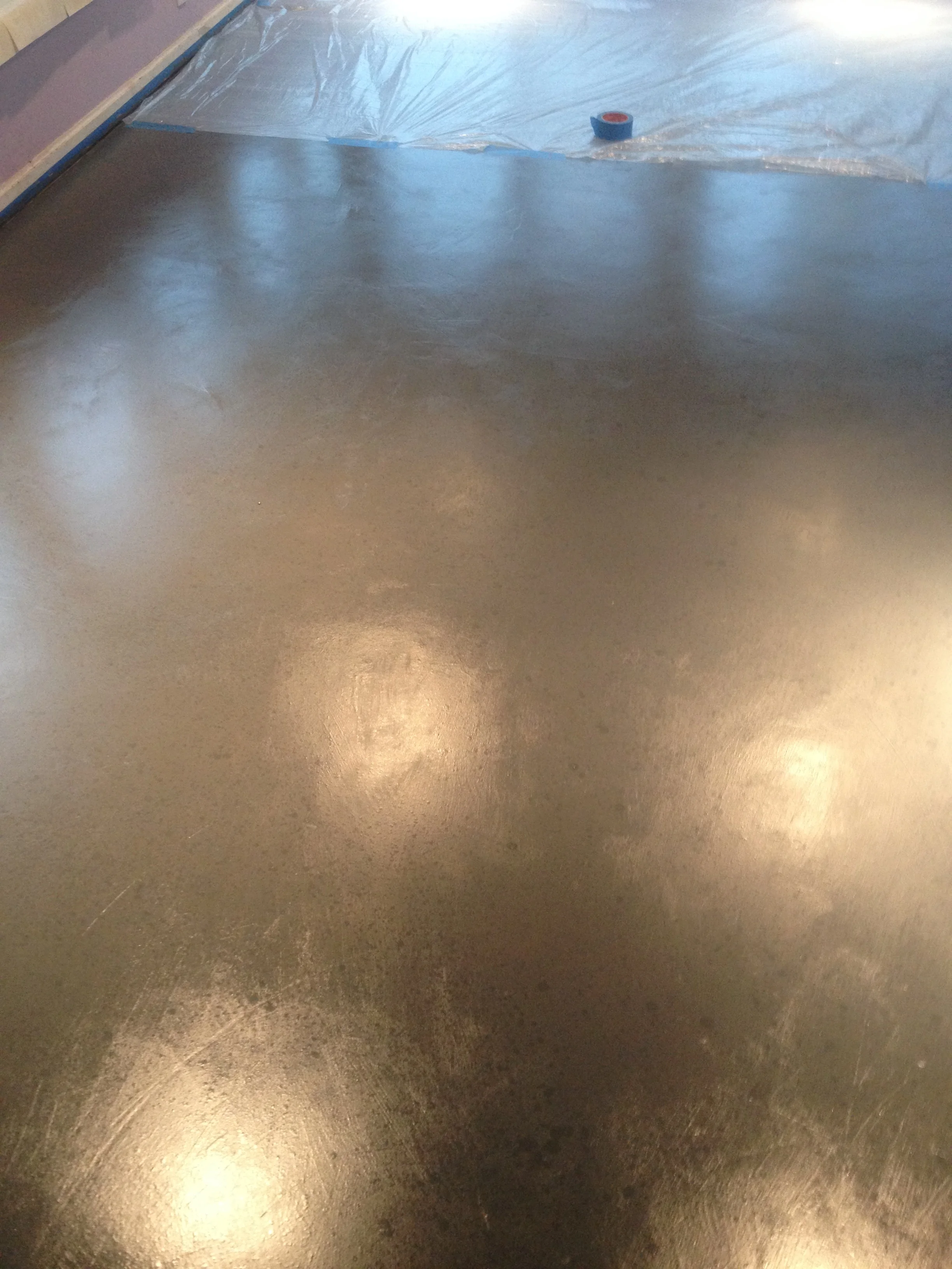
I slept on it. Still hated it. Then decided to sand the entire thing back down. By hand. This time I put the stain on by hand (with a rag) rather than with a roller. This allowed me to make some natural looking concrete streaks. I then mixed a charcoal paint in the stain so that it was a little darker and put it into a spray bottle and lightly sprayed the floors to get a speckled look. It seemed to work!

We then used a concrete sealer to finish it off!

And since my husband is awesome, he surprised me with a weekend in Chicago for our anniversary halfway through staycation! It was a much needed getaway and we had a blast. 

Then, it was back to the gridstone on these darn windows! I finished painting them and my sister was her awesomely helpful self and came over on a rainy day to help me scrape the excess paint off the glass. I really love how bright everything feels now, so it was worth it. You can see what color they use to be in this picture:

And the very latest! We still need to finish up some details, decide on a light or fan, add the trim and pick out our dining room furniture! So, a ways to go, but I'm happy to not have to look at the purple/dust mess anymore. It's the little things.

Guest Bedroom Updates

Until now, this room has been many things including a temporary kitchen during renovations, a dump zone of project materials, and more recently a spare bedroom which consisted of a mix of pieces from our old house that didn't really work in the space. 

I loved having a nice guest room at our last house because it was actually used a lot and we loved hosting after a late night with the siblings who wanted to crash, friends from out of town, or spending a nice weekend with our parents. 

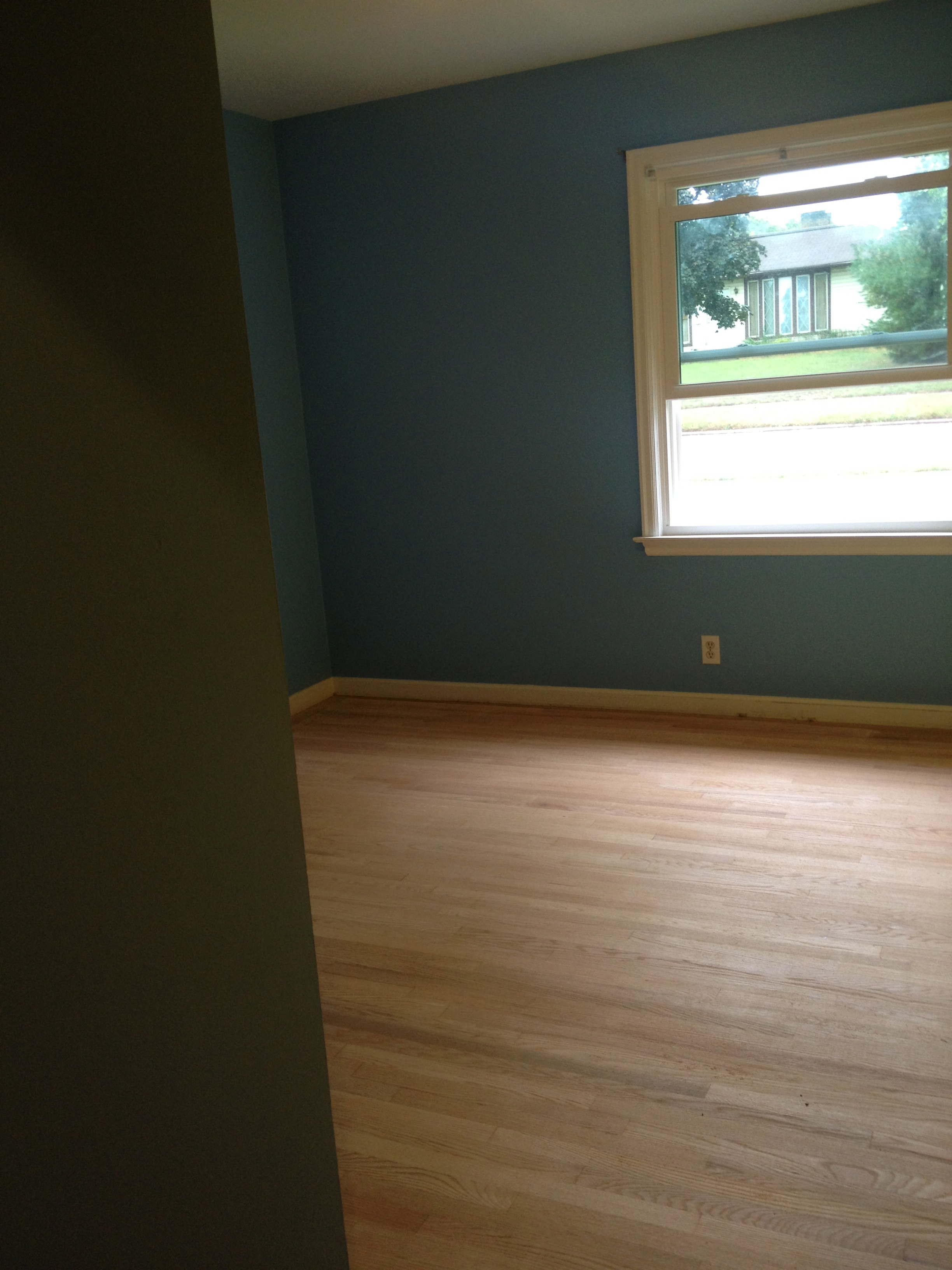
You may recall some before shots of what it looked like when we bought it and in progress:

Screen Shot 2013-06-02 at 11.29.18 PM.png

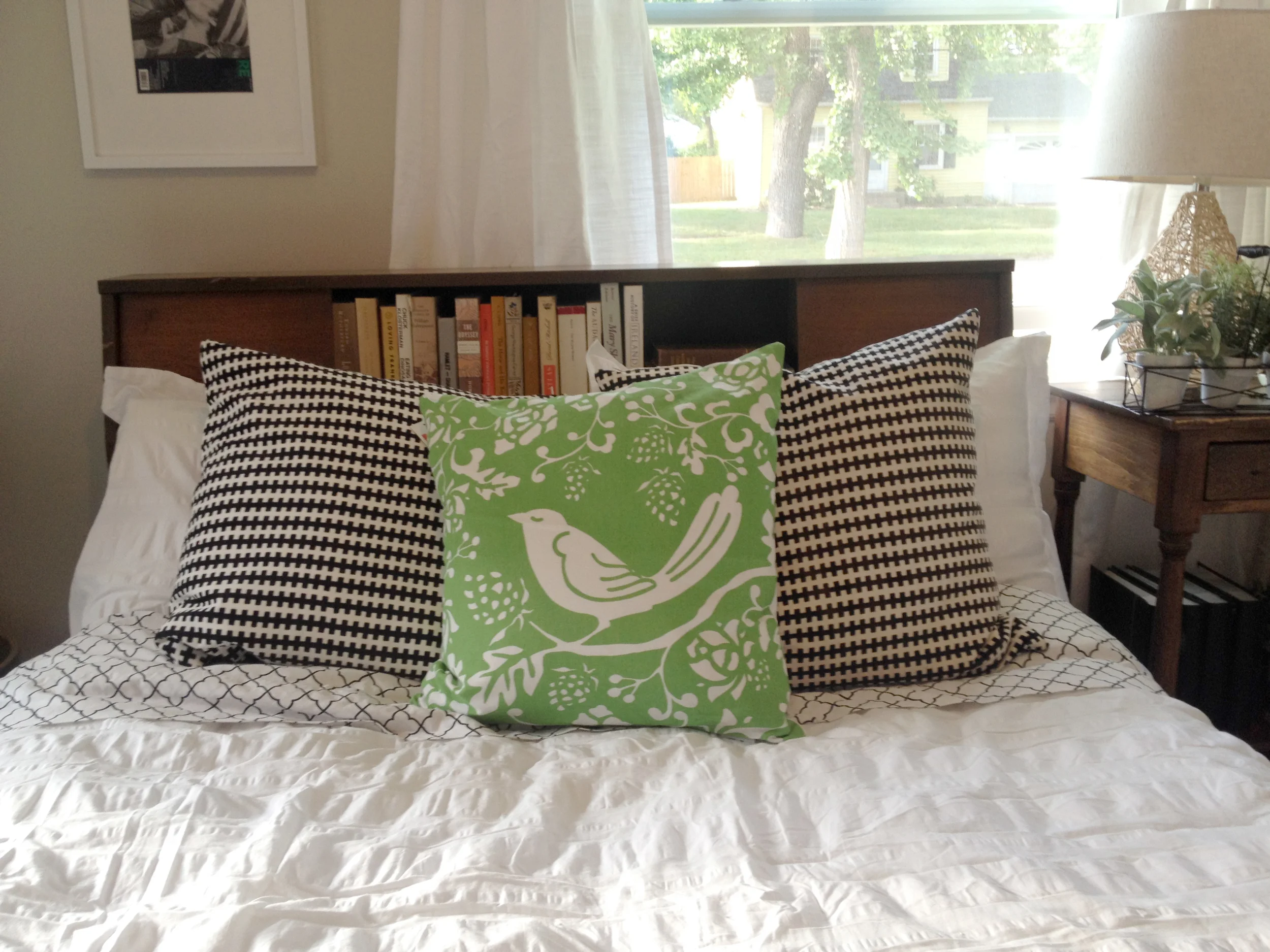
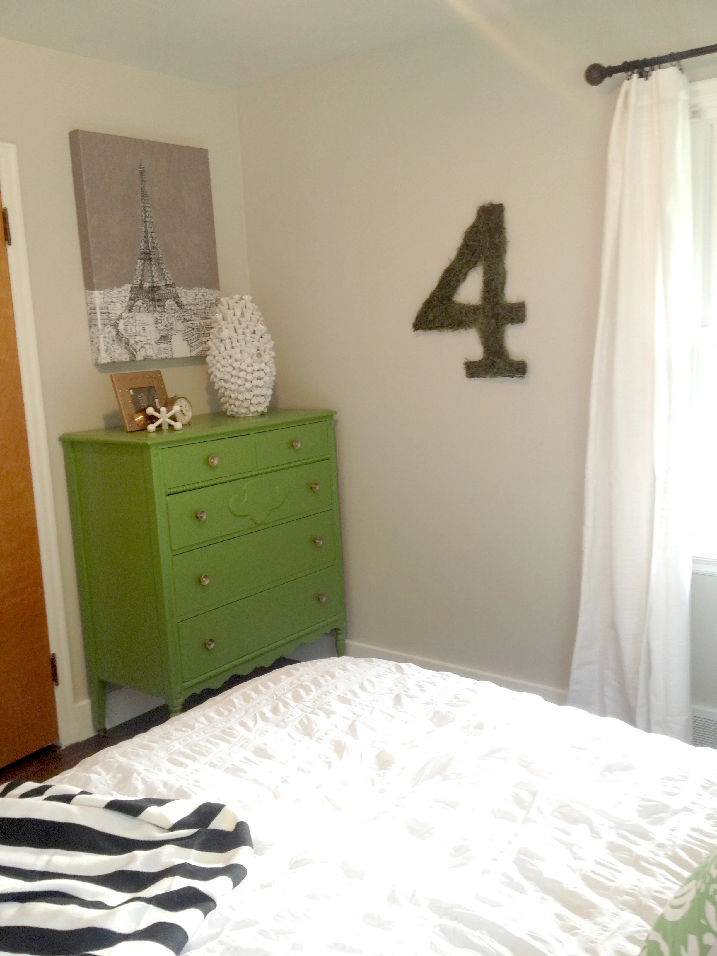
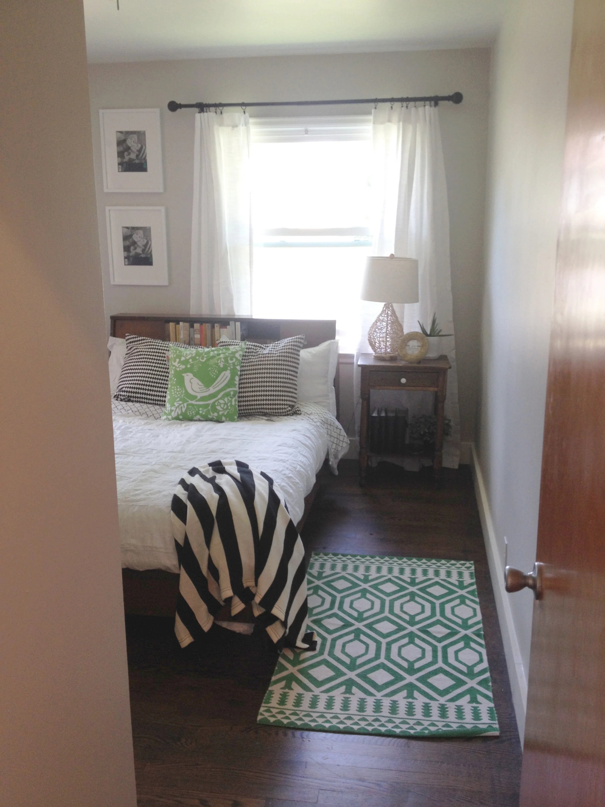
Keeping our guests in mind, I really wanted this room to have a story. I decided to use a lot of frames for the wall art  to fill with photos of family and friends since we don't have a lot of wall space in the rest of our house. I also picked out some of our favorite books to stock the MCM bed frame that I bought at a flea market. We also share a love for Paris with our mom, so I found a cool painting and also incorporated a clock that we bought in France. All of these pieces really started to inspire a "theme" and I began slowly collecting items I wanted to be included.

Colors. I REALLY struggled with this one. In an attempt to quickly bury the blue and yellow walls, I painted it a light grey as soon as the floors were done. With a mix of our old furniture, it felt like an adult kids room and I just was never sold on it. I also loved all of the pieces and didn't want to get rid of them, so in order to make it feel more modern like the rest of our house...color was key. 

I would say the color selection process has been in the works for a couple of months now. I would always look at textiles whenever I went to Home Goods, etc. and never found anything that excited me. I'm REALLY tired of a lot of the patterns and stuff lately...anyone else?

So, not to say that this bird pillow is anything revolutionary, but it totally inspired my room. I just LOVE the kelly green color and used this pillow to pull together a new look that I'm so thrilled with! 

I wanted to avoid using so much green that it turned into a giant booger, so I stuck with white as the primary with black and white secondary textiles (because I already had them - win!). I also used brass and gold as my accessories and green as the accent color.

IMG_4104.jpg

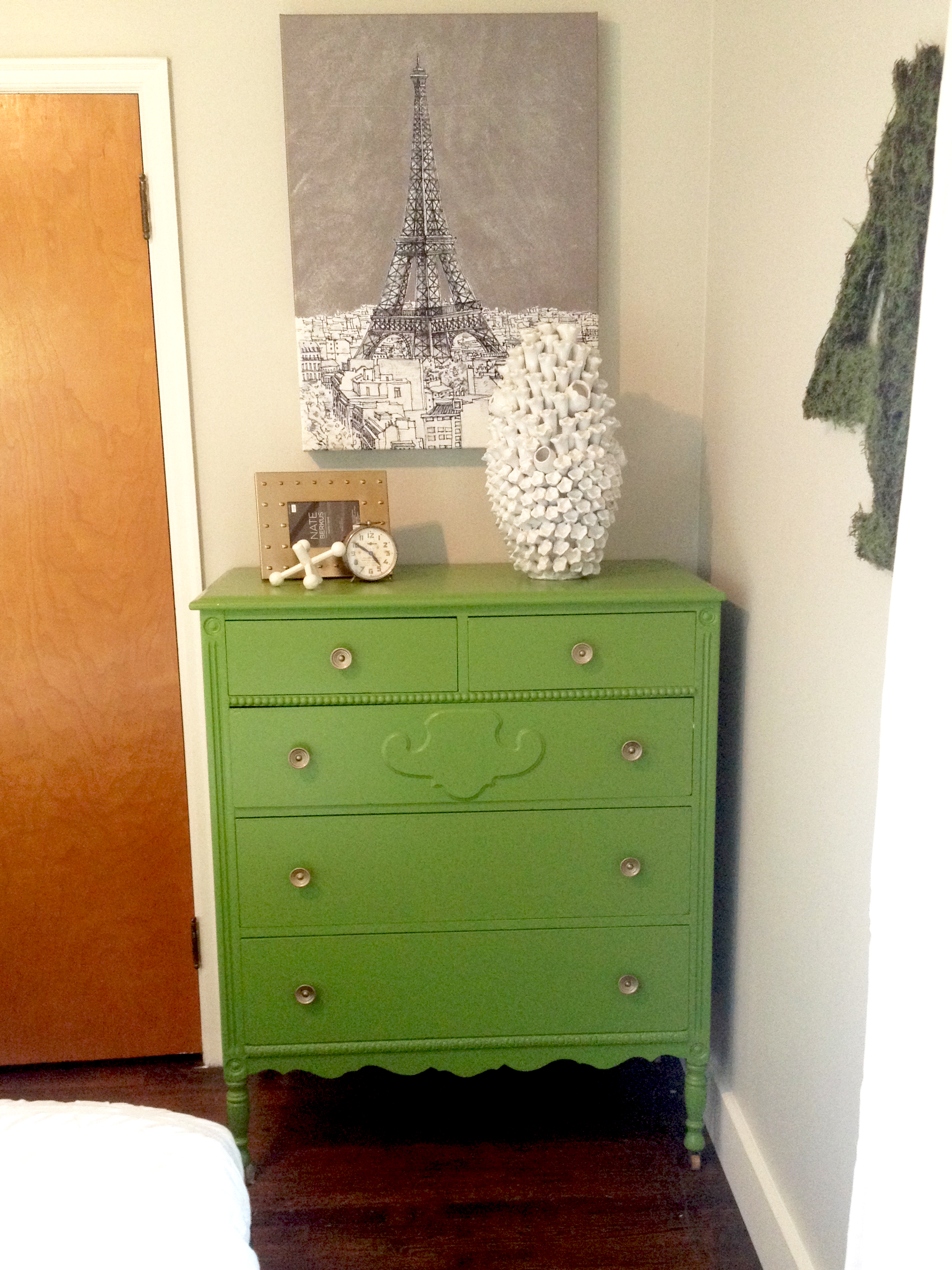
And now for my favorite piece...the dresser. I bought this dresser at a yard sale while we were in the Union house. I painted it this awesome red color and really, really didn't want to paint it...but it was holding me back from pushing the design in this room. The red worked great where and how it was used in our last house, but we needed to say goodbye red....and hello green!

IMG_0516.jpg

Ah, I just love it. 

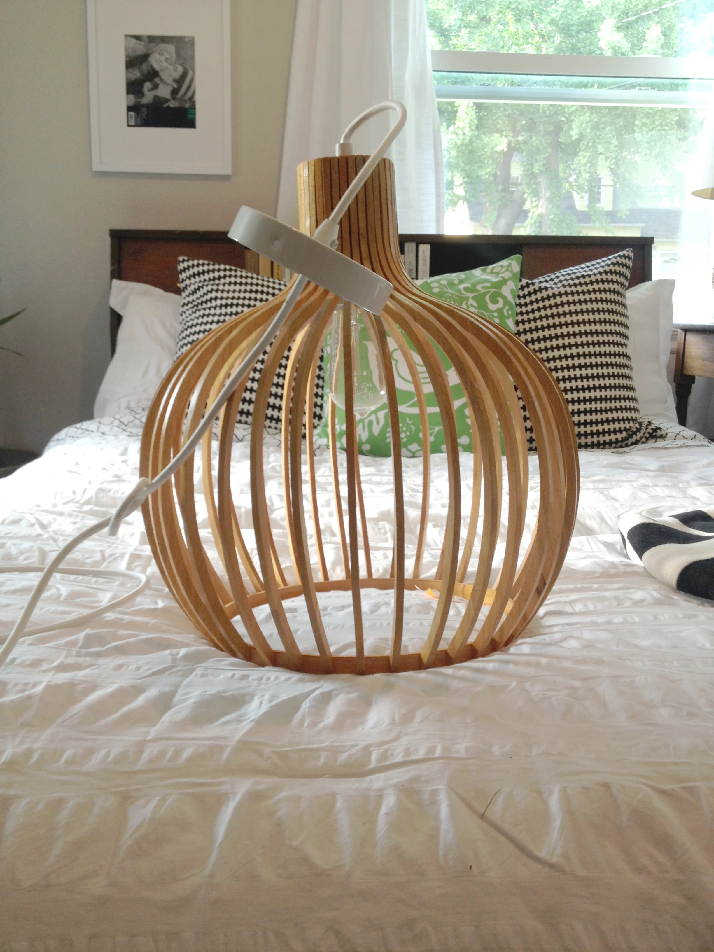
Another great find was this light I bought around Christmas on super clearance at JCP. I had no idea where I was going to use it, but I had to have it. I think this will be the perfect addition to this room and really help tie in the modern aesthetic found in the rest of the house. Now, just need to get the hubby to hang it (hint, hint B. Satt). 

And here is the overall look. Now, I just need a finished bathroom and guests! 


Bold + Gold

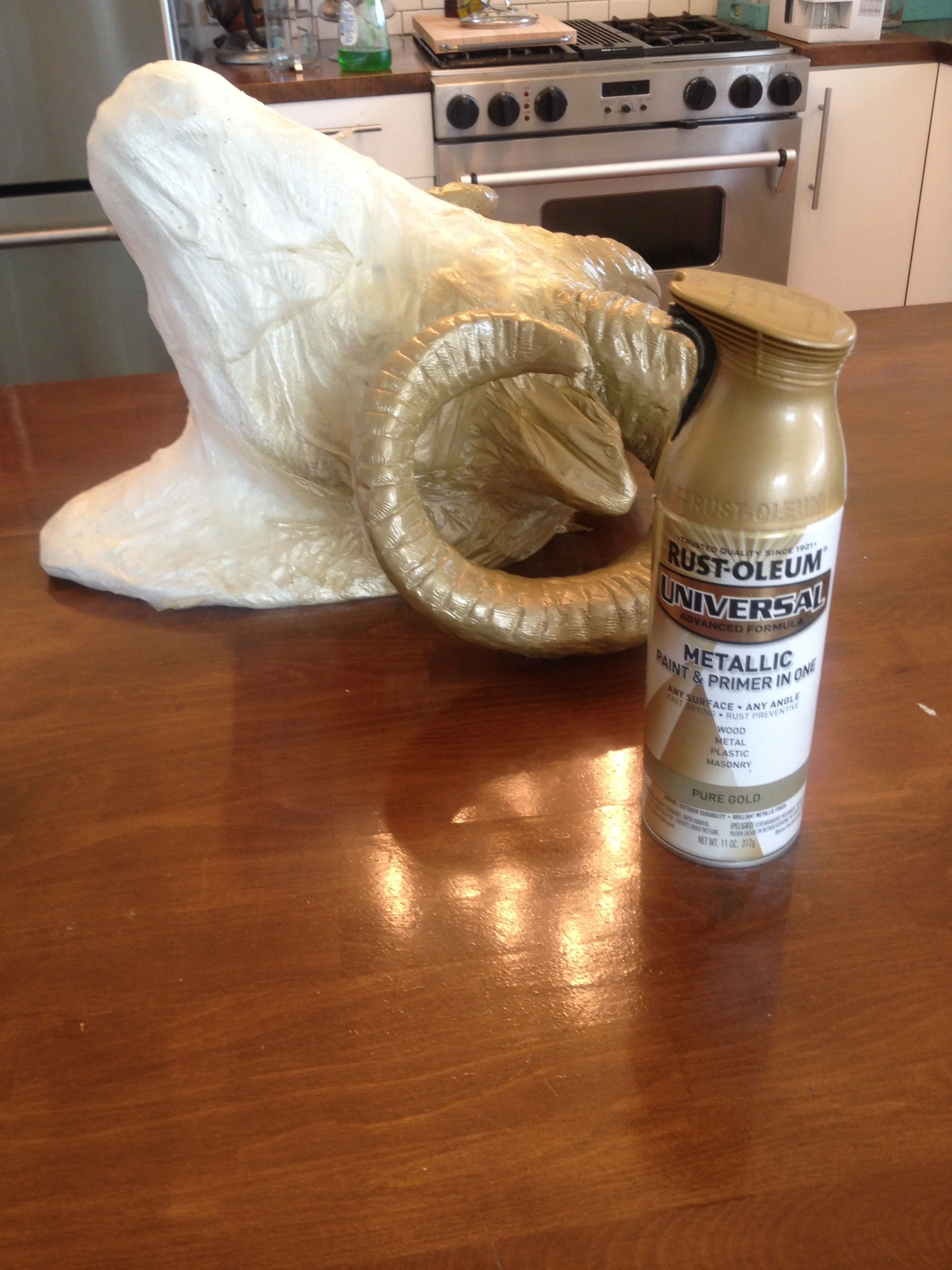
We are finally getting to my favorite part of this crazy home progress – decorating! I know some people hate the taxidermy decor, but I put things in my house because I like them...so they're stayin'. I don't know why, there is just something fun about them that I like.

I bought this guy at home goods – and while I like the white on white look...he needed a little facelift. After spending 20 minutes trying to find tape, I gave up and went rummaging through the drawers to find another way to mask the area I didn't want painted. 

Press and Seal was the perfect solution! I have actually used it on several other painting projects and thought I would share:

IMG_3623.jpg
Mini Session: Cabin Remodel

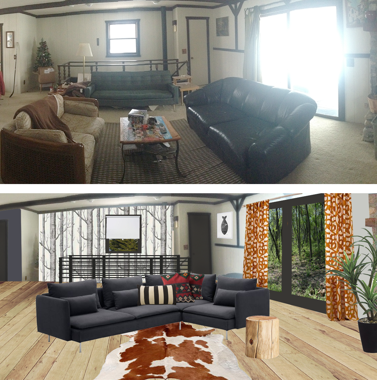
I'm pretty sure this has been one of my favorite projects to date. I can't even describe to you how excited I was when Chris Emmer of Sweaty Wisdom – a friend and super human approached me about a birthday surprise for her boyfriend, Drew. I have a huge place in my heart set aside for cabins and cottages, so after a little dance and some jumping on the couch – I went right to work and started pulling together some inspiration.

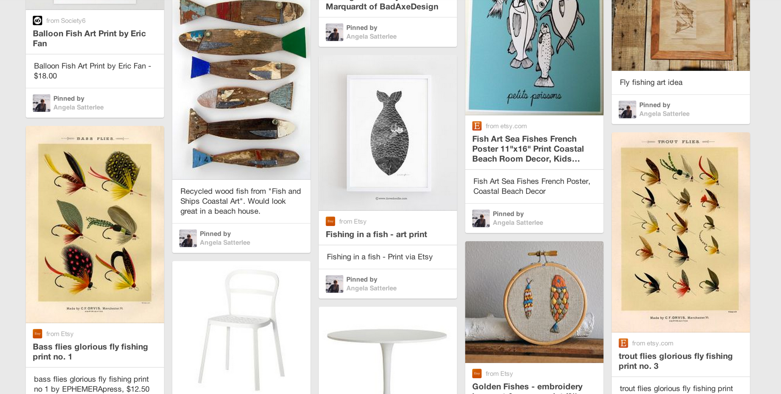
Chris and Drew spend a lot of time here, so I wanted it to be a space that represented them both. They had this really cool orange backsplash in their kitchen that was really the foundation for this design. I kept things pretty modern with a nod to natural pieces found within the details. Drew is a fisherman, so I knew I wanted to incorporate his passion in the wall art and details throughout.

Like all mini-sessions, I always try to use as much as I can that already exists in the space. With only a few requests – such as keeping the backsplash, and getting rid of the carpet – I was able to give this a fresh facelift with some pretty simple solutions.

For the floors, I went with a plywood plank. I have always loved this idea, but have never found a good place to use it. I think the natural look and especially cost – makes this a perfect solution for a cottage/cabin.

Emmer_living.png

Chris, thank you SO much for the opportunity to work with you. You are truly amazing and I had a blast with this project. I can't wait to see the finished product!

Like what you see? Check out the board on Pinterest.

A NEW WORKSPACE!

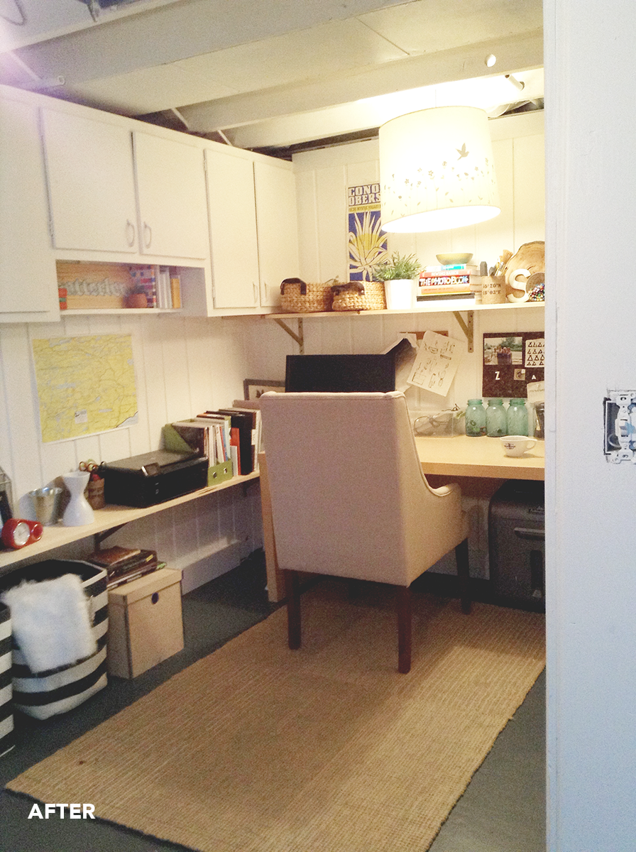
I know, enough with the delayed posts already! I've been plugging away at our basement family room project for about a month now and it's pretty close to being complete! I mentioned before that my workspace was going to be at the kitchen counter, but with the type of work that I do (sketching and wireframes)...it hasn't been great. I like to spend a lot of time working on something and walk away when I get stuck – which also means coming back to where I left off. With this space, I found myself packing everything up at the end of the day to keep the clutter off the counters which really interrupted my workflow. 

Since we have a perfect little nook in the basement - we decided to try this out! After unpacking my home office from our previous house, I don't know what I was thinking completely doing away with an office! I quickly fell in love with the transformation and love this cozy little spot to have some heads down time!

Check out the before and afters below:

There were some cabinets already in this space, so I simply painted them and utilized it for storage. I then made some simple DIY shelves using shelf brackets (that I spray painted) and some pine planks from Home Depot. We still haven't made any decisions on basement lighting, so it's all a little temporary for now, but does the job!

MINI SESSION: KERSTETTER RESIDENCE

I had the pleasure of working with the Kerstetter Family a couple of weeks ago and am thrilled to show you the results! The goal for this project was to create a space that is a better reflection of them – using light, natural elements with a hint of quirkiness and fun for their two children.

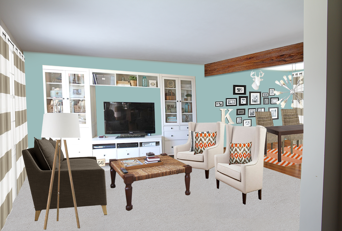
The first room you enter is the living room room which is open to the dining room. Lindsey and Ryan had already thought about tearing out the partial wall to expose into the kitchen – which I couldn't have agreed more. This allows for an alternate traffic flow to the dining/kitchen area and would eliminate the current need to walk in front of the television. 

We were also challenged with a large sectional from their previous home. It was a great couch and we tried to make it work, but ultimately decided an alternate seating option would work best in this space. 

Layout.jpg

Here is the before photo of the living/dining room (not shown: television wall, right)

IMG_6136.JPG

And after!

Kerstetter_LivingDining.png

Since Ryan is also a painter, they were really looking for some wall color options and cabinet color choices for their kitchen. The cabinets are super nice and in great shape, so giving them a lil' update was all they really needed. While we kept the outer countertops, we changed the island in the middle to a butcher block and refaced the back. 

IMG_6146.JPG

After!

Kerstetter_Kitchen_BLUE.png

I had a blast working on this project and want to thank Lindsey and Ryan for being so sweet and welcoming me into their home. I hope you love your new design plan! 

MINI SESSION: PENTWATER COTTAGE

I can't tell you how many friends I have made at random through facebook. I'm not sure what that says about me, but I do have a lot of friends that I talk to on a regular basis...that I've never met. Abby Hoppen is one of those people. She found me at random one day after Second Chance Design posted one of my home updates on their page...and the rest is history!

She has many passion projects including her blog, Binks and the Bad Housewife and her store Oh Abigail (now in the old Rebel location on Fulton)! I love following her Pentwater Cottage project and was drawn to this weeks post on her bathroom update. She made some great color choices, but was about to throw in the towel when it didn't turn out the way she had hoped. A quick e-mail later and a Fairly Modern mini-session was underway! 

The biggest goal for me during a mini-session is to compliment what a client already has. There isn't always a need for a full demo and you can certainly get a high-end look on a small budget. For this bathroom, the only major project includes removing the current beadboard and replacing with some inexpensive wood planks. Since she had already put in the time and money to paint, I definitely wanted to compliment that through accessories and simple hardware changes. Needless to say, everything fell into place and Abby now has a solid visual plan to tackle her bathroom as time and budget allow!

abigail_before.png
ABIGAIL_PLAN.png

Thank you Abby for letting me take on this challenge! 

FROM THE WEEKEND: THE LITTLE THINGS

While there wasn't any major progress on the home front, it was a great weekend in the Satterlee house. My dad came over Saturday morning and we went to Home Depot to gather all the materials for various projects we needed to tackle. The biggest was replacing the wood posts in the basement (yep, the ones holding up the beams to our house) with steel. I forgot to bring the drawings that our engineer gave us to HD, so we thought we could go back and get them, swing by Lowes (they are the closest), and pick them up no problem.

Seriously. I don't know why I do this to myself.

Without fail, we left with three posts as instructed by the Lowes employee based on the weight requirement from our engineer, installed them....and BAM. Post bent. Insert some profanities, taking new posts down, old back in...and we have about a half-day wasted and landing right back to square one. The installation of posts meant I could finish painting the floors in the basement, but since I can no longer do that....I reverted back to the shelf project in the kitchen. Which is always a good reason to have two projects going. You can keep momentum and it's a good distraction from being very, very angry about the other failed project. 

For the shelves, we are following this tutorial, but tweaking as we go to get desired sizes and a different under cabinet lighting. It involves carving out pieces of drywall so that we can attach the brackets to the studs. I know it may be over-kill, but let's fast forward to my kitchen being complete (which maybe...never?) and my shelves are filled with all of my REALLY special place settings and china. I'll talk more about this collection later, but needless to say...there will be no possible way for them to come crashing down based on the above process. 

Floating-Shelves_progress.png

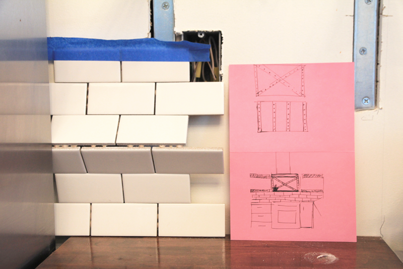
In other exciting news, we also decided on a backsplash tile! We knew we wanted subway, but were having a hard time deciding on which size (there are SO many options!). We both really loved this one and the scale just feels right for how we are using it. You can see my little sketch above and a few ideas for what we would like to do between the tile and the range hood...more on that project later.

Backsplash_plan.png

I also got around to adding the front panel on the dishwasher. Which seems silly, but after staring at a black box for months...I was pretty pumped. My dad is stopping over to hook it up on Monday, so no more hand washing for us = happy dance.

cabinets.png

Between Valentine's Day with the hubby, my bestie's 30th birthday, and a get together for my Grandpa's birthday on Sunday - I would say it was pretty successful! 

Angela Satterlee Comments
A NIGHT IN: FOR THE LOVERS AND THE HATERS

Skip the crowded restaurants and spend your Valentines Day at home. Fairly Modern and Love's Ice Cream hope to inspire your "night in" with a little something for everyone. 

Swing by the Downtown Market with your love and grab a pint of the Champagne Strawberry or crawl into bed waiting for this day to be over with a pint of Blackberry Ginger.  

2 for $14 or Buy one get one FREE!

FM_night-in_lovers.png
FM_night-in_haters.png
FM+LOVES.png
Angela SatterleeComment
FROM THE WEEKEND: BASEMENT PROGRESS

First bit of exciting news: It's officially been 6 months since day 1 of renovations! It all seems very surreal considering we were down to studs at one point. 

Last week the blog took a little hiatus as I scheduled a few nights off to catch up with friends. Priorities. Not to mention, there would have been some pretty lame updates like "another coat dry!" for the eighteenth time. If you've ever attempted to paint knotty pine (especially white) you can relate to the absolute madness it can cause. Even after three coats of Kilz, I just couldn't get a layer of paint on without it being sucked into the wood like a sponge. I think I stopped counting after the 6th coat and one teary meltdown. 

I also decided to paint the ceiling white. A lot of people do black (which also looks nice), but since this room flows right from our main area upstairs - the goal was to make it feel like part of the house and less of a basement. We also don't have any wires to hide over here, so it's pretty clean to start with. I thought of doing something different like a cool grey or something, but ultimately landed with white. Womp womp.

It was also my first experience with a paint sprayer. I scored a great deal on one during the holiday season knowing we would need it to do the exterior in the spring. This also made the ceiling portion go faster, but it made a HUGE....I mean HUGE mess. Think of thin coat of dust over literally everything in your home....except that it's paint. Although it did make the actual job faster, I don't think we will be ever using it inside again due to the clean-up. 

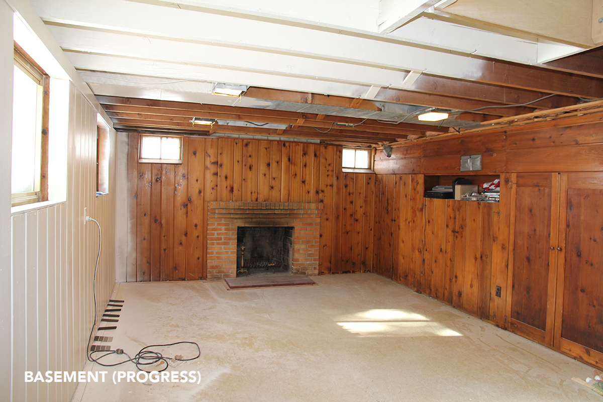
So, if you think back to a few weeks ago...the basement looked a little something like this:

basement_before1.png

And here is with our first wall of paint and some of the ceiling...this took about 4 nights:

Basement_01.png
basement_02.png

The goal of this room was to get it "finished" on the cheap until we decide what flooring works best for us. In the process of picking up paint, I actually found one at Lowes this weekend that we LOVE, but after adding it up – we decided to stick with the $25 gallon of floor paint until we save up our pennies. Ultimately, we have too many other projects that take priority right now, so this does the job. You will see below that we painted right over the floor tile after filling the gaps with Bondo. Overall it worked and will get us by for the year while being able to enjoy it! 
basement_04.png

The basement is Franks access to the backyard, so timing was everything. I made sure he went out for the last time of the night and then did three coats before bed:

basement_05.png

Funny story: So the bondo I used the day before had me quite "loopy". I could barely sleep because I knew once the floors were dry – we could move our furniture in. I woke up Sunday morning to see the results and was so excited that I woke Brandon up to ask him to help me move the sofa. (7AM on Sunday, mind you.) He responds "Are you still high?!" I couldn't really come up with a clear answer...but I did get him to help me :)

basement_06.png

Furniture and decor in progress! I still have a ways to go, but have added my visual to-do list. I haven't decided if I'm going to paint the fireplace yet. It's actually really grown on me! 
basement_07.png

....and here is where we all get to have a good laugh. Behind me (I'm sitting on the stairs) is a not-so-finished space. In my defense, all of our furniture has been stored in our basement and sunroom for the past six months. We played a little game of musical furniture as the furniture above needed to come out of the sunroom so that the stored furniture under the stairs could take it's place. I know my logic probably doesn't make much sense to anyone on this one, but I also haven't shown you a pic of my sunroom/furniture storage unit yet. 

So, here is part 2 that you all get to enjoy updates on over the next few weeks. This nook area is going to be a workspace for Brandon and I, so I can't WAIT to get this going. The stairs area also being pulled out and replaced with new (these were temporary during the reno). 

Basement_08.png
basement_09.png