Guest Bedroom Updates
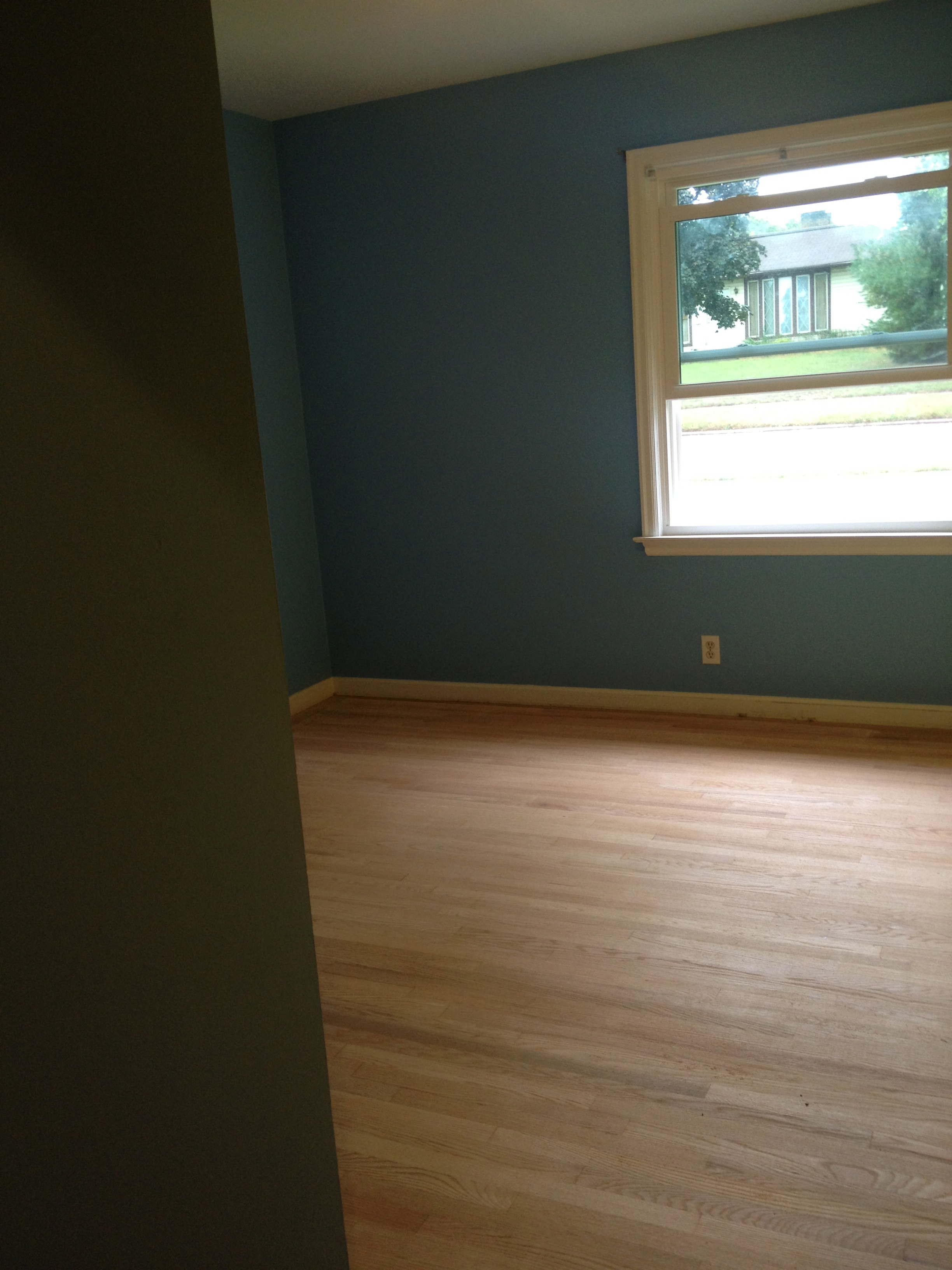
Until now, this room has been many things including a temporary kitchen during renovations, a dump zone of project materials, and more recently a spare bedroom which consisted of a mix of pieces from our old house that didn't really work in the space.
I loved having a nice guest room at our last house because it was actually used a lot and we loved hosting after a late night with the siblings who wanted to crash, friends from out of town, or spending a nice weekend with our parents.
You may recall some before shots of what it looked like when we bought it and in progress:
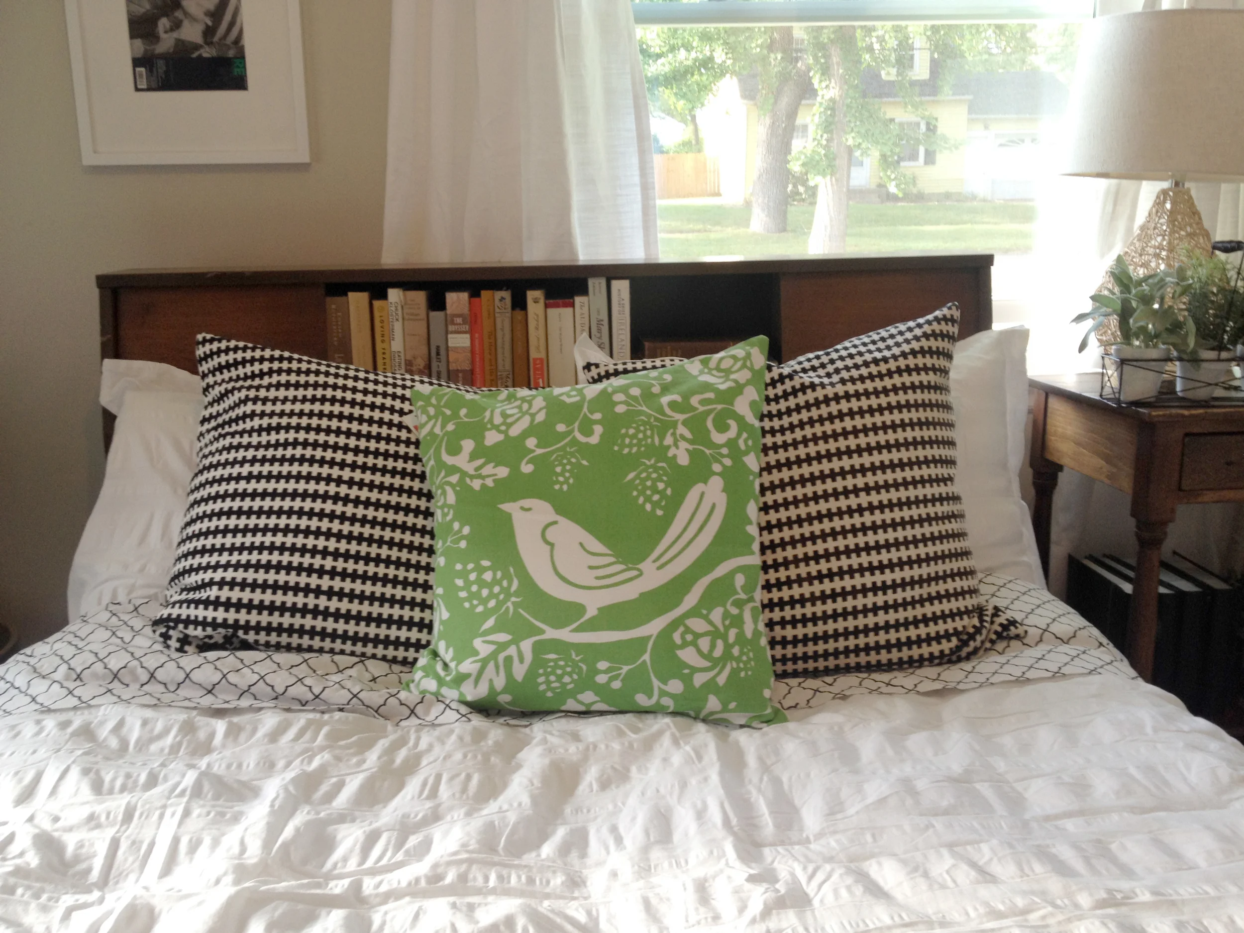
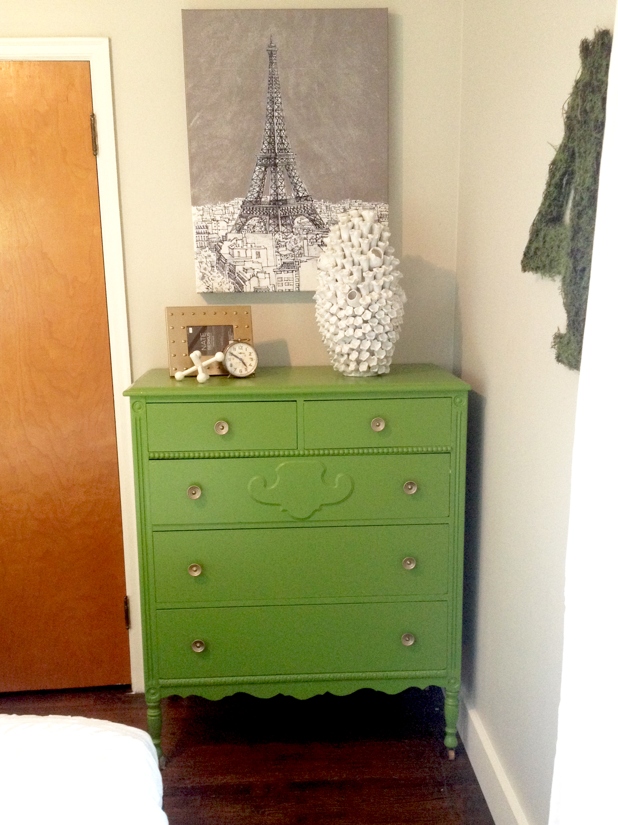
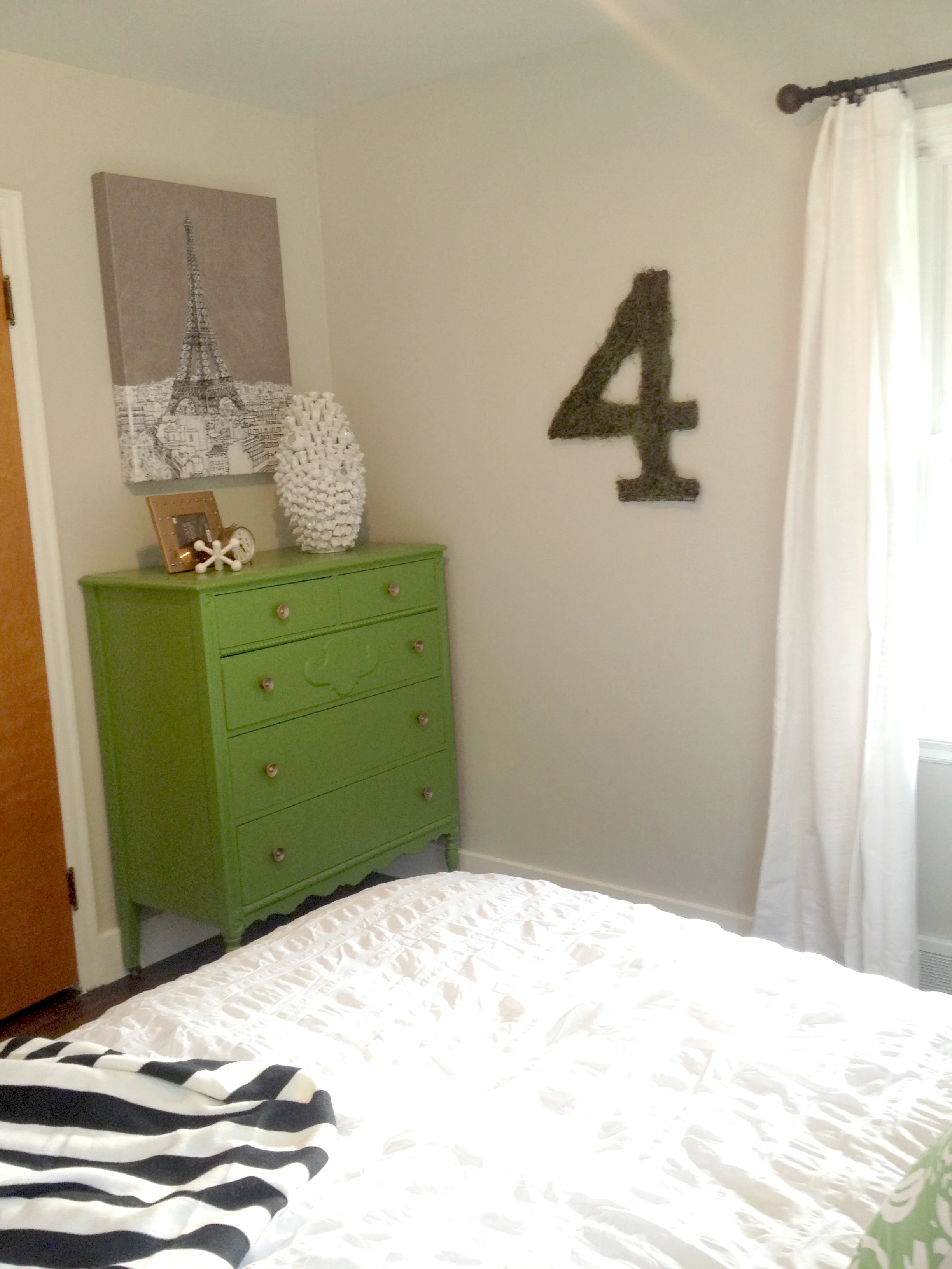
Keeping our guests in mind, I really wanted this room to have a story. I decided to use a lot of frames for the wall art to fill with photos of family and friends since we don't have a lot of wall space in the rest of our house. I also picked out some of our favorite books to stock the MCM bed frame that I bought at a flea market. We also share a love for Paris with our mom, so I found a cool painting and also incorporated a clock that we bought in France. All of these pieces really started to inspire a "theme" and I began slowly collecting items I wanted to be included.
Colors. I REALLY struggled with this one. In an attempt to quickly bury the blue and yellow walls, I painted it a light grey as soon as the floors were done. With a mix of our old furniture, it felt like an adult kids room and I just was never sold on it. I also loved all of the pieces and didn't want to get rid of them, so in order to make it feel more modern like the rest of our house...color was key.
I would say the color selection process has been in the works for a couple of months now. I would always look at textiles whenever I went to Home Goods, etc. and never found anything that excited me. I'm REALLY tired of a lot of the patterns and stuff lately...anyone else?
So, not to say that this bird pillow is anything revolutionary, but it totally inspired my room. I just LOVE the kelly green color and used this pillow to pull together a new look that I'm so thrilled with!
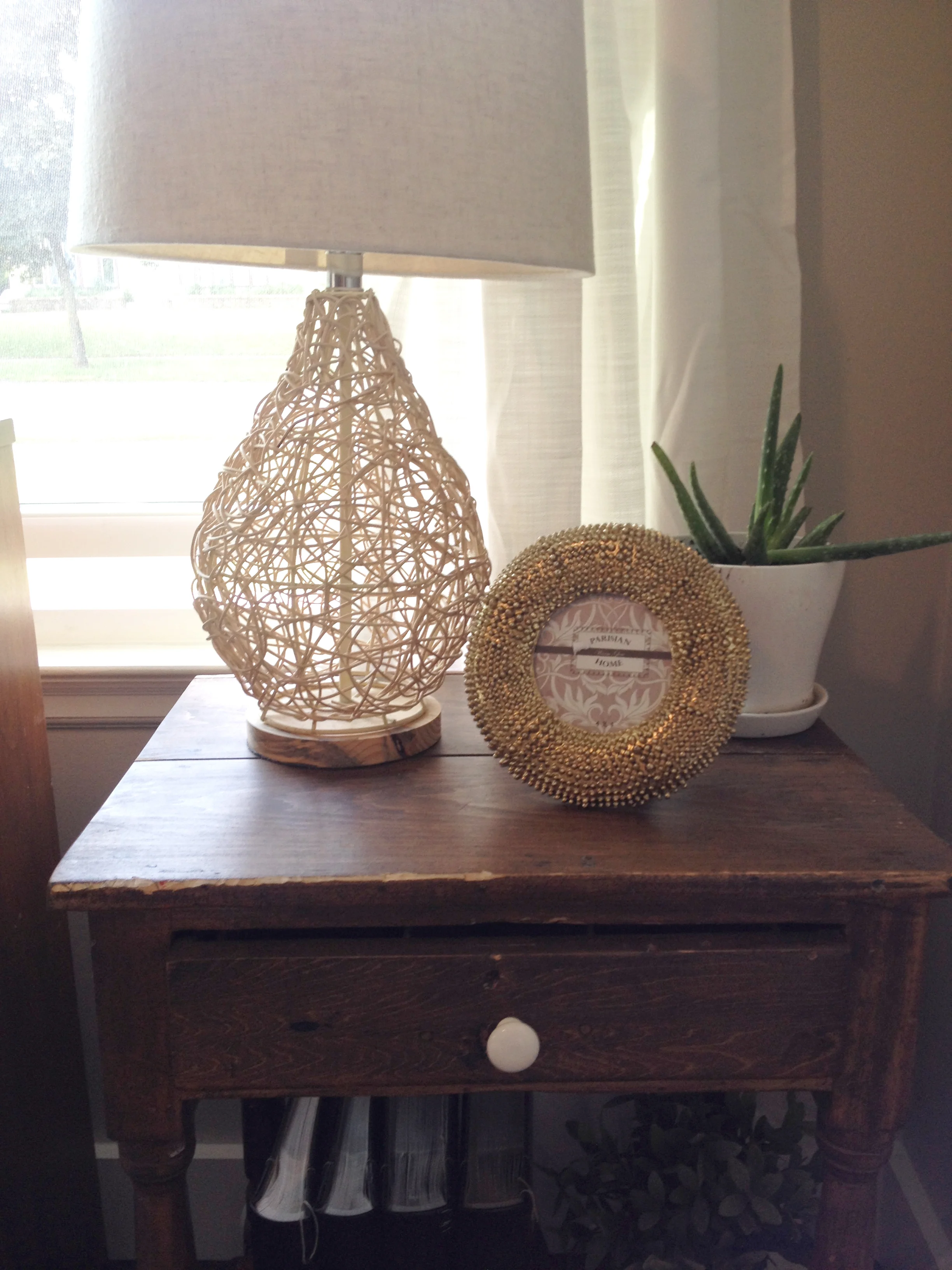
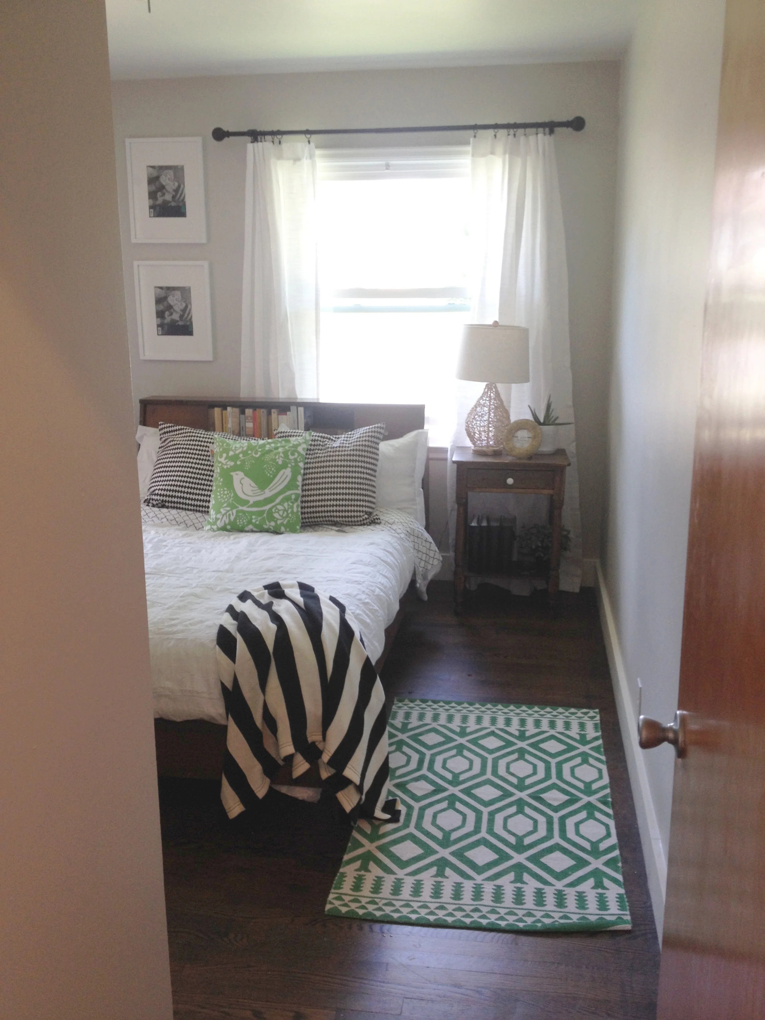
I wanted to avoid using so much green that it turned into a giant booger, so I stuck with white as the primary with black and white secondary textiles (because I already had them - win!). I also used brass and gold as my accessories and green as the accent color.
And now for my favorite piece...the dresser. I bought this dresser at a yard sale while we were in the Union house. I painted it this awesome red color and really, really didn't want to paint it...but it was holding me back from pushing the design in this room. The red worked great where and how it was used in our last house, but we needed to say goodbye red....and hello green!
Ah, I just love it.
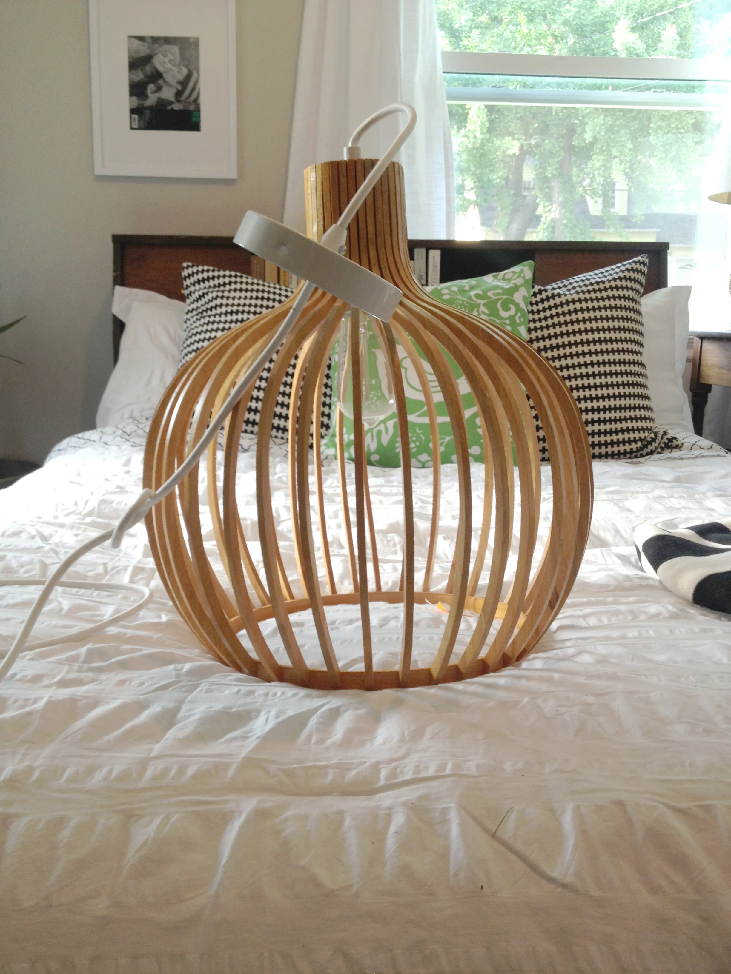
Another great find was this light I bought around Christmas on super clearance at JCP. I had no idea where I was going to use it, but I had to have it. I think this will be the perfect addition to this room and really help tie in the modern aesthetic found in the rest of the house. Now, just need to get the hubby to hang it (hint, hint B. Satt).
And here is the overall look. Now, I just need a finished bathroom and guests!


