BATHROOM UPDATES
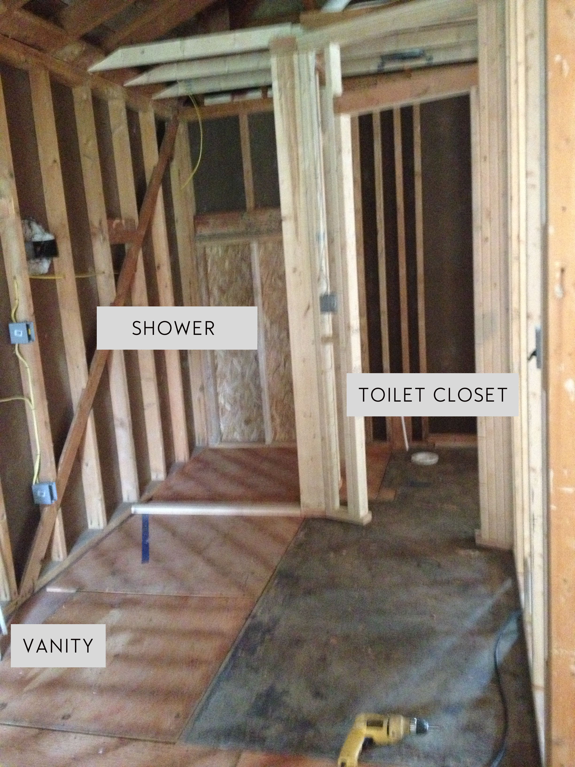
As some of you know, there were some major changes to bathroom. It started out as your standard size sharing the outer wall with a pantry kitchen and gradually landed on its 7' x 14' glorious self. The fact of the matter was, we've always had a bathroom battle with our shared schedule and we're happy we landed on a layout (and space) that will work for both of us!
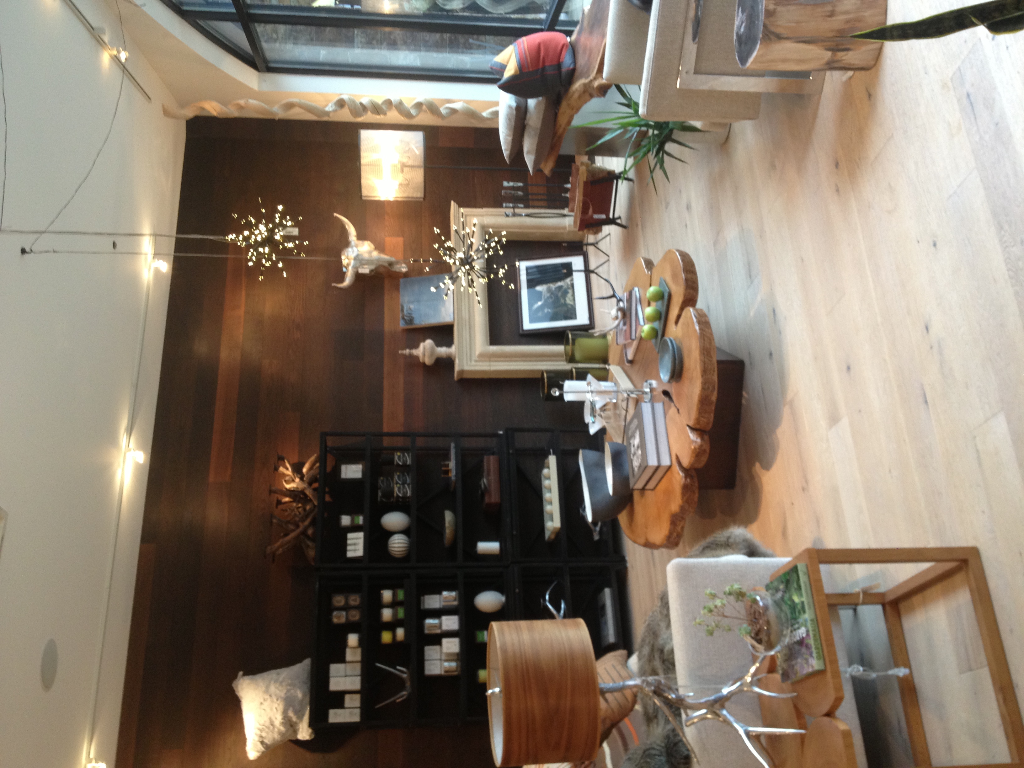
While I was out in Colorado last week, I stumbled across Worth Interiors where I had a total drool fest. It really made me re-consider a lot of the design decisions we were making and inspired me to stick with the furnishings we have while accenting them with some beautiful modern pieces. My urge to go completely retro put me in night sweats of having to change all of our furniture....but was relieved to see that wasn't the case. The warm, wood-sy design is definitely up our alley and with a slight twist with the retro fixtures...I think we have a winner!
Here is a photo from Worth Interiors:
Naturally, I couldn't stop thinking about it on my flight back and had to throw together a mood board for the bathroom before I lost it. We have already purchased our lighting, but you can start to see where the fixtures will tie into the overall design.
The Details: We have selected our tile from the Tile Shop in Grand Rapids. The floor tile will be a wide rectangular grey. The shower will have a glass door so you can see the white subway tile (wall) and pebble floor. Behind the vanity will be Cole & Sons "Woods" wallpaper with sconces mounted on each side. Not 100% on the mirrors, but they are Target:Threshold Captains Mirror. We are keeping the ceilings cathedral, so there will be a skylight installed along with matching chandelier.


